
Let’s dive into the art of turning numbers into narratives. With Eda Salihoglu, learn how to strike that balance between detail and clarity, so your data can tell insightful stories.
In the contemporary business landscape, characterized by an abundance of dashboards and automated reports, the utilization of visualizations to communicate insights effectively is paramount.
You’ve likely come across two buzz terms – data visualization and data storytelling. Both are key in making sense of the numbers and statistics we deal with daily, but they do play slightly different roles.
Data Visualization and Data Storytelling
Data Visualization, in the realm of marketing, serves as a critical instrument for condensing complex datasets into visual, easy-to-grasp formats such as charts, graphs, and maps. Visualizations not only enable information to be digestible but can also be used to understand raw data better and make it more credible. They help create more robust views on performance and bring loosely relevant data sources together to establish a stronger standpoint.
On the other hand, Data Storytelling builds upon this foundation and takes it a step further. It weaves the disparate pieces of data into a cohesive and compelling narrative. By adding context and insights, it not only sheds a spotlight on the ‘what’ but also provides the ‘why’ and ‘how.’ It drives comprehension deeper, persuades stakeholders, and informs strategic business decisions.
In sum, while data visualization paves the way for understanding data, data storytelling leverages this understanding to drive action and decision-making in marketing contexts.
Is a dashboard with twice as many visualizations powerful?
The kind of information you can show on dashboards is endless, thanks to constant improvements on both visualization and data source ends. For the last couple of years, with the sole purpose of increasing added value from dashboards, marketers have tried their very best to expand their scope and utilize all the new features visualization platforms made available. With every new iteration, different forms of visualizations, calculated fields for comparisons, and fields you can create and amend with simple coding were introduced. However, the more complex the dashboards got, the more we deviated from the main objective of having dashboards in the first place – to make data relatable and actionable.
Let’s review the steps of weaving a compelling data-driven dashboard or report. It consists of the following:
Defining your end goal
When reports/dashboards are shared with end users, we should always assume they don’t have the most analytical backgrounds. For that reason, focusing on the very first goal of visualization – making data easier to understand – is absolutely essential. The purpose of a chart or what information it’s supposed to show should not be in question. Knowing the end user and how they will use these data insights to make better business decisions should, therefore, always come first.
Choosing the right visuals
One way of ensuring the information you’re trying to convey isn’t getting lost is to have a report set up that:
- Adds value: Deciding which graphs/charts would add the most value to each page of the dashboard or report
- Defines a 50/50 split: To make the information on the dashboard digestible and not visually tiring, try to get as close to a 50-50 split between data tables and score cards and graphs and charts, leaving texts aside.
Connecting the dots
In the below example, the two data tables are supported by three graphs that enable the figures to be put into perspective.
Specifically, the link between revenue and cost is quite clear. Moving the cursor to see how each column is calculated would take extra effort if you only used visualizations on this page. Similarly, if you only used data tables, the clear trend lines would’ve been difficult to determine.
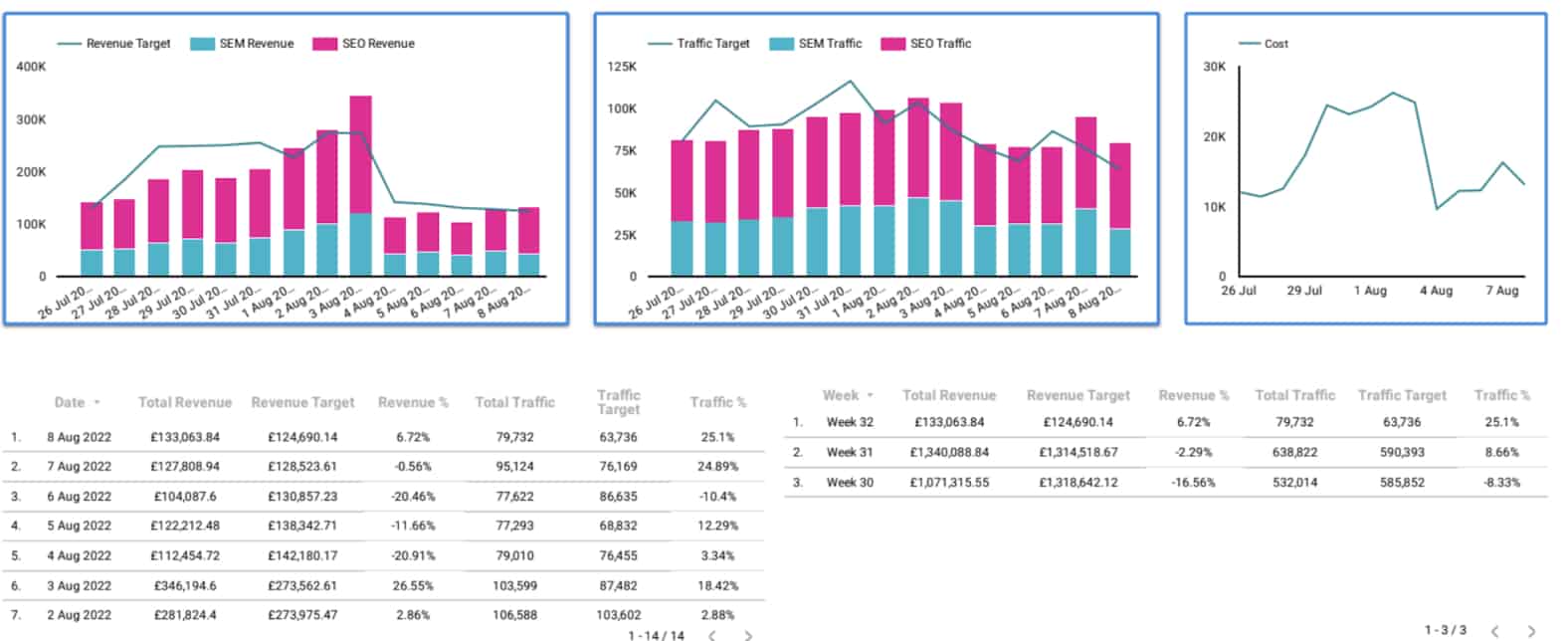
What’s important is that the tables and visualizations are very closely linked; the information on both support one another and are very relevant.
Building a storyline with data
In the example below, the order and position of the scorecards again help build a narrative – specifically, how much PPC and SEO contribute to overall clicks.
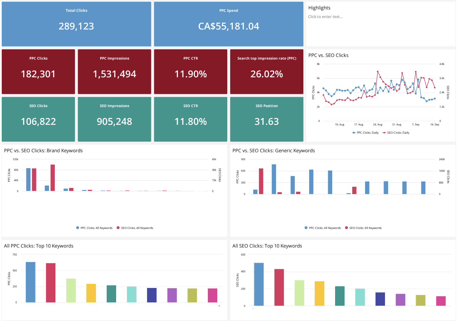
One more thing to remember is how each graph, chart, data table, and scorecard relates to the same overarching topic. Instead of condensing a dashboard into a small number of pages and having lots of information shown on each page, often not significantly related to each other, try coming up with a premise for each page first.
Ideally, these premises should not have much in common so that you don’t risk repetition. A safe choice would be to go from general to granular in the flow, so starting with totals and going into detail about channels, markets, and campaigns in the following pages usually is easier to process.
Leveraging tech to weave your narrative
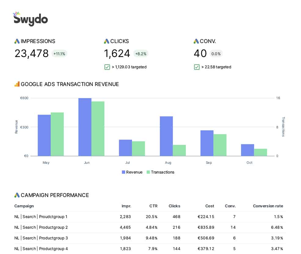
Some platforms provide flexibility concerning graph/chart types independent from dimension and metric pairings, like Swydo and Tableau, and those that seem more advanced, like Looker, which is slightly more rigid but offers more adjustability in visual features.
Regardless of which visualization platform better serves your purpose, it’s easy nowadays to experiment with all the different graph and chart options these platforms provide. There’s a common belief that the more obscure and complex a graph, the more advanced it is – more often than not, this is not true.
Looking at the above screenshots, visualizations in both examples helped support the narrative of these dashboards by making it easier to put the numbers into context. When there’s a direct link between elements that show raw data and visualizations supporting them, developing a strategy and action items becomes a straightforward task.
At Kaizen, we always start with setting objectives for reports and dashboards themselves instead of digging into which data sources, dimensions, and metrics to work with. Coming up with wireframes in which each page has a clear premise, each visualization connected to one of the data tables or scorecards on the page, we minimize room for error and build structures in the most efficient way possible to serve these ideas.

Eda is an industrial engineer turned digital marketing professional and a Data & Analytics Manager at Kaizen. Her proficiency with numbers and attention to detail has strengthened her skill for interpreting and visualizing data efficiently and coherently to add significant value to reporting methods and easily draw actionable insights. Feel free to reach out if you’re wondering how to take your reporting to the next level to make better-informed decisions!
Tell data-driven stories with Swydo. Bring your favorite marketing data together in one platform to create comprehensive client reports. Start your journey here.