
Vanity metrics are numbers that go up reliably but don’t change a single business decision. Followers, impressions, traffic, opens, page views — they make the report look impressive while the client’s revenue line stays flat. Eric Ries gave them their name in The Lean Startup and his 2010 Harvard Business Review column, and the test he proposed back then still works in 2026: a metric is only worth tracking if it’s actionable, accessible, and auditable.
Most agency reports in 2026 fail that test on at least three rows.
You’re sitting in a Monday meeting. The slide hits the screen. Reach: 2.4 million. Impressions: 8.7 million. Followers: 45,000. A CMO who’s read one Andrew Chen post tilts her head and asks: which of those produced a sale?
Silence.
That’s the moment. That’s when you find out whether your reporting earned its keep — and whether your contract renews. The pressure is real and measurable: 63% of CMOs report increased pressure from their CFO to prove ROI, and 61% from their CEO, according to the Spring 2025 CMO Survey of 281 marketing leaders. Vanity metrics don’t survive that meeting. Neither does the agency that brought them.
This guide walks through what counts as a vanity metric in 2026, the IMPACT framework I use to filter them, what to track in their place by channel, and how to switch a client over without setting their hair on fire.
What Are Vanity Metrics
A vanity metric is any number that monotonically rises with activity but can’t be tied back to a business outcome. It looks like progress because it never goes down. It feels like progress because the dashboard cell is green.
It isn’t.
Likes go up. Followers go up. Page views go up. None of them appear on a P&L. The CFO doesn’t have a column for “impressions.” The board doesn’t ask about open rates. So when you spend an hour of your senior strategist’s time on a slide titled “Social Engagement Trends,” you’ve spent real money on theater.
Ries’s three A’s still cut through the noise.
- Actionable: did the number change because someone made a decision, and can you make a different one if it moves?
- Accessible: can the person seeing it understand it without a translator?
- Auditable: can you trace it to a specific customer, a specific event, a specific dollar?
If a metric fails any of the three, it’s vanity. It can still be interesting. It just can’t be the thing you’re paid to report on. The distinction between KPIs and metrics matters here — a vanity metric can still be a metric. It just shouldn’t be a KPI.
The Metrics That Seduce You
Six families of metrics keep showing up on agency reports in 2026 even though they shouldn’t be the headline. Each one has a useful diagnostic role buried somewhere — but as the lead number on a client report, they’re costing renewals.
Social media followers. A follower is not a customer. It isn’t even a fan. In 2026 it’s frequently a bot. Track follower growth as a context indicator, not a north star. The lift you’re paid for is engaged audience-to-revenue conversion, not headcount.
Website traffic without context. A million sessions tell you nothing on their own. Traffic from a Reddit thread by an angry ex-customer is also traffic. Always slice it by source, intent, and conversion behavior — and lately, by whether it’s even human (more on that below).
Email open rates. Apple’s Mail Privacy Protection, which shipped in iOS 15 in September 2021, pre-fetches images on any opened message. That inflated open rates industry-wide and never deflated. I’ve seen campaigns with 40% open rates generate less revenue than 15% open rate campaigns. Track click-to-revenue instead.
LinkedIn impressions. LinkedIn impression counts inflated dramatically through 2024 and 2025 as the platform’s feed algorithm pushed more content per scroll. The number doubled. The pipeline didn’t.
LLM mentions. This is the newest one. A tool tells you ChatGPT or Perplexity referenced your client’s brand 800 times last month. Cool — but did anyone click through? Did any of those references actually drive a qualified lead, or just exist in a model’s hidden context? LLM share-of-voice is signal. LLM-attributed revenue is metric. Don’t confuse them.
AI Overview impressions. Google’s AI Overview now appears in half of all searches, according to HubSpot’s 2026 State of Marketing Report. Your client’s brand might appear in dozens of those answers a day. If the click-through-to-revenue is zero, the appearance isn’t a metric — it’s a screenshot.
None of these are inherently bad. They become vanity when they’re reported as the answer instead of the question. Run them through the broader list of digital marketing metrics you already track and ask which ones survive a CFO meeting. Most don’t.
The Bot Tax on Your Dashboard
Roughly half of every dashboard you build in 2026 isn’t being viewed, clicked, or generated by a person. It’s a bot.
Imperva’s 2025 Bad Bot Report — analyzing trillions of blocked bot requests across thousands of domains — found that for the first time in a decade, automated traffic surpassed human activity. Bots accounted for 51% of all web traffic in 2024, with bad bots specifically at 37%, up from 32% the year before. DoubleVerify’s parallel 2025 analysis of more than a trillion ad impressions found North American bot fraud surged 101% year over year, with the US alone up 106%.
So when your client’s report shows 500,000 sessions, somewhere between 150,000 and 250,000 of those weren’t human. When it shows 80,000 LinkedIn impressions, a meaningful share weren’t either. When it shows 2 million ad impressions, a slice of that — Pixalate’s 2025 benchmarks put global mobile-app invalid traffic at around 36% — went to a server farm.
The Bot Tax on Your 2026 Dashboard
Share of measured activity that isn’t human, by surface.
All web traffic
51% bots
Bad bots (web)
37%
Mobile app IVT
36%
Web IVT (global)
23%
CTV IVT
21%
Sources: Imperva 2025 Bad Bot Report (web traffic, bad bots); Pixalate 2025 IVT benchmarks (mobile, web, CTV).
This is the bot tax. It isn’t a margin issue you fix by switching ad networks. It’s a structural distortion of every impression-, view-, and click-based metric you put on a client report. Two practical implications:
First, any metric that doesn’t filter for invalid traffic is more vanity in 2026 than it was in 2022. The same number that earned a renewal in 2019 may not represent the same human activity today. Second, the metrics that hold up against the bot tax — revenue, qualified conversions, leads that convert to opportunities, store visits, completed checkouts — are the ones that should anchor the report.
The fix isn’t to argue with the client about bot percentages. It’s to put the bot-resistant metrics on the cover slide and let the impressions sit on page seven as context.
The Three-Question Vanity Test
Before any metric makes it onto a client report, run it through three questions in this order. If a metric fails any of them, it’s a vanity metric — even if it’s traditionally been considered a KPI.
- Can my client make a decision based on this number changing? If LinkedIn followers jump 12%, what does the client do differently next week? If the honest answer is “nothing,” the metric is decorative.
- Does this number tie back to revenue, retention, or cost? Not eventually, not theoretically — directly, through a documented path. “Brand awareness leads to consideration leads to purchase” is a story, not a path.
- Would a non-marketer understand why this matters in one sentence? Try it. Explain “reach” to a CFO in one sentence without saying anything they’d dispute. Most marketers can’t.
The first question is the hardest. Most metrics fail it. That’s fine. Demoting a metric from “headline” to “diagnostic context” is a feature, not a defeat.
The IMPACT Framework
Every metric I put on a client report has to clear six gates. I call them IMPACT, and the framework is what stopped me losing clients to “your reports look pretty but I have no idea if you’re working.”
The IMPACT Framework
A six-gate test for any metric you’re about to put on a client report. Miss two letters, demote to appendix. Miss four, drop it.
I
Influenceable
Can the client’s actions move this number?
✓ Conversion rate by campaign
M
Measurable to Money
Can you trace it to revenue, cost, or retention?
✓ Customer acquisition cost
P
Predictive
Does it forecast a future outcome?
✓ Trial-to-paid conversion rate
A
Actionable
Does a change trigger a specific next action?
✓ Lead-to-MQL ratio by source
C
Contextual
Does it only make sense paired with other numbers?
✓ CTR + cost + conversion rate
T
Time-bound
Is there a window in which it must move?
✓ Sales-qualified leads this quarter
A metric that clears IMPACT belongs on the cover slide. One that misses two or three letters belongs in the appendix. One that misses four or more doesn’t belong in the report at all — log it as an internal context indicator and move on.
Want to use this on your own reports? Pick three metrics from your last client deliverable and score them against the six letters. Most agencies find that two of three fail at “Measurable to Money.”
The Trust Death Spiral
Reporting vanity metrics doesn’t just waste time — it triggers a predictable churn pattern I’ve watched play out across dozens of agencies on a roughly 10-to-12-month timeline.
Months 1–3: The report looks great. Numbers up everywhere. The client is happy. You’re billing.
Months 4–6: The client’s CFO asks how marketing is going. The CMO opens your report. The CFO asks, calmly, which of these produced revenue last quarter. The CMO can’t answer with a number. The CFO files this away.
Months 7–9: The CMO starts asking for “more strategic” reporting. You add more charts. The CMO is now defending you to a finance team that has already mentally written off the spend. Gartner’s February 2026 forecast — based on 426 senior marketing leaders surveyed in late 2025 — predicts that over 40% of CMOs who push for larger budgets without ROI proof will lose C-suite influence by 2027.
Months 10–12: The CMO sends an “we’re evaluating other options” email. You pitch. You lose. You don’t know why.
You know why. Your report never answered the only question that mattered. The fix isn’t more charts — it’s client retention built on reporting that ties spend to revenue, cost, and outcomes. Lead with those at the top of the page and demote everything else.
What to Track Instead by Channel
Six tables, six channels. Left column is the vanity metric most agencies still lead with. Right column is what to lead with instead, in 2026.
Paid Advertising
Paid is the channel where vanity hurts the most because the spend is real-time and visible. Get the ROAS vs ROI distinction right — and the rest of the PPC metrics stack falls into place — and the rest of the report follows.
| Stop leading with | Track instead |
|---|---|
| Impressions | Cost per acquisition (CPA) by audience and creative |
| Click-through rate alone | CTR × conversion rate × order value |
| Ad spend volume | Return on ad spend (ROAS) by campaign |
| Generic “engagement” | Lead-to-MQL ratio by ad source |
| Reach | Incremental reach (new humans, filtered for IVT) |
For multi-platform ROAS, build it once and let it follow you across every report and dashboard. Open Swydo’s Combined Data Sources widget, blend up to five ad platforms in one view (Google Ads, Meta, LinkedIn, TikTok, Microsoft, and the rest), and use Cost, Revenue, Purchases, and ROAS as the column set. Same widget in your Monthly Report.
Same widget on the client’s live Dashboard. Same widget feeding your internal Monitoring Board. If you’d rather start from a pre-built version, the Google Ads report template ships with the headline metrics already wired up — clone it, swap in the client account, and you’ve got something to show by Monday.
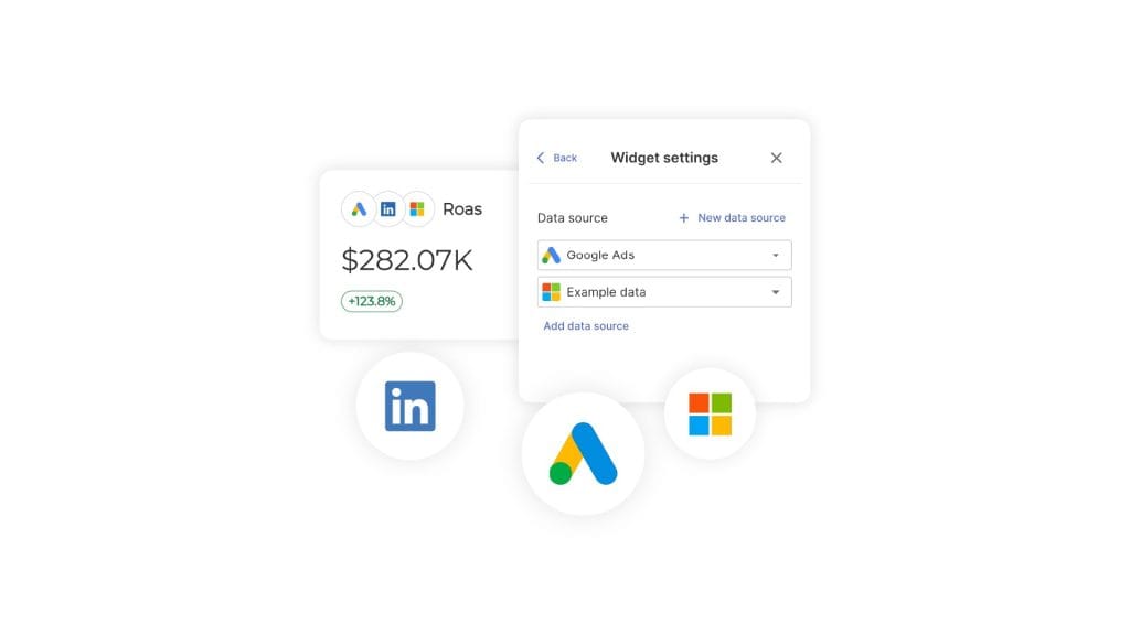
One thing to know: custom metrics don’t currently work inside Combined Data Sources widgets. If you need a custom blended metric, build it as a Manual KPI alongside the combined widget — five extra minutes, one extra row.
SEO
| Stop leading with | Track instead |
|---|---|
| Domain authority | Pages ranking in top 10 for revenue-driving keywords |
| Total backlinks | Referring domains by relevance and authority |
| Keyword rankings (all) | Rankings for commercial-intent keywords only |
| Organic traffic volume | Organic conversions and revenue |
| Page views | Pages with high engagement and conversion metrics |
| Bounce rate (alone) | Engagement rate from GA4 (event-based) |
GA4 changed what counts. The old “bounce rate” doesn’t exist the same way; engagement rate (the inverse of the new bounce metric) is event-based and harder to game. The default GA4 setup is barely useful out of the box — set up GA4 event tracking for conversions before you build a single report, or you’re reporting on platform defaults instead of business outcomes.
Add Semrush’s AI Overview ranking metrics into a Swydo report and you can show clients exactly which queries trigger an AI Overview, and whether their site is being cited inside it — a measurable surface, not a screenshot.
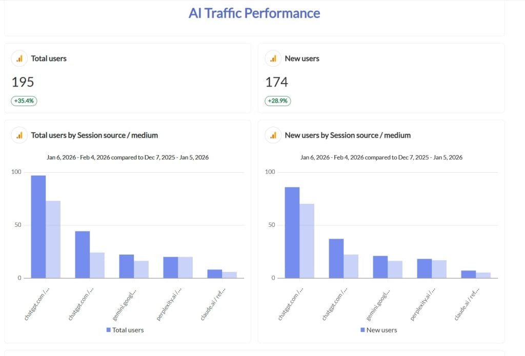
For the LLM-referral side of the same conversation, the AI traffic report template gives you a starting structure for separating ChatGPT, Perplexity, and Gemini traffic from the rest of the organic line.
Email Marketing
| Stop leading with | Track instead |
|---|---|
| Open rates | Click-to-revenue (revenue per email sent) |
| List size | Engaged subscribers (active in last 30 days) |
| Unsubscribe rate (alone) | Net list growth × revenue per subscriber |
| Total emails sent | Emails generating qualified leads |
| Generic “engagement” | Specific actions completed (demo, purchase, reply) |
Post-MPP, treating open rate as a primary metric is choosing to be wrong. Click-to-revenue is harder to inflate.
Social Media
| Stop leading with | Track instead |
|---|---|
| Followers / fans | Social-attributed revenue and qualified leads |
| Generic likes and shares | Comments, saves, and direct messages (intent signals) |
| Reach | Conversion rate from social traffic |
| Impressions | Click-through to conversion |
| Profile visits | Profile visits that convert to follows that convert to leads |
The interesting question is no longer “did the post do well.” It’s “did the post bring in someone who buys.” Same question, different metric.
Local and Brick-and-Mortar
| Stop leading with | Track instead |
|---|---|
| Online directory listings count | Calls and direction requests from Google Business Profile |
| Google review count | Review velocity and average rating trend |
| Local pack appearances | Store visits attributed to specific campaigns |
| Citation count | Local conversion rate by source |
| Map pack impressions | Click-to-call rate by listing |
Google’s store-visit measurement (Performance Max, Local) remains the most reliable way to tie ad spend to foot traffic. Meta’s old store-traffic targeting has been winding down for advertisers — don’t lead with it.
E-Commerce
The right ecommerce KPIs start at conversion and AOV, not at top-of-funnel traffic. Lead with rate, not volume.
| Stop leading with | Track instead |
|---|---|
| Total website visitors | Conversion rate by traffic source |
| Cart additions | Cart completion rate and recovered revenue |
| Total orders (alone) | Average order value × order frequency |
| Email subscribers | Subscriber-to-customer conversion |
| Social followers | Social-attributed revenue and customer LTV |
A 10% bump in traffic with a 0.2% drop in conversion rate is a net loss. The lift number gets headlines; the rate kills the quarter.
How to Build a Real Measurement Framework
Stop building reports first. Start with outcomes. Then work backwards to the metrics that prove or disprove movement toward them — never the other way around. A well-structured approach to marketing measurement starts with one number and works outward.
The structure I use across every client, regardless of channel mix:
Layer 1: North Star Metric. One number, agreed with the client. It directly represents what success means for this business. For an e-commerce brand that’s usually revenue. For SaaS it’s net revenue retention — the top quartile of SaaS metrics benchmarks puts NRR at 110–115%. For local brick-and-mortar it’s qualified phone calls or in-store visits. One metric. Not three. If you can’t get the client down to one, you don’t yet understand what they’re paying for.
Layer 2: Supporting metrics. Three to five numbers that cause the North Star to move. For an e-commerce brand: conversion rate, average order value, customer acquisition cost, repeat purchase rate. These belong on the cover slide too.
Layer 3: Diagnostic metrics. The next 10–15 that help you debug when a supporting metric moves wrong. CTR, sessions by source, time on page, email click rates. Useful when something breaks. Not the answer.
Layer 4: Context metrics. Everything else. Followers, impressions, reach. They exist for sanity-checking, not for storytelling.
Most agency reports invert this stack. They lead with Layer 4 and bury Layer 1 in slide 23. Flip it.
The Four-Layer Metrics Stack
Most agency reports invert this. The cover slide is Layer 1.
1. North Star
Revenue · NRR · Qualified calls
2. Supporting metrics (3–5)
Conv. rate · AOV · CAC · Repeat rate
3. Diagnostic metrics (10–15)
CTR · Sessions · Email click rate
4. Context metrics
Followers · Impressions · Reach
Cover slide ends at Layer 2. Layers 3–4 live in the appendix.
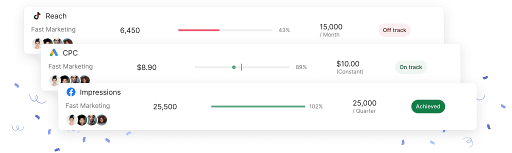
Set the North Star and supporting metrics as Goals inside Swydo — Monitoring → Goals → +New Goal — with pacing turned on, so On Track / Off Track / Achieved status updates daily without you re-reading the dashboard. Pair each goal with an alert so you find out the moment a metric breaks pace, rather than the morning of the client meeting.
How to Switch a Client From Vanity to Real Metrics
You can’t show up Monday with a new report and remove every metric the client got used to. They’ll feel like you’re hiding something. The transition is the work, and the client reporting best practices you’ve been building toward are what carry it.
I use what I call the sandwich method, and it takes one quarter.
Month 1 — Frame. Tell the client you’re upgrading their reporting to match what their executive team needs. Don’t say “your old reports were vanity.” Say “I want to make sure these numbers answer the questions your CFO is going to ask.” Run their next report with both the old metrics and the new ones side by side.
Month 2 — Educate. Walk through what each new metric means and why it matters. Show them an actual P&L impact for one supporting metric — “your conversion rate moved 0.4 points; that’s $43,000 in extra revenue at your current traffic level.” Numbers stop being abstract the moment they’re attached to money. This is also where good data storytelling earns its keep — the same chart with the same numbers becomes a renewal or a churn depending on how you frame it.
Month 3 — Replace. Drop the vanity metrics to the appendix. The cover slide is now North Star plus three to five supporting metrics, every one of which clears IMPACT. The client should be able to look at the first page and tell their CEO whether marketing is working in under thirty seconds.
The clients who push back hardest in Month 1 thank you in Month 4. The ones who don’t push back probably weren’t paying attention to the report in the first place.
Tools That Help and How to Pick
A short list of what to plug in. The trap is over-tooling: every additional vendor is another monthly invoice, another integration to maintain, another login your team forgets.
Analytics: GA4, properly configured for key events. Defaults will mislead you; spend the hour to set custom events for revenue-driving actions.
Conversion tracking: Each ad platform’s native pixel, paired with server-side tracking where possible to recover what iOS tracking restrictions stripped.
Multi-touch attribution: Adobe Marketo Measure (the artist formerly known as Bizible), Dreamdata, or RockerBox. Each tool is opinionated about how revenue gets credited; if you’ve never read up on marketing attribution models, do that before you pick one. The wrong model makes a good campaign look bad and a bad campaign look great.
Qualitative insight: Hotjar or Microsoft Clarity. Numbers say what; recordings say why. Pair the qualitative vs quantitative data sides of the story; one without the other leaves you guessing.
Reporting and monitoring: This is the layer that ties it together. You want a single tool where the client report, your internal monitoring board, the goals, and the alerts all live. The distinction between dashboards vs reports matters here — a live dashboard for the client and a scheduled report for the executive team are different jobs, and any tool you pick should do both without you maintaining two stacks.
That last part is genuinely operational. Swydo runs a Data Health Check on every connected source daily; if a token expires or a permission breaks, a red-dot alert appears in-app and an email goes out before the report sends, not after the client emails to ask why Friday’s numbers are blank.
Swydo doesn’t have a permanent free tier — but the 14-day trial doesn’t require a credit card, and the flat rate includes 10 data sources, which covers most agencies’ first two to three clients while you’re testing it.
The Advanced Layer Worth the Effort
Once your client’s measurement framework is clean, three additional moves separate good reporting from indispensable reporting.
Marketing mix modeling. Supermetrics’ 2026 Marketing Data Report, based on 435 marketers across the US, UK, Germany, Australia, and Singapore, found that marketing mix modeling is the single biggest measurement investment marketers are making this year — 40% of respondents — ahead of AI creative testing (37%) and A/B testing (36%). MMM is back because deterministic attribution broke when Apple, Google, and the cookie deprecation reversal scrambled the cross-channel signal.
Cohort analysis. Group customers by acquisition source, time, or campaign. Watch how each cohort behaves over six and twelve months. The cohort that costs twice as much to acquire but stays four times as long is the one that funds your growth.
Incrementality testing. Stop spending on the channel for a month. See what happens. The channels that show no drop in revenue when paused weren’t earning their line item. This is the single most-avoided test in marketing because it’s terrifying and the answers are often unflattering. It’s also the one that pays for itself the fastest.
Your Action Plan This Week
A staged plan you can run starting Monday morning. No prep meetings. No new tooling. Just decisions you can make this week.
- Step 1 — Audit your current reports. List every metric on your three biggest client reports. Beside each, write the answer to: “What decision does this number drive?” Cross out anything where the honest answer is “none.” You’ll probably cross out a third of them. Good.
- Step 2 — Reset the North Star. Email each of those clients with a single sentence: “What’s the one business outcome you want us to move this quarter?” When they reply, that’s your Layer 1.
- Step 3 — Build supporting metrics. For each North Star, write the three to five metrics whose movement causes the North Star to move. Set them up as Goals with pacing.
- Step 4 — Alert the breakage. For every supporting metric, set an alert with a trigger that catches a real deviation early. Daily check, sensible thresholds, notifications to your team’s Slack and your inbox.
- Step 5 — Rebuild one report. Pick one client. Build the new version with the old report alongside it. Show them both at the next meeting.
- Step 6 — Replace the old report. Once the client has seen both versions side by side, drop the vanity metrics to the appendix. The cover slide is now North Star plus supporting metrics. Every number on the front of the report clears IMPACT.
- Step 7 — Watch the renewal conversation change. The client who used to email “we’re evaluating other options” stops sending that email. The CFO meeting gets shorter. The contract gets bigger.
Vanity Metrics FAQ
Direct answers on spotting, replacing, and reporting metrics that actually matter
A vanity metric is a number that goes up reliably with activity but can’t be tied to a business outcome. It looks like progress because it never goes down. Followers, impressions, page views, and total email subscribers all fit this description — they grow as long as you’re active, but none of them appear on a P&L.
The clearest test: if the number went up 20% last month, what decision changes as a result? If the honest answer is “nothing,” it’s a vanity metric.
The ones that appear most often on agency reports — and cause the most damage — are social media followers, total website traffic without conversion context, email open rates (especially post-Apple MPP), LinkedIn impressions, page views, and total ad reach. Each one goes up steadily with effort and looks impressive in a dashboard cell, but none of them directly answer whether the marketing is generating revenue.
Two newer additions to watch: AI Overview impressions (your brand appearing in a Google AI answer with zero clicks attached) and LLM share-of-voice (a tool saying ChatGPT mentioned your brand X times last month, with no attribution trail to a lead or sale).
A KPI (Key Performance Indicator) should directly measure progress toward a business goal. A vanity metric measures activity. The distinction matters because a number can technically be a metric without being a useful KPI — followers and impressions are real measurements, they’re just not indicators of performance in any business sense.
Any metric can be demoted to vanity status if it’s reported as the headline answer rather than diagnostic context. Impressions aren’t inherently useless — they tell you whether a media buy ran. But as the lead number on a client report, they’re costing renewals.
Yes — as context and diagnostic signals, not as proof of value. Follower counts can track audience growth trends. Open rates can flag deliverability problems. Impressions confirm a campaign ran as planned. The mistake is treating them as the answer rather than as a check on what’s happening underneath the numbers that actually matter.
The rule: vanity metrics belong in the appendix or the diagnostic layer, not on the cover slide. If a client’s CFO asks “is marketing working,” none of these numbers answer that question.
Because they’re easy to produce, they always go up, and early in a client relationship they generate approval without requiring hard questions. A follower count rising 8% month over month looks like progress and doesn’t invite scrutiny about revenue impact.
The problem surfaces around month four to six, when a client’s finance team starts asking whether the marketing spend is working. Vanity metrics can’t answer that question — and by then, switching to revenue-focused reporting feels like an admission that the previous reports were empty. The agency that builds around real metrics from day one never has that conversation.
Three questions, in order. First: can the client make a different decision next week if this number moves? If LinkedIn followers jump 12% and nothing changes operationally, the metric is decorative. Second: does this number tie directly — not theoretically — to revenue, retention, or cost? “Brand awareness leads to consideration leads to purchase” is a story, not a documented path. Third: can a non-marketer understand why it matters in one sentence without disputing you?
Fail any one of the three and the metric belongs in diagnostic context, not the headline. This is the original framework Eric Ries proposed — actionable, accessible, and auditable — and it still cuts through every dashboard in use today.
IMPACT is a six-gate test for deciding whether a metric belongs on a client report. Every letter is a filter:
| Letter | Question | Fails on |
|---|---|---|
| I — Influenceable | Can the client’s actions move this number? | Industry market size |
| M — Measurable to Money | Can you trace it to revenue, cost, or retention? | Brand sentiment score |
| P — Predictive | Does it forecast a future outcome? | Total impressions YTD |
| A — Actionable | Does a change trigger a specific next action? | Follower count |
| C — Contextual | Does it only make sense paired with other numbers? | CTR reported alone |
| T — Time-bound | Is there a window in which it must move? | Lifetime page views |
A metric that clears all six belongs on the cover slide. Miss two or three and it belongs in the appendix. Miss four or more and it doesn’t belong in the report at all.
A North Star Metric is a single number that directly represents what success means for a specific business. One metric — not three. For e-commerce it’s typically revenue. For SaaS it’s net revenue retention. For local services it’s qualified phone calls or verified store visits. If you can’t get a client down to one North Star, you don’t yet have a shared understanding of what they’re actually paying for.
To choose it, ask: “What’s the one business outcome you want us to move this quarter?” Get the answer in writing. Then work backwards: what three to five numbers cause the North Star to move? Those are your supporting metrics. Everything else — impressions, followers, open rates — lives in the diagnostic and context layers behind them.
Build the report in four layers, and never invert the stack. Most agencies do it backwards — they lead with the context layer and bury the outcome layer on slide 23.
| Layer | What goes here | Where it lives |
|---|---|---|
| Layer 1 — North Star | One agreed business outcome metric | Cover slide |
| Layer 2 — Supporting | 3–5 metrics that move the North Star | Cover slide |
| Layer 3 — Diagnostic | 10–15 metrics that explain why supporting metrics moved | Body of report |
| Layer 4 — Context | Followers, impressions, reach, open rates | Appendix |
A client should be able to look at the first page and tell their CEO whether marketing is working in under thirty seconds. That’s the test for whether the structure is right.
Automated traffic has surpassed human traffic as a share of total web activity, meaning a significant portion of the sessions, impressions, and clicks in any unfiltered dashboard aren’t from real people. This “bot tax” is a structural distortion — the same session count that represented X amount of human activity a few years ago represents noticeably less today.
Impression-, view-, and click-based metrics are the most exposed. Revenue, qualified conversions, completed checkouts, and verified phone calls can’t be faked by a bot. That’s exactly why bot-resistant metrics should anchor every report, and impression-based metrics should never be reported without a note on the filtering method applied.
Replace vanity social metrics with numbers that connect to revenue or qualified pipeline. A follower is not a customer — and in many cases it’s a bot. Likes and shares don’t appear on a P&L. The real question is whether the post brought in someone who buys.
| Stop leading with | Track instead |
|---|---|
| Followers / fans | Social-attributed revenue and qualified leads |
| Likes and shares | Comments, saves, and DMs (intent signals) |
| Reach | Conversion rate from social traffic |
| Impressions | Click-through to conversion |
| Profile visits | Profile visits that convert to leads |
Raw traffic volume is, yes. A million sessions tells you nothing on its own — traffic from an angry Reddit thread counts the same as traffic from someone actively searching to buy. The number becomes meaningful only when sliced by source, intent, and conversion behavior.
| Stop leading with | Track instead |
|---|---|
| Total organic traffic | Organic conversions and revenue |
| Domain authority | Pages ranking top 10 for revenue-driving keywords |
| Total backlinks | Referring domains by relevance and authority |
| All keyword rankings | Rankings for commercial-intent keywords only |
| Bounce rate (alone) | GA4 engagement rate (event-based) |
Yes, for engagement purposes. Apple’s Mail Privacy Protection pre-fetches email images on open, which inflated open rates industry-wide from late 2021 onward and never corrected. Campaigns with 40% open rates have been shown to generate less revenue than campaigns with 15% open rates. The metric no longer measures what it claims to measure.
Use open rates as a deliverability signal only — a sharp drop can indicate a spam folder problem. For anything related to engagement or revenue, switch to click-to-revenue as your headline email metric. It’s harder to inflate and directly answers whether the email program is working.
Paid is the channel where vanity metrics are most costly because the spend is visible and ongoing. Impressions tell you the ad ran; they don’t tell you if it was worth it. CTR alone is meaningless without conversion rate and order value attached to it.
| Stop leading with | Track instead |
|---|---|
| Impressions | Cost per acquisition (CPA) by audience and creative |
| CTR alone | CTR × conversion rate × order value |
| Ad spend volume | ROAS by campaign |
| Generic engagement | Lead-to-MQL ratio by ad source |
| Reach | Incremental reach filtered for invalid traffic |
For local businesses, the metrics that matter are the ones that connect to foot traffic and phone calls — not online directory listings or review counts in isolation.
| Stop leading with | Track instead |
|---|---|
| Online directory listing count | Calls and direction requests from Google Business Profile |
| Google review count | Review velocity and average rating trend |
| Local pack appearances | Store visits attributed to specific campaigns |
| Citation count | Local conversion rate by source |
| Map pack impressions | Click-to-call rate by listing |
Google’s store-visit measurement through Performance Max and Local campaigns is the most reliable way to tie ad spend directly to foot traffic.
Start at conversion rate and average order value, not traffic volume. A 10% traffic increase paired with a 0.2% drop in conversion rate is a net loss — the traffic number gets celebrated while the rate change quietly costs the quarter. Lead with rate, not volume.
| Stop leading with | Track instead |
|---|---|
| Total website visitors | Conversion rate by traffic source |
| Cart additions | Cart completion rate and recovered revenue |
| Total orders alone | Average order value × order frequency |
| Email subscribers | Subscriber-to-customer conversion rate |
| Social followers | Social-attributed revenue and customer LTV |
Show them money. Pick one campaign, one month, and walk the full path from impression to click to conversion to revenue. Most clients switch immediately once they see both sets of numbers side by side — no argument required. The comparison does the work.
Don’t frame it as “your old metrics were wrong.” Frame it as: “I want to make sure these numbers answer the questions your CFO is going to ask.” That repositions the upgrade as protecting the client, not criticizing them.
Use a three-month transition. Month one: run both the old metrics and the new ones side by side — never drop familiar numbers cold or the client assumes you’re hiding a decline. Month two: attach a real dollar figure to one supporting metric (“your conversion rate moved 0.4 points; that’s $43,000 in extra revenue at your current traffic level”). Numbers stop being abstract the moment they’re connected to money. Month three: move vanity metrics to the appendix. The cover slide is now the North Star plus three to five supporting metrics.
The clients who push back hardest in month one tend to thank you in month four.
It follows a predictable pattern. Months one through three feel great — numbers up, client happy. Around month four to six, the client’s CFO asks which of these metrics produced revenue. Nobody can answer. The CFO files this away. By months seven through nine, the CMO starts asking for “more strategic” reporting. By months ten through twelve, you’re receiving an “evaluating other options” email.
The report never answered the one question that mattered. Vanity metrics aren’t just a reporting problem — they’re a positioning problem. The agency that reports on followers gets paid like a posting service. The agency that reports on revenue gets paid like a strategic partner.
Keep them — in the appendix. Don’t fight the request. Move the revenue metrics to the cover slide and put followers and reach on page seven where they belong. Most clients stop caring about the vanity metrics once they have a clear revenue number to look at instead. They didn’t love vanity metrics; they just didn’t have anything better to look at.
The clients who genuinely insist on followers over revenue as the primary success measure after seeing both are typically not a long-term fit for a performance-focused agency.
Set your North Star and supporting metrics as tracked goals with pacing enabled, so you have an On Track / Off Track / Achieved status updating daily rather than discovering a miss on the morning of the client meeting. Pair each goal with an alert that fires when a metric deviates meaningfully — and route those alerts to Slack and email so they reach your team in real time, not on a weekly review cycle.
The goal is to find out a supporting metric broke the same day it happened, not when the client emails asking why last week’s numbers look different.
Marketing mix modeling (MMM) is a statistical approach that measures how much each channel — paid, organic, email, offline — actually contributed to revenue, without relying on individual-level tracking data. It uses historical spend and revenue data to attribute outcomes across channels rather than following a user through cookies or pixels.
It matters now because deterministic attribution — the kind that tracked individual users across devices and platforms — broke when Apple’s privacy changes, cookie restrictions, and consent requirements fragmented the cross-channel signal. MMM fills the gap by working at the aggregate level. It’s the right tool when you need to understand channel mix efficiency across a full portfolio, rather than tracking individual conversion paths.
Incrementality testing answers one question: did this channel actually cause the revenue, or would those customers have converted anyway? The method is straightforward — pause spending on a channel for a defined period, hold everything else constant, and measure what happens to revenue and conversions. The drop, if any, is the channel’s true incremental contribution.
It’s the most avoided test in marketing because the answers are often unflattering — some channels that look productive in attribution reports show near-zero incremental lift when spend is paused. It’s also the test that pays for itself the fastest, because it identifies budget being spent on activity that wasn’t driving outcomes.
Cohort analysis groups customers by a shared characteristic — acquisition source, sign-up month, or campaign — and tracks how each group behaves over time. This reveals patterns that aggregate numbers hide. A campaign that looks average in total revenue might be your best customer acquisition source when you look at 12-month retention by cohort.
The most valuable insight cohort analysis produces is lifetime value by acquisition source. The cohort that costs twice as much to acquire but retains four times as long is the one worth scaling. That insight is invisible in a standard monthly dashboard that only shows volume and cost.
ROAS (Return on Ad Spend) measures revenue generated per dollar of ad spend. ROI (Return on Investment) measures profit after all costs — including production, fulfillment, agency fees, and overhead — per dollar invested. A campaign can show strong ROAS and negative ROI simultaneously if margins are thin.
It matters because optimizing purely for ROAS can steer budget toward high-revenue, low-margin products or channels that aren’t actually profitable. For clients with varying product margins or significant non-ad costs, ROI is the more honest number. ROAS is a useful campaign-level efficiency signal; ROI is the business-level answer.
Attribution models assign credit to touchpoints in a conversion path, and the model you choose changes which channels look productive. Last-click attribution makes the final touchpoint look like the hero. First-click attribution inflates awareness channels. Linear attribution spreads credit evenly. Data-driven attribution uses actual conversion patterns to weight touchpoints, but requires enough conversion volume to produce reliable results.
The wrong model can make a good campaign look bad and a bad campaign look great. The right starting point is to understand what decision the attribution data will drive — budget allocation, channel mix, bid strategy — and choose the model that reflects how your customer actually makes decisions. For most multi-channel programs, data-driven attribution or a time-decay model is more accurate than last-click, which is still the default in many platforms.
Yes, but it requires measuring it properly rather than using social proxies. Aided brand recall from a recurring tracking study, share of search (your brand’s search volume relative to competitors over time), and branded search growth are all measurable, auditable signals of awareness that don’t rely on follower counts or impressions.
The test is whether the measurement passes the IMPACT framework — particularly whether it’s predictive of a future outcome and traceable toward revenue. Branded search growth, for instance, correlates with eventual conversion volume and can be tracked continuously in Google Search Console at no cost. Social followers, regardless of how large they grow, predict nothing reliably.
Final Thoughts
Vanity metrics aren’t a measurement problem — they’re a positioning problem. The agency that reports on followers gets paid like a posting service. The agency that reports on revenue gets paid like a data-driven marketing agency.
Run your next report through IMPACT. Cut what fails. Lead with what passes. You’ll feel naked on the cover slide for about a week. Then a client will email asking why the numbers are so much clearer this month, and you’ll know.
If you want to build the framework directly into your reports, Swydo’s reporting for marketing agencies is built around the IMPACT logic by default — Goals, Alerts, and the Monitoring suite all assume you’re tracking outcomes, not impressions. The 14-day trial connects to GA4, Google Ads, Meta, LinkedIn, and the rest in about twenty minutes, no credit card. Pick one client, run a parallel report alongside your current one for a week.
The new report will feel obvious in retrospect. They always do.
Build reports that connect metrics to business growth. Show clients what really matters.
Start Your Free Trial