
Data storytelling is the practice of pairing numbers with narrative so the reader knows what happened, why it happened, and what to do next. For an agency, it’s the gap between a client who reads your report and a client who forwards it to their CFO with a question mark.
Most agencies lose accounts they earned.
The campaigns worked. The spend was efficient. But nobody wrote the sentence that explained why any of it mattered to the client’s business, so the client filled that gap on their own. They usually fill it wrong. They land on the one metric that dipped, decide the month was bad, and start asking around about what other agencies charge.
You already have everything you need to prevent that. The data’s sitting in your reporting tool right now. What’s missing is about two hundred words of interpretation, written in the right order.
This guide gives you that order. Five beats, the metrics worth building a story around, what to say when the month went badly, and where AI genuinely helps versus where it quietly makes things worse.
Why Data Storytelling Matters for Agency Client Reports
Clients don’t churn because your campaigns underperformed. They churn because they couldn’t tell whether your campaigns performed at all.
That’s a communication failure, not a delivery failure. It’s also the more expensive of the two, because you already paid for the work in hours and got nothing back for it in credit.
Length is part of the problem. Nielsen Norman Group tested five versions of the same web content and found that writing which was concise, scannable, and objective all at once scored 124% higher in measured usability than the padded original. Same facts. Different packaging. More than double the comprehension.
Your 22-page monthly PDF is the padded original.
There’s a newer reason this matters too. Your client can paste their Google Ads export into ChatGPT and get a competent summary in nine seconds. That used to be your value. It isn’t anymore.
What a model can’t produce is the part where someone who sat in the kickoff call, knows the new CMO started in March, and remembers the Q4 target got revised, explains which of the eight true things in the report is the one that should change a decision. That’s the job now. The report is just the place you do it.
Data Storytelling vs Data Visualization vs Reporting
These three words get swapped around like they mean the same thing. They don’t. A report shows what happened. A visualization shows the shape of it. A data story explains the why and hands the client a decision.
Most agencies deliver the first two and stop right before the part that keeps them hired.
Reporting, Visualization, and Storytelling Compared
Three different jobs. Most agency reports do the first two and stop before the one that defends the retainer.
| Reporting | Data visualization | Data storytelling | |
|---|---|---|---|
| What it answers | What happened | What the pattern is | Why it happened and what to do |
| Output | Tables, metric tiles, PDFs | Charts, graphs, heatmaps | Narrative plus supporting visuals |
| Who interprets it | The client | The client | You |
| Typical reaction | “What am I looking at?” | “Interesting.” | “What should we do?” |
| Effort to produce | Automated | Mostly automated | Automated data, human judgment |
| Defends the retainer | No | Rarely | Yes |
The same number can appear in all three. Only the third one produces a decision.
Take a chart with conversions down 18%. That’s visualization. Now the story version:
“Conversions fell 18% after your closest competitor started bidding on your brand terms in week two. We moved budget into your highest-intent non-brand keywords and clawed back 11 points by the 28th. Next month we’re testing a defensive brand campaign, which should cost about $1,200 and protect roughly $9K in monthly revenue.”
Identical number. One version earns you a follow-up question. The other earns you an approved budget.
For the mechanics of matching a chart type to the point you’re making, choose the right data visualization covers that on its own.
How the Client Story Arc Works
The Client Story Arc is a five-beat structure for turning a month of campaign data into something a client can act on. Context, Challenge, Action, Result, Next. Five sentences minimum, five short paragraphs at most.
Order matters more than eloquence here. Each beat sets up the next one, which is exactly why reports that open with a metrics grid feel disorienting. The client has nothing to hang the number on yet.
The Client Story Arc
Five beats that turn a month of campaign data into a narrative a client can act on. Run every report through them in order.
1
Context
What did the client say they wanted?
“Last quarter you wanted to take share from your main competitor while holding margins above 40%.”
2
Challenge
What one obstacle threatened it?
“Your cost per acquisition jumped 30% mid-month when a new competitor entered the auction.”
3
Action
What did you do about it, in plain words?
“We moved 40% of Facebook budget into Google Shopping and paused three ad sets that were spending without converting.”
4
Result
What happened, and what is it worth in dollars?
“Margins held at 44%. That 4-point gain is roughly $23,000 in additional profit this month.”
5
Next
What decision do you want them to make?
“Three untested audience segments your competitor ignores. Roughly $40K in potential revenue at current margins.”
Beats 1 and 2 frame the month. Beats 3 and 4 prove the work. Beat 5 is the one that gets renewed.
1. Context
Lead with the client’s business goal. Not your metric.
“Last quarter you wanted to take share from Competitor X while holding margins above 40%.”
One sentence, and suddenly the whole report has a frame. The client stops judging your work against some vague sense of whether marketing is working, and starts judging it against the thing they told you they wanted in January.
Go pull the last report you sent. Does the client’s stated objective appear anywhere on the first screen? For most agencies it doesn’t appear at all, anywhere, in twenty-two pages.
2. Challenge
Name one obstacle. The biggest one.
- “Cost per acquisition jumped 30% mid-month when a new advertiser entered your auction.”
- “Demand shifted three weeks earlier than last season.”
- “Your best creative hit frequency fatigue by day nine.”
Agencies bury this beat because naming a problem feels like confessing to one. The opposite happens. A report with no obstacle in it reads like the month was easy, and easy months make clients wonder what exactly they’re funding.
Pick one. The other fourteen small fires belong in your internal notes.
3. Action
Say what you did, in words the client’s CFO would understand without a glossary.
Not this: “We optimized bidding strategies across platforms and refined audience segmentation.”
This: “We shifted 40% of your Facebook budget into Google Shopping, where your competitors weren’t bidding as hard, and switched off three ad sets that were spending without converting.”
Simple test. Could you say the sentence out loud to a smart friend who doesn’t work in marketing, and have them get it the first time? If not, rewrite it. Jargon doesn’t read as expertise. It reads as hedging.
4. Result
Tie the outcome back to the goal from beat one, then convert it into money.
“Margins held at 44%, up from 40%, and we picked up an estimated 15% more share of voice on your core terms.”
Then the sentence most agency reports never include:
“Four points of margin is roughly $23,000 in extra profit this month. That covers the product launch budget you flagged back in January.”
Clients think in dollars. Percentages are a currency they have to convert in their head, and most of them can’t be bothered. So do the conversion for them. Every time. It takes eleven seconds.
One practical snag worth knowing about. When the result depends on several channels working together, a per-channel breakdown buries it and the client has to average three numbers themselves. A blended figure lands harder. Combined Data Sources builds a single widget that merges Google Ads, Meta, and Microsoft Advertising into one ROAS or cost-per-acquisition number, so your headline is one figure instead of a puzzle.
5. Next
Close with what happens next, tied to the same objective you opened with.
“Next month we’re testing three audience segments Competitor X isn’t touching. At your current conversion rate that’s roughly $40K in incremental revenue at existing margins.”
Clients almost never cancel when they’re curious about what’s coming. A report that ends in a number ends the conversation. A report that ends in a decision starts one.
Scope the decision for them:
| Move | Budget | What it tests |
|---|---|---|
| Quick win | $500 | New audience segment showing 3x engagement in early data |
| Strategic | $5,000 | Remarketing sequence for abandoned carts |
| Big bet | $15,000 | The regional market a competitor just exited |
Three tiers. Clear prices. Clear reasoning. Approvals come back faster when someone else did the scoping.
Which Metrics Carry a Story and Which Don’t
A metric earns a paragraph when its movement changes what the client should do. Everything else is context at best. Filler at worst.
The test is blunt: if this number rose 20% tomorrow, what would the client do differently? No answer means no paragraph. Possibly no place in the report. Most vanity metrics wash out on the first pass.
What survives depends on how the client makes money, which is why one template stretched across your whole roster produces reports that feel generic to every single client on it.
Ecommerce. Revenue per visitor, customer acquisition cost against lifetime value, cart recovery rate, margin by channel. Sessions and follower counts rarely earn their place.
B2B and lead gen. Cost per qualified lead, lead-to-customer rate by source, deal size by channel, pipeline velocity. Blog views don’t change a decision. Neither do newsletter signups.
Local. Visibility against the nearest three competitors, review velocity, calls and direction requests, cost per store visit. National traffic trends mean nothing to a business serving a five-mile radius.
Once you know which numbers matter for a given account, the marketing KPIs clients care about become that client’s fixed spine and everything else moves to an appendix.
How to Tell the Story When the Numbers Are Bad
Bad months are where this skill actually pays, and where most agencies fold.
The instinct is to lead with a win, tuck the problem onto page nine, and hope nobody scrolls. They always scroll. And the damage was never the bad result. It’s the discovery that you tried to soften it.
Same five beats. Just don’t flinch on the second one.
- Say it first, plainly. “Leads dropped 22% in March. Here’s what happened and what we’ve already changed.”
- Give a cause, not an alibi. External factors are fair context. A report that blames the algorithm and stops there reads as helplessness. Name what was inside your control too.
- Show what you already did. Not the plan. The thing you changed the week you caught it. This is the single most trust-building sentence available to you.
- Attach a date to the recovery. A timeline beats a promise.
- State the lesson in one line. “We were checking creative fatigue monthly. It’s a weekly alert now.”
Bad news with a plan makes you the person handling the problem. Bad news delivered late makes you part of it. Worth auditing whether you’re under-reporting to clients on exactly the months that needed the most explaining.
Where AI Writes the Story and Where It Can’t
AI drafts the narrative layer in seconds. What it can’t do is decide which insight leads, because that call depends on things that were never in the ad account.
Useful split: the model handles the first pass, you handle the judgment.
Swydo AI runs inside the report itself rather than in a separate tab you paste exports into. Open a report, click the AI icon, pick from four prompts. Summary, Wins, Issues, Recommendations. Use the paperclip to aim it at one section or a handful of metrics instead of the whole document, then drop the output straight into a text widget. It works in Dutch, English, French, German, and Spanish, which matters if half your roster doesn’t operate in English.
For scheduled sends, AI summaries slot into the delivery email automatically, so the client gets the headline before they’ve opened anything. You can also switch on client-facing AI in dashboard share settings and let clients interrogate their own numbers between meetings.
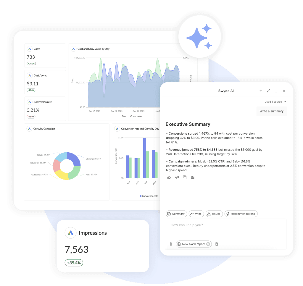
Some honest limits before you build a process on it. Swydo AI covers reports and dashboards but not templates. It can’t analyze across multiple reports at once. And the included 4,000 monthly credits work out to roughly 42 summaries at about 95 credits each, with no rollover, so a shop producing a hundred reports a month will hit that ceiling and need a spend cap for the overage.
The harder limit isn’t technical. A model reads what happened in the account. It doesn’t know the client’s competitor just closed a funding round, or that their new CMO has ninety days to prove something, or that the target moved during a call last Tuesday. Those facts are what decide which of eight true statements becomes the headline. That call stays yours, and it’s most of what the client is actually paying for.
The Morning Check Is the Real Bottleneck
Here’s the part nobody puts in a data storytelling article, and it’s the part that decides whether any of this survives contact with a real client roster.
One good story is easy to write. Forty of them, every month, across a roster that keeps growing? That’s an operations problem, and no amount of writing advice solves it.
Think about what the morning actually looks like when you’re running 5 clients, or 20, or 50. You open a tab per client. You check whether the dashboard even loaded. You scan for anything that moved. You try to remember which accounts had a goal attached and what the number was. You find out that a Meta connection expired eleven days ago and the last two reports went out with a hole in them. Then you do it again tomorrow.
That’s the job in Looker Studio. It’s the job in a folder of spreadsheets. It’s the job in most reporting tools, honestly, because they were built to produce documents rather than to watch accounts.
None of it is storytelling. All of it is the tax you pay before you’re allowed to start.
The Morning Check, Before and After
What it takes to know where to look today, across a roster of 20 clients.
Manual setup
Looker Studio, spreadsheets, or a document-first reporting tool
Open a dashboard tab per client and wait for each to load
Scan each one for anything that moved since yesterday
Recall from memory which accounts had targets, and what they were
Spot a broken connection only when a widget renders empty
Repeat tomorrow. And the day after.
Every morning, before any storytelling starts
Automated setup
Monitoring runs the check and tells you where to look
Metrics Overview shows six KPIs across every client on one screen
Goals hold each target as a live object marked On Track or Off Track
Alerts email or Slack you the moment a metric breaks its bounds
Data Health Check flags an expired connection before the report goes out
You open the tool already knowing which two accounts need you
Same routine at 5 clients or 50
The left column doesn’t scale. It just gets longer, until someone on the team quietly becomes the reporting person.
Four things collapse that morning into a single screen:
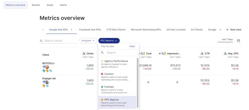
Metrics Overview puts up to six KPIs across every client in one view, with unlimited views and tabs so you can keep a paid view separate from an SEO one. One screen instead of twenty tabs. Search across clients, filter by label, and you know within thirty seconds where to look today.
Goals turn each client’s target into a live object rather than a number you retype monthly. Client, data source, metric, condition, value, period. Everything then shows On Track, Off Track, or Achieved, and you can copy a goal across accounts instead of rebuilding it forty times.
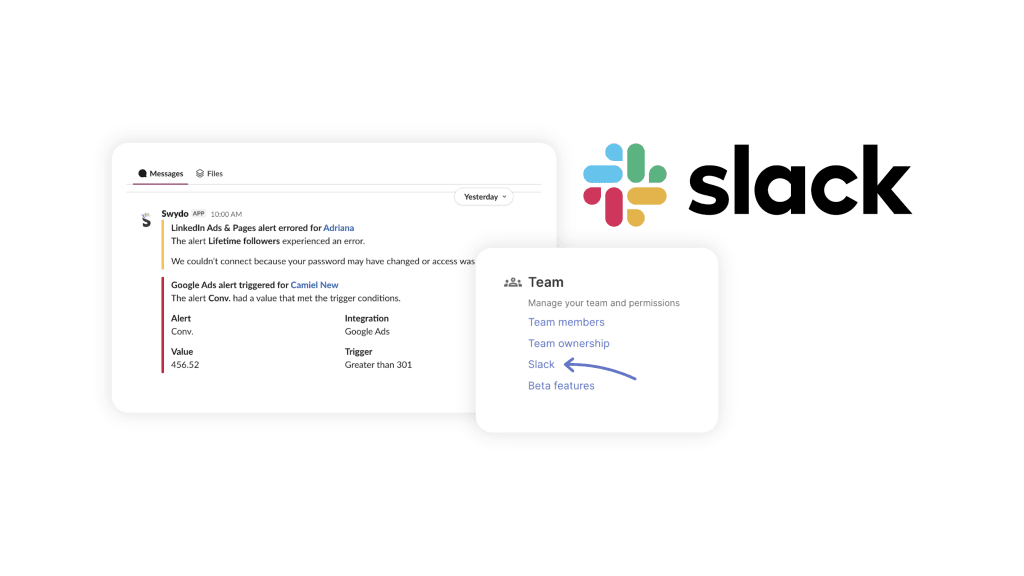
Alerts watch any metric on any client daily and email you when something breaks its bounds, with trigger windows of 1, 7, 30, or 90 days. Pause them on weekends if you’d rather not get Saturday pings. Route them into Slack so they land where your team already lives.
Data Health Check Alerts monitor every connection for expired tokens and permission changes, flag broken ones under Settings → Connections, and email the owner with a link to fix it. This is the one agencies underrate until the month it saves them. A story built on numbers from a source that silently stopped authorizing three weeks ago is worse than no story at all.
The compounding effect is what matters. Once the morning check runs itself, the thing you find on the 4th gets a three-sentence email on the 5th. What moved, why you think it moved, what you changed. Then the monthly report lands as a summary of stories your client already knows, which is a far easier document to defend than a surprise.
That’s also the honest difference between monitoring vs reporting. One tells you on the 4th. The other tells you on the 30th, when the client’s already noticed and drawn their own conclusion.
How to Choose the Setup That Fits Your Agency
Three ways agencies handle this. Each genuinely works at a certain size, and picking wrong costs you either money or Saturdays.
| Spreadsheets and slides | Looker Studio or DIY | Purpose-built agency platform | |
|---|---|---|---|
| Setup cost | Free | Free, plus connector fees | Subscription |
| Time per client per month | 3 to 6 hours | 1 to 2 hours after build | 15 to 30 minutes |
| Cross-client view | None | Build it yourself | Included |
| Broken data source | You find out from the client | You find out from the client | Alert before the send |
| Breaks down at | 3 to 5 clients | 10 to 15 clients | 50+ clients |
Stay on spreadsheets if you have fewer than five clients and reporting is a few hours a month. A subscription won’t pay for itself yet. Put the money into delivery instead.
Looker Studio makes sense if you have real technical capacity in-house, a small roster, and clients who want bespoke dashboards more than they want narrative. The build is genuinely good. Maintenance is what gets people, because every connector change and every new client means somebody rebuilds something.
Move to a purpose-built platform when the morning check starts eating a person. Usually somewhere between ten and twenty clients. The signal isn’t cost, it’s that someone on your team has become the reporting person by accident and stopped doing the work you hired them for.
Swydo’s flat rate covers unlimited users, clients, and reports, with 10 data sources included, so adding a teammate never costs extra and the bill moves with accounts rather than headcount. Worth checking against the best client reporting software options before you commit, since the right answer really does depend on roster size and channel mix.
Data Storytelling FAQ
Direct answers to the questions agencies actually ask about turning numbers into decisions
Data storytelling is the practice of pairing numbers with narrative so the audience knows what happened, why it happened, and what to do next. It combines three things: the data itself, visuals that make the pattern visible, and a written or spoken narrative that explains the meaning.
For an agency, it’s the difference between handing a client a set of facts and handing them a decision. Reporting leaves the interpreting to the client. Data storytelling does the interpreting for them, which is what they assumed they were paying for.
Because people act on meaning, not on numbers. A client who reads a chart and doesn’t know what it implies will either do nothing or invent their own conclusion, and the invented one is usually worse than the truth.
There’s a commercial reason too. Most agencies lose accounts they actually earned. The campaigns worked, the spend was efficient, but nobody wrote the sentence connecting that work to the client’s business. So the client filled the gap themselves, landed on the one metric that dipped, and started asking what other agencies charge.
Data, narrative, and visuals. Data is the factual base that keeps the story honest. Narrative explains what the numbers mean for the audience. Visuals make the pattern obvious without anyone reading a paragraph.
Drop any one and it stops working. Data plus visuals with no narrative is a dashboard. Narrative plus visuals with no data is a pitch deck. Data plus narrative with no visuals is an email people skim and forget.
Visualization shows the shape of the data. Data storytelling adds the interpretation and the recommendation on top of it.
A chart with sales down 20% is visualization. The story version says the drop began when a competitor launched, hit the premium segment hardest, and here’s the recovery plan with a date on it. Same chart. One of them produces a question, the other produces a decision.
Three skills, and only one of them is technical.
- Editing. Deciding what to cut. Harder than deciding what to include, and more valuable.
- Business translation. Turning a marketing metric into a number the client’s finance team recognizes.
- Chart literacy. Knowing which visual makes a given point obvious rather than decorative.
Most people who struggle with this aren’t bad at analysis. They’re reluctant to leave things out, because leaving things out feels like hiding work. It isn’t. A report that shows everything shows nothing.
Overloading the audience is the big one. Too many metrics with no hierarchy leaves the reader to work out what matters, and they won’t.
The rest, in rough order of how often they show up in agency reports:
- Leading with metrics before setting any context
- Reporting percentages without converting to money
- Showing a number with nothing to compare it against
- Burying bad news instead of opening with it
- Describing tactics in jargon the client can’t picture
- Ending on a result rather than a recommendation
Follow five beats in order: Context, Challenge, Action, Result, Next. Open with the goal the client gave you. Name the single biggest obstacle. Say what you did in plain words. Report the outcome in dollars. Close with a decision they can approve.
Order matters more than polish. Each beat sets up the next, which is why reports that open with a metrics grid feel disorienting. The client has nothing to hang the first number on, so they build their own frame, and it’s rarely the one you wanted.
Start with the client’s own goal in their own words, not with a metric. One sentence is enough.
That single line reframes everything after it. The client stops judging your work against a vague sense of whether marketing is working and starts judging it against the thing they told you they wanted. Go check your last report. Does the client’s stated objective appear anywhere on the first screen?
Four sentences: the goal, the headline result in dollars, the one thing that got in the way, and the decision you need from them. Nothing else.
An executive summary isn’t a shrunken version of the report. It’s the whole answer, written for someone who will read only that. Assume the reader stops after it, because most of them do. If your summary can’t stand alone as the complete story of the month, it isn’t a summary yet, it’s an introduction.
Five supporting metrics, three insights, one recommendation covers most monthly reports. Everything else moves to an appendix the client can open if they want it.
Use one test on every metric that survived: if this number rose 20% tomorrow, what would the client do differently? No answer means no paragraph. Completeness and comprehension work against each other past a certain page count, and comprehension is the one that renews the contract.
Convert the metric to money and give it something to sit next to. A number on its own is trivia. A number with a comparison point and a dollar figure is an argument.
Percentages are a currency clients have to convert in their heads, and most won’t bother. Do the math for them every time. It takes seconds and it changes whether the report gets read or forwarded with a question mark.
Close with scoped options and price tags, not with a summary. A report that ends in a number ends the conversation. A report that ends in a choice starts one.
| Option | Budget | What it tests |
|---|---|---|
| Quick win | $500 | An audience segment showing early traction |
| Strategic | $5,000 | Remarketing for abandoned carts |
| Big bet | $15,000 | A regional market a competitor just left |
Clients approve faster when somebody else did the scoping. They also rarely cancel while they’re curious about what comes next.
Use one test on every sentence: could you say this out loud to a smart friend who doesn’t work in marketing and have them get it first time? If not, rewrite it.
Not this: “We optimized bidding strategies and refined audience segmentation.” This: “We moved 40% of your Facebook budget into Google Shopping, where your competitors weren’t bidding as hard, and switched off three ad sets that were spending without converting.”
Jargon doesn’t read as expertise to a client. It reads as hedging, and it quietly trains them to skip your commentary.
First, plainly, at the top. “Leads dropped 22% in March. Here’s what happened and what we’ve already changed.”
Then give a cause rather than an alibi, show the fix you made the week you caught it, attach a date to the recovery, and state the lesson in one line. The order matters because each part answers the question the previous one raises.
The instinct is to lead with a win and tuck the problem onto page nine. They always scroll. And the damage was never the bad result, it’s the discovery that you tried to soften it. Bad news with a plan makes you the person handling the problem. Bad news delivered late makes you part of it.
Answer that metric directly before you widen the lens. Jumping straight to context reads as deflection, even when the context genuinely matters more.
Then reconnect it to the goal. “Sessions fell 12%. We cut the three campaigns driving that traffic because none of it converted, and cost per acquisition improved 31% as a result.” Clients fixate on single numbers because nobody handed them a hierarchy. Give them one and the fixation usually stops on its own.
Layer it. One document, three depths, and each reader stops where their job ends.
| Reader | What they want | Where they stop |
|---|---|---|
| Founder or CEO | Revenue, cost, and the decision | Executive summary |
| CMO or marketing lead | Channel performance and trade-offs | Channel breakdown |
| Specialist or analyst | Campaign and keyword detail | Appendix |
The mistake is averaging them into one middle-depth report that satisfies nobody. Too shallow for the specialist, too dense for the founder. Layering costs you nothing extra because the detail already exists, it just moves further down.
Explain it before the client finds it, and name one number as the source of truth up front. Usually that’s the CRM or the client’s revenue system, because it’s the one their finance team already trusts.
Platform numbers disagree for boring, legitimate reasons: different attribution windows, consent settings that block some tracking, modeled conversions filling gaps, and each platform crediting itself for the same sale. None of that is a mistake. All of it looks like one to a client who spots it unannounced.
Two sentences in your report (“Ad platforms will report higher conversions than your CRM because each credits itself. We use CRM revenue as the number of record”) prevents the meeting where you spend forty minutes defending arithmetic instead of discussing strategy.
Give them the metrics and keep the hierarchy. Add what they asked for to an appendix or a live dashboard, and leave the front page exactly as it was.
A request for more data is almost never about data. It’s about trust, or about a stakeholder upstream asking a question the client couldn’t answer. Ask which question they’re trying to answer. Nine times out of ten you can answer it in a sentence, and the request for fifteen more charts quietly disappears.
Because the report asks them to do work. Twenty pages of accurate charts with no interpretation is a research assignment, and your client already has a job.
They open it, scan for something alarming, find one dip, and close it. The fix isn’t a nicer template. It’s putting the answer on the first screen and moving everything else behind it. When a client can read four sentences and know whether the month went well, they read the four sentences. Some of them then keep going.
Both, for different jobs. The PDF carries the story, the dashboard carries the detail.
A PDF is a snapshot with a narrative attached, which makes it the right container for “here’s what happened last month and what I recommend.” A live dashboard is the right container for “check anything you want, whenever you want,” and it kills the ad-hoc email asking how last week went.
The common mistake is sending only a dashboard. A dashboard with no narrative puts the interpreting back on the client, which is the exact problem data storytelling exists to solve.
Monthly for the full story, always-on for the dashboard, and immediately for anything that changes a decision.
The monthly report is a poor container for urgent news. Something breaks on the 4th, you notice it building the deck on the 30th, the client reads about it on the 2nd. That’s a month between the event and the explanation, and in that window the client may well have noticed the drop themselves.
Weekly full reports are usually a mistake. They cost four times the effort and most weeks have no story in them. A three-sentence email the day something moves does the same job for a fraction of the work.
Short enough that the client reads all of it. For most retainers that’s one page of narrative plus a handful of supporting visuals, with detail available behind a link.
Length signals effort to the person writing it and signals homework to the person receiving it. Those are different experiences of the same document. If you’re worried a short report undersells your work, put the hours into the recommendation instead of the page count.
Pick the chart from the point you’re making, not from the data you have.
- Change over time goes in a line chart
- Comparison between things goes in a bar chart
- Parts of a whole goes in a stacked bar, rarely a pie
- A single headline number goes in a big number, not a chart at all
- Progress toward a target goes in a gauge or a bar with a target line
One rule covers most mistakes: if the reader has to study the chart to find the point, the chart is doing the wrong job. Annotate the insight directly on it and the study time drops to nothing.
AI can write the draft. It can’t decide which insight leads. That call depends on things that were never in the ad account.
A model doesn’t know the client’s competitor just closed a funding round, or that the new CMO has ninety days to prove something, or that the target moved during a call last week. Those facts decide which of eight true statements becomes the headline.
Practical split: let AI summarize, flag anomalies, and turn raw metrics into readable sentences. Keep the judgment about what matters. That judgment is most of what the client is paying you for.
Three jobs need covering: pulling the data automatically, catching changes as they happen, and writing the narrative next to the numbers.
One platform that handles all three beats four that each handle one. Not because bundling is better in principle, but because a story assembled across four disconnected tools quietly stops getting written around month three. The workflow fails, never the intention.
When someone on your team has become the reporting person by accident and stopped doing the work you hired them for. That usually happens between ten and twenty clients, and it happens quietly.
| Setup | Time per client per month | Breaks down at |
|---|---|---|
| Spreadsheets and slides | 3 to 6 hours | 3 to 5 clients |
| Looker Studio or DIY | 1 to 2 hours after build | 10 to 15 clients |
| Purpose-built agency platform | 15 to 30 minutes | 50+ clients |
Under five clients, stay where you are. A subscription won’t pay for itself yet and the money is better spent on delivery. Past that, what eats the hours is the daily check across every account, not the reports themselves.
Ten to fifteen minutes per client once the five beats are second nature. That assumes the data is already pulled and you spotted the story earlier in the month.
Most of the real cost was never the writing. It’s hunting for what happened, which is why agencies who catch changes as they occur write faster reports than agencies who go looking at month end.
Start With One Report
Pick one client. Not the roster. One.
Rewrite their next report using the five beats: open with the goal they gave you, name the single obstacle you dealt with, say what you did in plain words, translate the result into dollars, and finish with a decision they can approve. Ten minutes of writing on top of a report you were producing anyway.
Then do the second thing, because the first one doesn’t scale on its own. Set an alert on the one metric that would have changed your recommendation this month. Next month, that story reaches the client on the 5th instead of arriving as history on the 2nd.
That’s really the whole shift. Not better charts. Not more data. A shorter distance between something happening in the account and someone explaining it to the person paying for it.
Most agencies are sitting on months of wins nobody ever heard about.
So what would your last client report have looked like if you’d deleted every metric that didn’t change a decision, and spent that space explaining the three that did?