
As a marketing agency, you are in the business of understanding human behavior. You decipher consumer actions and respond with carefully designed campaigns. To do that effectively, you need a nuanced understanding of data. One very important distinction to consider is the difference between discrete and continuous data.
Discrete data is a number. Continuous data is an amount. Think of a glass of ice water. The number of ice cubes: discrete whole number. The water: amount that can be divided in numerous ways, including fractions and percentages.
In data analysis, discrete data counts specific actions, while continuous data shows dynamic patterns. They differ but also complement each other. Discrete data gives form and substance to continuous trends, while continuous data contextualizes discrete events. Together, they reveal much about your audience, enabling you to build more effective campaigns and generate impressive results.
For example, you analyze website traffic patterns and notice a steady rise in daily visitors over a month. This continuous data reveals a trend, but to understand its cause, you need discrete data. So you examine campaign click data to find the specific factor driving the increase. If you only look at click metrics, you can’t determine whether the rise is unusual or just normal activity. Continuous data gives you this context, showing the bigger performance picture and highlighting the importance of the discrete click data.
This guide explores the importance of the distinction between discrete and continuous data, and outlines effective ways for marketers to analyze, visualize, and leverage both types.
- Learn how to extract meaningful insights, create accessible visualizations, and put advanced analytics into practice.
- Understand how overlooking key data sources creates blind spots.
- Learn how to avoid misinterpreting this data to prevent inaccurate insights.
- Real-world examples show you how to translate your data into actionable, profit-driving strategies.
What is Discrete Data?
Discrete data consists of specific, countable values that are finite and often expressed as whole numbers. Examples include clicks, sales, and subscriptions. Each data point represents a clear, measurable action, allowing marketers to track individual actions and evaluate fluctuations over time.
Here are a few examples:
| Email marketing | |
| Metrics | Number of emails sent, open counts, clicks on CTA buttons, unsubscribes. |
| Why it’s useful | Helps identify how many people engage with email content, providing insights into subject line effectiveness and CTA performance. |
| Social media | |
| Metrics | Likes, shares, comments, follower count. |
| Why it’s useful | Each interaction serves as a discrete data point, making it easy to see how different types of content resonate with audiences. |
| Sales transactions | |
| Metrics | Total purchases, product returns, and user inquiries. |
| Why it’s useful | Every transaction is an individual, countable event. Discrete sales data points are crucial for sales performance analysis. |
| Website performance | |
| Metrics | Sessions, page views, bounce rate, conversions. |
| Why it’s useful | Exact counts of user sessions and conversions allow marketers to analyze which pages and campaigns drive the most actions. |
How to Visualize Discrete Data Using Charts
The right visuals make it easy to spot trends, find opportunities, and gauge campaign performance at a glance. While there are many ways to show discrete data, charts are a favorite for their simplicity in showing data and changes over time.
Bar Charts
Use bar charts to quickly compare metrics and easily assess performance across campaigns or segments.
For example, bar charts can show click-through rates across social media channels or ads, making it clear which ones perform best.
Pie Charts
Pie charts are useful for showing the breakdown of audience segments, traffic sources, or demographics, like age or gender, to ensure campaigns reach the right people.
A pie chart might show the percentage of website visitors from different referral sources like social media, email, paid ads, or organic search. This detailed breakdown helps you identify which channels contribute most to website traffic or conversions, enabling more effective budget targeting and strategy adjustments.
Column Charts
Like bar charts, column charts work well for tracking discrete metrics over time, such as monthly lead generation from email campaigns. They help marketers spot spikes or dips and link trends to specific events or strategies.
For example, a surge in leads during a particular month could reflect a limited-time offer, allowing marketers to evaluate campaign impact and plan future promotions effectively.
What is Continuous Data?
Continuous data can assume any value within a range, including fractions and decimals. This allows precise measurement, limited only by available tools. Examples include time spent on a website, customer engagement scores, and advertising spend. Continuous data captures gradual changes and trends, providing a nuanced understanding of behavior and performance.
| Session duration | |
| Metrics | Time spent on the website. |
| Why it’s useful | Measuring session duration helps understand engagement levels and the quality of traffic from different sources. |
| Conversion rates | |
| Metrics | Percentage of users who take desired actions (e.g., signing up, purchasing). |
| Why it’s useful | Continuous monitoring of conversion rates allows for performance adjustments across multiple campaigns. |
| Revenue metrics | |
| Metrics | Customer lifetime value (CLV), average order value (AOV). |
| Why it’s useful | Agencies can use these metrics to help clients plan retention strategies, identify high-value customers, and refine ad spend. |
| Advertising performance | |
| Metrics | Cost per click (CPC), return on ad spend (ROAS). |
| Why it’s useful | Continuous data helps track ad performance over time, allowing real-time budget adjustments based on CPC and ROAS. |
Best Visualization Techniques for Continuous Data
Strategic visualization of continuous data reveals critical performance patterns. Map time-series data against key business metrics to identify actionable growth opportunities and optimization points.
Take a closer look at compelling visualization practices for continuous data:
Line Charts
Line charts are ideal for revealing continuous data patterns, particularly for metrics like revenue growth and engagement rates over time. You can connect data points over time, creating a visual trajectory highlighting upward, downward, or flat trends.
Line charts help businesses visualize revenue growth trends, including month-to-month, day-to-day, or year-to-year fluctuations and patterns. With the ability to compare multiple lines on one graph, this chart type also makes it easy to view various metrics side by side to find correlations between revenue growth and promotions or new product launches.
Histograms
Histograms are valuable for visualizing the distribution of continuous data, showing how often data points fall within defined ranges or intervals. Such graphs can reveal patterns like spending, session durations, or frequency of user logins, helping teams identify common behaviors and worrying performance signals.
When displaying user engagement over various time ranges (like time spent on a site), histograms can show whether most users engage for shorter or longer periods, which helps develop targeted strategies. Unlike bar charts that compare specific categories, histograms reveal data distribution across a continuous range.
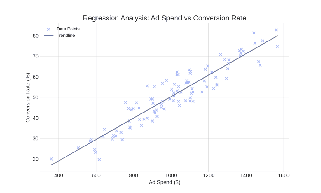
Scatter Plots
Scatter plots are great for highlighting relationships or correlations between two continuous variables. By plotting one metric along the X-axis and another along the Y-axis, scatter plots reveal patterns – correlations, clusters, or outliers.
Here’s an example: using a scatter plot, the agency can analyze the relationship between ad spend and conversion rate. Each point on the plot represents a specific campaign, making it easy to spot patterns. If the points show a trend where higher ad spend aligns with higher conversions, the agency gains valuable insights into how effectively investments drive results to their clients.
Is Your Metric Discrete or Continuous?
Answer the questions below to find out if your metric is discrete or continuous.
1. Can you count individual instances or events (e.g., clicks, purchases)?
Discrete vs. Continuous Data: Key Insights for Marketers
Understanding the distinction between discrete and continuous data is essential for data-driven decisions. Data insights enhance audience targeting, shape marketing plans, and improve campaign performance.
How It Impacts Decision-Making
Both discrete and continuous data influence decision making. Discrete data, such as email opens or responses, signifies countable actions. On the other hand, continuous data, like internet traffic over a period, changes fluidly. It’s also measurable on scales, which makes it helpful in tracking trends and patterns. Observing metrics such as daily visits or average session length can show how viewers engage with content and highlight periods of high engagement.
To show how discrete and continuous data drive marketing decisions, consider a PR agency; to promote a blog article, they experimented with email content, sending out both article teasers and article spoilers.
- Continuous Data Insights:
- They observed a significant traffic increase, and they noted that spoiler emails directly correlated with higher website traffic.
- They measured session duration, and they found that spoiler emails led to longer engagement periods.
- Conversely, teaser emails resulted in reduced traffic and shorter session times.
- Discrete Data Insights:
- They counted individual link clicks, and they determined that spoiler emails generated a higher click-through rate.
- They tracked website arrivals, and they established a direct link between spoiler email clicks and website visits.
- They tallied newsletter sign-ups, and they discovered that spoiler emails produced a greater number of subscriptions.
Continuous data showed that traffic surged, while discrete data revealed why. The PR company made a strategic decision; they prioritized the spoiler email strategy, because discrete and continuous data validated it. They achieved campaign success.
When to Apply Discrete or Continuous Data
We’ve looked into widely used approaches to choose the most suitable data type in each case. Each data type has its own strengths and can offer unique perspectives to optimize your client’s campaign performance.
| Scenario | Best Data Type | Reason |
|---|---|---|
| Monthly Campaign Click Counts | Discrete | Gives exact counts for actions and individual responses |
| Yearly Revenue Trends | Continuous | Shows long-term growth patterns and changes |
| Email Open Rates | Discrete | Tracks specific actions to assess email appeal |
| Session Duration on Landing Pages | Continuous | Indicates user engagement and page effectiveness |
| Product Returns per Month | Discrete | Counts return items, helping to spot product issues |
| PPC Ad Performance | Continuous | Tracks cost per click (CPC) and return on ad spend (ROAS) |
| New Customer Sign-Ups | Discrete | Tracks exact counts for growth in user base |
How to Combine Discrete and Continuous Data
The key to effective marketing campaigns is combining discrete and continuous data to understand customer behavior holistically. Mixing the two data types manually is possible but challenging. The right tools can make the process much simpler and more efficient.
Reliable tools and methods for correctly analyzing and visualizing this data help marketers avoid inaccurate insights and misguided campaign decisions.
| Practice | Discrete Data | Continuous Data | Outcome |
|---|---|---|---|
| Email Campaign Analysis | Open and click counts | Time spent reading email | Enhanced email subject line and CTA |
| Website Optimization | Page views, conversions | Session duration, scroll depth | Improved layout for user engagement |
| Social Media Strategy | Likes, shares, comments | Engagement rate over time | Targeted content creation based on popular formats |
| Ad Campaign Performance | Click-through rates, conversion counts | Cost per click (CPC), ROAS | Budget adjustments for better ROI |
| Customer Journey Mapping | Clicks on CTA at each funnel stage | Time spent at each stage | Improved funnel flow and engagement |
| Product Sales Analysis | Units sold, refund counts | Average revenue per unit, sales growth rate | Sales strategy refinement |
| Content Performance Monitoring | Shares, clicks | Average time on page, bounce rate | Content adjustments for higher engagement |
| Customer Retention Strategy | Repeat purchases, churn rate | Customer lifetime value (CLV) | Retention-focused campaigns |
| A/B Testing for CTAs | Conversion counts for each variant | Average time to conversion | Best-performing CTA based on conversion speed |
| SEO Traffic Analysis | Organic clicks, bounce rate | Session duration, pages per session | Enhanced content for better retention |
Refine User Experience with Discrete and Continuous Data
Your agency can improve user experience by combining discrete data like demographics, device type, and location with continuous metrics like session duration, bounce rate, and scroll depth.
We all have used an online travel booking platform. And there’s one aiming to improve user experience by making destination suggestions more relevant and personalized. The platform identifies key user traits with discrete data, such as users’ age groups, previous destination categories (e.g., beach, adventure, city break), and booking preferences (single, family, couple).
Meanwhile, continuous data, such as time spent browsing specific destination pages, average scroll depth, and the frequency of return visits, sheds light on real-time interest and engagement.
Data analysis shows, for example, that users in their late 20s and early 30s spend considerably more time looking at adventure travel pages than any other category. The platform can identify that adventure travel resonates strongly with this age group by cross-referencing this continuous engagement data with discrete demographic data. This insight could help the platform to showcase more adventure-related recommendations and discounts to these users in future visits.
Continuous feedback loops between discrete and continuous data further refine the experience. Suppose a returning user previously engaged with “weekend city breaks” but spends more time exploring “beach vacations” on their latest visit. The dynamically adjusting platform can prioritize beach-related destinations in real time.
Based on known preferences and current browsing behavior, such fast-acting personalization offers users content that aligns with their interests, providing a better user experience and improving conversion rates.
Improving Content Marketing Strategy
Discrete and continuous data provide a holistic view of what content resonates with different segments of an audience. Discrete data points, like content format, user interests, and acquisition channels, when analyzed with continuous metrics like click-through rate (CTR) and time-on-page, allow marketers to identify patterns.
For instance, a blog post covering beginner-level tutorials (discrete data) might have a high CTR but low time on page (continuous data). This could indicate a mismatch between content complexity and audience expectations. Marketers can then adjust the content’s depth and tone to align with user interests, improving engagement and the value the content provides.
This combination also benefits social media strategies. Marketers can examine discrete data (post types, hashtags) along with continuous engagement metrics (impressions, shares, likes over time).
Conversion Optimization
The combination of discrete and continuous data offers valuable insights for enhancing conversion paths.
Analyze discrete data (e.g., ad type, landing page category) and continuous data (e.g., average time to conversion, clickstream analysis) to optimize how website visitors become customers.
For instance, if a specific ad format (discrete data) leads to higher average conversion rates (continuous data), marketers can allocate more budget to that ad type, optimizing ad spend.
A/B testing also benefits from this data combination. Marketers can examine which call to action (CTA) leads to longer website visits or faster conversions. This refines conversion elements based on proven patterns, making optimizations data-driven and user-centric.
Best Application Discrete vs. Continuous Data in Marketing
Discrete Data
- Click counts on ads or CTAs
- Conversions from specific campaigns
- Counts of user actions (e.g., purchases)
- Newsletter sign-up counts
- New customer acquisitions per campaign
- Social media interactions (likes, comments, shares)
- Downloads of gated content or resources
- Return counts on products or services
- Lead form submissions on landing pages
- Website traffic from each referral source
Continuous Data
- Session duration over time
- Conversion rates across months
- Revenue growth trends
- Customer lifetime value (CLV)
- Average order value (AOV)
- Time spent on individual web pages
- Average daily engagement on social media posts
- Click-through rates (CTR) for email campaigns
- Cost per click (CPC) for PPC campaigns
- Monthly website traffic trends
- Ad spend over a campaign duration
- Churn rate changes over time
Use discrete data for specific actions, and continuous data for trends and patterns.
The Challenges and Solutions of Integrating Data from Merged Sources
Integrating discrete and continuous data from various platforms could be a complex task. The wide range of data sources, from website analytics and social media to CRM systems and email marketing tools, creates various challenges – from data incompatibility and siloed information to resource demands.
Data Siloing Across Platforms
Data silos split important information between among platforms. Using a single data warehouse can eliminate duplication and enable comprehensive analysis across multiple channels. For example, Google Analytics might track user interaction metrics, while a customer CRM system contains detailed customer profiles and purchase history. Without the right tool, this knowledge remains divided, preventing marketers from drawing valuable insights.
When different departments rely on different data sources, isolated data can lead to repeated work and mismatched targeting. Overcoming this problem requires a unified strategy to standardize data collection, ensuring every data point contributes to a complete view of the marketing approach.
Data Compatibility and Inconsistent Metrics
Every platform organizes and labels data differently, which can create compatibility issues when merging data from multiple sources. For example, Facebook tracks engagement, while Google Analytics measures interactions. While these terms refer to similar actions, they come with different metrics.
These inconsistencies in metrics and definitions can lead to confusion and make data alignment difficult. To avoid this, marketers need standardized measurements to build an accurate representation of their data. This means unifying Key Performance Indicators (KPIs) and keeping platform metrics consistent.
Data Integration Requires Significant Resources and Time
Combining data from different platforms can consume significant time and resources, especially when manual data processing is required. Without automation tools or experience with large datasets, teams may spend countless hours exporting, cleaning, and aligning the data.
Complex data environments require robust engineering solutions. Implement automated ETL (Extract, Transform, Load) processes to handle large-scale data integration efficiently. These tools automate data blending from multiple sources, minimizing the need for manual tasks.
Data Visualization and Integration Tools
Choose the right tools for visualizing and integrating discrete and continuous data to extract actionable insights and improve your workflow efficiency. Many platforms provide powerful tools to analyze, visualize, and integrate data from different sources. What are the key tools marketing agencies rely on for success?
Google Analytics
- Real-time data tracking monitors the activities happening on a website as they occur. This is quite beneficial, especially for live events or when launching campaigns.
- Tracking specific goals allows users to define particular actions as objectives, such as purchasing items, filling in forms, or viewing pages. Users can view and quantify those actions over time.
- The segmentation capability helps users segment data based on factors like device type, geographic location, and user demographics. This aids in comprehending particular groups of users.
Looker Studio (formerly Google Data Studio)
- Looker Studio’s data blending combines multiple data sources into a single chart or table without setting up a database, making it easier to draw insights across campaigns and platforms.
- Customizable templates enable users to build basic dashboards quickly with pre-set designs.
- Extensive customization options allow for integrating and visualizing various data types, creating interactive dashboards by blending data from Google platforms and third-party sources.
Swydo
Swydo is a powerful tool for client reporting. It lets you create automatic marketing reports that highlight social media performance, both paid and organic. This includes tracking PPC return on investment and providing live dashboards with smooth integrations.
- Swydo designs its features specifically for marketing agencies. It focuses on efficient and simple reporting, and it requires less effort to start using than other tools.
- Direct integration with major advertising and analytics platforms makes data pulling seamless and reporting unified. Also includes combining data sources.
- The intuitive drag-and-drop interface allows for quick creation and personalization of client reports. It also enables timely scheduling of reports, which come with widgets tailored to key performance indicators (KPIs) and customizable branding.
- Automatic report scheduling can send updates to clients weekly or monthly with no manual work, saving time for busy agencies.
- The custom reporting feature allows users to pull data from diverse sources, including Google Analytics 4, Facebook Ads, Salesforce, and Google Sheets. It combines this data into a single, cohesive report.
- Automation features reduce the manual workload, freeing up resources for strategic analysis.
Power BI
- Advanced data visualization options and deep analytics capabilities make it a strong tool for agencies needing more complex analysis.
- Excellent customization and interactivity options enable users to create highly tailored, dynamic reports.
- Teams needing fast, user-friendly solutions may face difficulties with the steep learning curve and time-consuming setup. Complex data modeling often requires a good knowledge of DAX (Data Analysis Expressions).
Customer Data Platforms (CDPs)
- Designed especially for bringing together data from different areas to create a single profile, tools such as Segment and Adobe Experience Platform help provide one clear view of the customer.
- When set up correctly, these platforms let you automatically integrate both discrete and ongoing data throughout the customer journey, from their first contact until they become a client.
Select tools based on your agency’s requirements, technical expertise, and the complexity of your data sources. Tools like Swydo and Looker Studio are excellent for agencies that value user-friendly design, fast setup, and automated reports. On the other hand, programs like Power BI offer more advanced features but require a higher level of technical expertise.
These data visualization and integration tools are powerful. They help you merge separate and ongoing data, providing important insights. They also create compelling reports that can lead to better outcomes for your clients.
Best Practices for Data Integration
A strong data strategy with clear goals and key performance indicators is crucial for aligning your entire marketing agency. However, this requires continuous work. Whether you’re already working on a unified data platform or just searching for the best way to combine discrete and continuous data, here are a few tips on how to make data integration a simpler task:
Standardizing Data Fields
Minimize compatibility issues by defining standard metrics and aligning discrete and continuous data categories across platforms. Create a uniform data dictionary to label and format fields, enabling your platforms to recognize and accurately combine data.
Here’s an example of how simple data can become complicated when used by different people in your marketing agency:
| Values in different formats | Standardized data | |
|---|---|---|
| Dates | Dates in various documents, ex.: 01/01/2024 – 01/01/2025, 2024/01/01 – 2025/01/01, 01.01.24 – 01.01.25 | ISO 8601 format: YYYY/MM/DD |
| Measurement units | Different weight formats, ex.: 10 pounds, 12 oz, 54.10kg | Standard: kg |
Establish Data Governance
Setting clear rules for data access, accuracy, and privacy helps reduce the risks of combining data from different sources. Giving specific people responsibility for each data type and putting checks in place to confirm accuracy make the data more trustworthy and secure. These actions make tracking and managing data easier, ensuring it stays practical and protected over time.
Automate the Processes
To cut down manual work, speed up data integration, and decrease errors, use automation to extract and analyze data. Utilize tools such as Swydo or Looker Studio to establish automatic processes for integrating and combining different data sets. This ensures your reports always remain current with minimal effort.
Advanced Techniques for Data Analysis
Analyzing data is not just about monitoring basic metrics. It provides additional insights that help marketing companies make smart decisions. Using statistical techniques uncovers deeper trends that boost return on investment and help ensure campaign success. Techniques such as regression analysis, correlation analysis, and predictive modeling help marketers identify connections between different data types. They also help them spot key factors driving performance and predict future results.
Regression Analysis
Use regression analysis to quantify the impact of specific variables on marketing outcomes. Predict how budget adjustments will affect conversion rates and optimize resource allocation. It can look at how ad spending as a continuous variable affects sales conversions as a discrete outcome, showing how changes in budget might impact conversion rates.
Regression models examine past data, helping predict future performance more accurately allowing marketers to adjust budgets, plan resources, and refine marketing tactics based on clear insights. This approach also helps identify when extra spending may have less impact, guiding agency teams to shift resources where they’ll be most effective.
Correlation Analysis
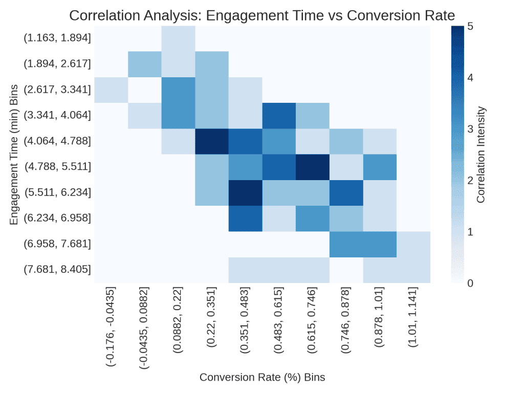
Correlation analysis looks for links between different metrics, helping to understand how one might influence the other. For example, if user engagement (like time spent on a site) and conversion rate (how many users make a purchase or sign up) are closely connected, then improving engagement could also increase conversions. Identify these correlations to adapt strategies and strengthen performance across multiple channels.
Predictive Modeling
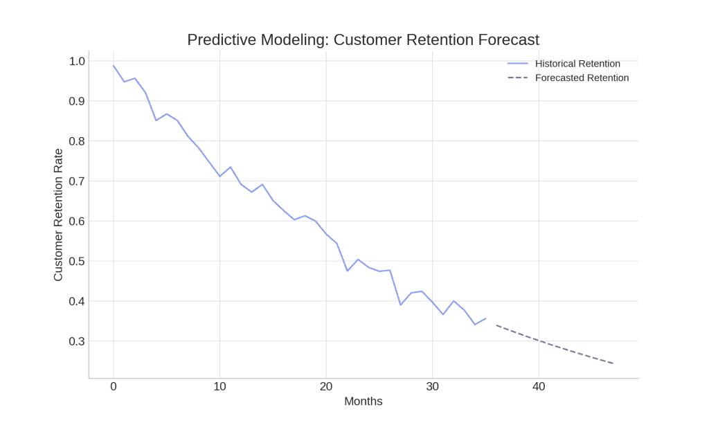
Use predictive modeling with past and current data to make educated guesses about future trends. Often equipped with AI or advanced software, marketers analyze patterns in data, forecasting outcomes like revenue growth, increase in website traffic, or user churn.
This kind of modeling turns raw data into practical insights and allows agencies to approach forecasted changes proactively. For example, if a model predicts a drop in customer retention, agencies can proactively adjust their strategies to improve the customer experience and reduce churn.
Common Challenges When Using Discrete and Continuous Data
Discrete and continuous data provide excellent insights. However, errors with these types of data can lead to false outcomes, so it is crucial to understand the potential issues. Mistakes while handling them may lead to inaccurate results and ethical issues.
Here are the most common difficulties you may encounter when mixing discrete and continuous data:
- Misinterpretation issues. Confusing discrete and continuous data results in incorrect analysis and misguided strategies. For example, if a marketing firm averages discrete data like event registrations from different promotions, it might obscure which specific promotion had the highest engagement. If the agency misses this, it may fail to recognize and prioritize the most successful type of campaign, which can reduce the overall effectiveness of their marketing approach.
- Rounding and estimation problems. Continuous data often requires precision, and errors in rounding can distort perceptions. For instance, rounding the average time on a webpage might make content appear less engaging than it actually is, leading to misguided strategies.
- Ethical concerns. Manipulating data and introducing bias can compromise ethical standards. Selectively presenting data or adjusting continuous metrics to show inflated success rates can mislead stakeholders, creating an inaccurate picture.
Knowing about these hurdles allows marketing agencies to circumvent common pitfalls and make informed and advantageous data-based decisions.
Conclusion
Combine discrete and continuous data to enhance campaign effectiveness, identify patterns, optimize strategies, and improve ROI across organic and paid channels.
Automatic reporting workflows and improve decision-making with strategic tool integration. Link Swydo to main data sources for real-time dashboard updates and automatic client reporting, while using advanced methods such as regression and predictive modeling on a platform like Python to Tableau for deeper insights. This integrated approach empowers your marketing agency to deliver highly targeted, data-driven outcomes for clients.
Discrete vs Continuous Data FAQ
Quick answers to common questions about data types for marketing analytics
Discrete data consists of exact, countable values that can only take specific values (usually whole numbers). It represents distinct, separate points with no values in between. Think of it as counting objects: you can have 1, 2, or 3 sales, but never 2.5 sales. Discrete data answers the question “how many?” and typically involves counting occurrences or events.
Continuous data can take any value within a range, including decimals and fractions. It’s measured rather than counted and can be divided into smaller and smaller units. Examples include time, height, temperature, or percentages. Continuous data answers “how much?” and is used to measure quantities that exist on a scale with infinite possible values between any two points.
The key difference is that discrete data can only take specific, separate values (like counting integers), while continuous data can take any value within a range. Think of a glass with ice and water: the number of ice cubes is discrete data (you can have 5 or 6 cubes, but never 5.5), while the amount of water is continuous data (you can have 8oz, 8.1oz, 8.15oz, and so on). Discrete data is counted; continuous data is measured.
Ask yourself these questions: Can I count it in whole numbers? Does it represent specific events or occurrences? Can it only take certain values? If yes, it’s likely discrete. If the data can be measured on a scale, includes decimal values, or represents measurements where you could theoretically have infinite values between points, it’s continuous. Discrete data includes counts like subscribers or purchases; continuous data includes measurements like time, rates, or percentages.
Common discrete data examples in marketing include: email opens, social media likes/shares/comments, website visits/sessions, ad clicks, form submissions, product purchases, downloads, newsletter sign-ups, video views, phone calls, unsubscribes, survey responses, customer complaints, referrals, and coupon redemptions. These are all countable events that occur in whole numbers—you never have 3.7 email opens or 2.5 product purchases.
Common continuous data examples in marketing include: time spent on site, conversion rates, cost per click (CPC), customer lifetime value (CLV), average order value (AOV), revenue growth rates, load time, bounce rate, scroll depth, engagement scores, ROI, market share percentage, customer satisfaction scores, Net Promoter Score (NPS), and age demographics. These can all take any value within a range, including decimals.
No, data cannot be both discrete and continuous simultaneously—it’s one or the other. However, the same variable can be represented as either type depending on how it’s measured. For example, time can be continuous (exactly 3.45 minutes) or discrete (3 minutes). Similarly, purchases can be viewed as discrete counts (5 sales) or transformed into continuous data like average daily sales (4.7 sales per day). The distinction matters because it affects how you analyze and visualize the data.
Conversion rate is continuous data. Although it’s calculated from discrete values (number of conversions divided by number of visitors), the result is a percentage that can take any value within a range. A conversion rate can be 3.75% or 3.76%—there are infinite possible values. This is why conversion rates are typically visualized using line charts rather than bar charts, and why statistical methods for continuous data should be applied when analyzing conversion rate trends.
Website visitors are discrete data. You count the exact number of individuals who visited your site—10, 345, or 1,027 visitors. You can’t have 345.5 visitors. However, if you’re looking at visitors per hour or the rate of traffic growth, those derived metrics would be continuous data since they can take any value, including fractions. Always consider whether you’re counting complete occurrences (discrete) or measuring values on a continuous scale.
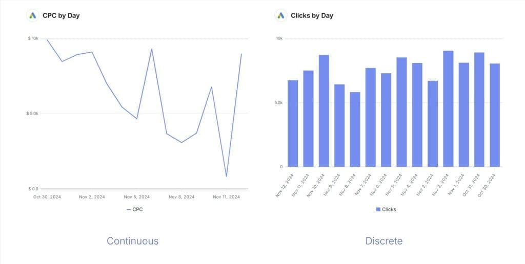
The best charts for discrete data are bar charts, column charts, and pie charts. Bar charts work well for comparing categories (like clicks by channel), pie charts show proportions of a whole (like traffic sources), and column charts track discrete values over time (like monthly lead counts). Other effective options include dot plots, bubble charts, and stacked bar charts. These visualization types emphasize the distinct, countable nature of discrete data points.
The best charts for continuous data are line charts, histograms, scatter plots, and area charts. Line charts excel at showing trends over time (like revenue growth). Histograms display value distribution (like session duration frequencies). Scatter plots reveal relationships between two variables (like ad spend vs. conversion rate). Area charts highlight cumulative values or parts of a whole changing over time. These visualizations effectively represent the flowing, measured nature of continuous data.
Yes, combination charts are perfect for visualizing both data types together. The most common approach is a bar-line chart, where bars represent discrete data (like monthly sales counts) and a line shows continuous data (like average order value or conversion rate). This powerful technique reveals both specific outcomes and underlying trends in one visualization. Dashboard tools like Looker Studio and Tableau make creating these combination visualizations straightforward.
The most common mistake is using line charts for discrete data. Line charts imply continuous movement between data points, suggesting values exist between the measured points. For discrete data like monthly sale counts, this creates a misleading impression that fractional values exist between the whole numbers. Use column or bar charts instead, which properly represent the distinct nature of discrete data. Another mistake is using a pie chart for continuous data ranges, which doesn’t make conceptual sense.
Understanding this distinction helps marketers choose the right analysis methods and visualizations, preventing misleading insights. Discrete data shows specific actions customers take, while continuous data reveals patterns and trends. Together, they provide a complete picture of customer behavior. For example, knowing your email campaign generated 153 clicks (discrete) is useful, but understanding the click-through rate was 3.2% (continuous) provides context and comparison. This knowledge leads to more effective marketing strategies and better reporting.
Neither is better—they work together. Discrete data (like conversion counts) tells you what happened, while continuous data (like conversion rates over time) explains patterns and context. For complete campaign analysis, track discrete metrics to measure specific outcomes and continuous metrics to understand performance trends. For example, 57 form submissions (discrete) tells you the volume of response, while a 4.8% conversion rate (continuous) lets you compare efficiency across different campaigns regardless of traffic volume.
Match discrete events with continuous metrics to uncover deeper insights. For example, analyze which email campaign (discrete) generated the highest engagement time (continuous), or which landing page design (discrete) yielded the best conversion rate (continuous). This cross-analysis reveals not just what happened but why it happened. Tools like Google Analytics, Looker Studio, and Swydo can help blend these data types, allowing you to create dashboards that show both the count of actions and the performance metrics in a unified view.
Google Analytics handles both types for basic marketing needs. For more advanced analysis, Looker Studio excels at data blending, Swydo specializes in agency reporting (saving agencies significant time on reporting tasks), and Power BI offers complex analytics capabilities. Customer Data Platforms like Segment help unify both data types across the customer journey. Choose tools based on your team’s technical expertise, reporting needs, and the complexity of your data sources. The ideal solution connects discrete actions with continuous performance metrics.
Common mistakes include averaging discrete data (like calculating the average number of purchases), applying the wrong visualization (like using line charts for discrete counts), analyzing one type in isolation, and confusing counts (discrete) with rates (continuous). Also problematic is rounding continuous data too aggressively, which loses important detail, or treating rounded continuous data as if it were discrete. Always remember that discrete data shows specific actions, continuous data reveals patterns, and you need both for complete insights.
Agencies using Swydo report saving an average of 10 hours per week on reporting tasks
Get Started TODAY