
Great marketing campaigns deserve great reporting. But let’s face it – proving ROI to clients isn’t always easy. Even when your campaigns hit record numbers, showing their true value can feel impossible.
The solution? Smart Key Performance Indicators (KPIs). Not random metrics that look good on paper, but numbers that show real business impact. This guide will show you how to pick the right KPIs and present them in ways that make clients take notice.
You’ll learn to:
- Choose KPIs that directly connect to client goals
- Build reports that clearly show your value
- Turn campaign data into actionable insights
Let’s make your reporting work as hard as your campaigns do.
What Are KPIs and Why Do They Matter
KPIs are specific, measurable values that show how well your agency meets key business goals for your clients. They work like a compass, keeping your campaigns and plans on track toward your client’s most important targets.
While basic metrics merely track numbers, KPIs provide valuable context, indicating if you’re making genuine progress in areas directly impacting client profits. While numbers like ad views or social media likes can help, they don’t always lead to business results by themselves.
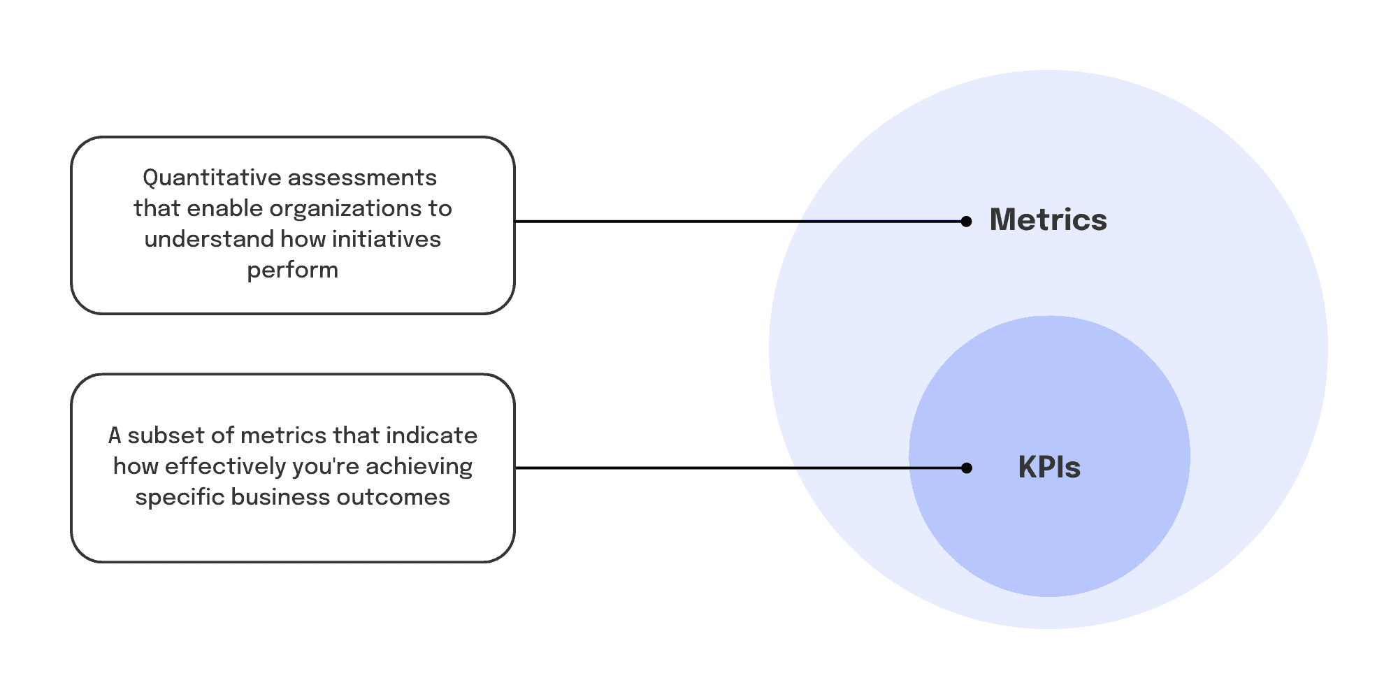
KPIs connect marketing and advertising work directly to real outcomes like leads created, sales rates, customer costs, or revenue growth. Focus your reports on these key numbers to clearly show the real value and return your agency brings.
Some common marketing KPIs include:
- Cost Per Lead (CPL)
- Customer Lifetime Value (CLV)
- Return on Ad Spend (ROAS)
- Online Store Sales Rate
- Growth in Search Traffic
In the end, KPIs link your daily marketing tasks to the big results your clients care about. They let you measure your impact and use data to keep making things better. Without clear KPIs, you can get lost in too many numbers and lose focus on what really drives results.
The Benefits of Tracking the Right KPIs
Good KPIs give you a powerful tool to make the most of your client’s marketing budget and resources. Here are some game-changing benefits you’ll see when you put KPIs at the center of your agency’s work:
Sharp Focus on What Really Counts
With so many parts in a digital marketing campaign, it’s easy to get caught up in endless data points. Trying to track and report every single number isn’t just time-consuming – it makes it harder to see what really matters.
When you have a clear set of KPIs, you focus on numbers that truly show success. You can put your effort into what will move the needle for your client in ways you can measure. No more wasting time on surface-level metrics that don’t help their bottom line.
A Shared Way to Talk About Success
One of the biggest challenges between agencies and clients is making sure everyone agrees on what success looks like. Clients might come in with their own ideas or unrealistic hopes about what they want to achieve.
Having KPIs that everyone agrees on from the start lets you set clear, realistic targets and get everyone on board with the same definition of success. Instead of unclear goals like “get more brand awareness,” you can create specific, measurable targets to work toward together.
KPIs also give you a common way to talk about how campaigns are doing, so there’s no room for confusion. You can point to real numbers and clearly state goals like “this is the cost per sale we want” or “this is how much we want to grow search traffic” to keep everyone aligned.
Quick Problem Detection
KPIs aren’t just for looking back at past results. When you track them regularly, they act as an early warning system for potential issues or drops in performance.
Let’s say you have a KPI for how many leads turn into customers. If you notice that number starting to drop, it’s a clear warning sign that something’s off in your marketing funnel. You can find and fix the problem before it becomes serious.
The same goes for good trends – if a KPI is doing better than expected, look deeper to understand what’s working and do more of it. KPIs help you spot and fix issues quickly instead of waiting for problems to grow.
Building Trust Through Data
Your clients hire you for results – they want to know their marketing money is being spent well. When you can point to steady progress and better numbers in your main KPIs, you prove your value as an agency partner.
When you back up your reports and suggestions with real data, clients trust your expertise more. They can see the actual results of your work, which makes them more confident in your skills. No more vague progress updates or questionable surface-level numbers.
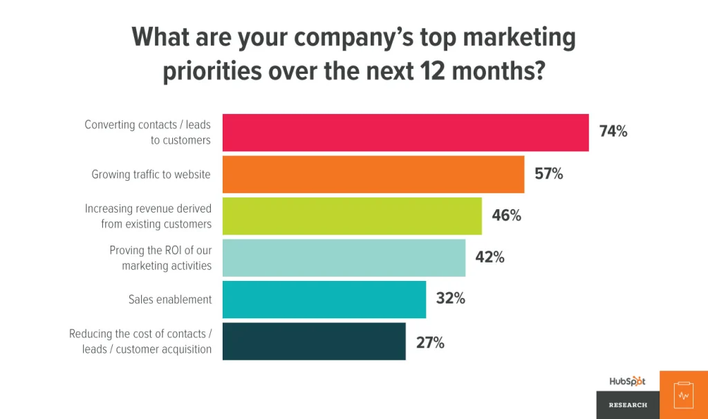
Focusing on KPIs also helps you connect your work more closely to your client’s sales and revenue, which they always care about. HubSpot found that 74% of companies say turning leads into customers is their top marketing goal. Show clear links between your campaigns and their key business goals to become their go-to partner.
How to Pick the Right KPIs for Your Agency and Clients
Now that you understand how KPIs help, you probably want to start tracking them. But it’s important to be careful about which KPIs you choose. Not all numbers matter equally, and focusing on the wrong ones can throw you off track.
Start with Your Client’s Main Business Goals
The best KPIs connect directly to what your client wants most. Find out what results they care about most. Is it getting more leads? Making more online sales? Keeping customers longer?
Your KPIs should be like checkpoints on the way to those big goals. If a number doesn’t help track progress toward those main goals, it’s probably not KPI material.
Take a B2B software company that mainly wants more product demo sign-ups. Some good KPIs might be:
- Marketing Qualified Leads (MQLs) created
- How many MQLs book demos
- Cost per MQL by marketing channel
- Average lead quality score
On the other hand, numbers like total website visits or social media views might be less important as KPIs, since they don’t directly show progress toward getting demo sign-ups. They can still be useful background metrics, but shouldn’t be your main focus.
Look at the Full Customer Path
Think about the different steps in your client’s sales process or customer path. Track KPIs that show you how your marketing affects each important touchpoint.
The basic marketing process has four main steps:
- Awareness – Getting potential customers to know about your client’s brand/products. Examples of KPIs: views, ad reach, brand searches, website visits.
- Consideration – Making prospects think about your client’s product as a solution to their needs. Examples of KPIs: email opens, content downloads, product page visits, demo requests.
- Sales – Turning good leads into paying customers. Examples of KPIs: sales rate, cost to get a customer, average sale amount, money made.
- Return Customers – Keeping customers happy so they buy again and tell others. Examples of KPIs: customer total value, repeat purchase rate, Net Promoter Score, referral rate.
When you have KPIs for each part of the process, you can spot where prospects get stuck or drop off, and which methods work best at moving people toward becoming loyal customers.
Get Specific with Your KPIs
Along with big-picture KPIs for each customer step, it helps to track performance by different parts of your campaigns, such as:
- Marketing channel (search, paid social, email, etc.)
- Customer type or group
- Product or service type
- Location or store
- Device type (desktop, mobile, tablet)
Breaking down your KPIs this way shows which specific campaign parts work hardest, so you can put your budget where it helps most. The more targeted your analysis, the more targeted your fixes can be.
Say you run a nationwide campaign for a retail client with online and physical stores. If you only look at total sales increase as your main KPI, you might miss that certain products sell better in stores than online, or that some areas do better than others. Breaking out your KPIs would let you use those details to get better results.
When breaking down KPIs by marketing channels, audiences, or devices, clarify the role of data types:
- Continuous data helps track trends over time, revealing shifts in performance that require immediate attention.
- Discrete data identifies static results or categorical insights, like comparing performance across audience segments or regions.
Highlighting this distinction here reinforces why both data types are crucial for understanding campaign impact.
Make Sure Your KPIs Lead to Action
As you pick potential KPIs, ask yourself “what next?” What will this number tell you about performance, and more importantly, what can you do with that information?
Good KPIs should be like road signs, not just mile markers. They should point toward ways to get better results, not just show what already happened.
Some test questions to check if a number will be a useful KPI:
- If this number gets better or worse, do we know which campaign parts caused that change?
- Does this number help us find things we can test or make better?
- Will this number trigger alerts if it goes too high or low?
- Can we track and report this number easily? (meaning the data is available and reliable)
If yes to these questions, you likely have a strong KPI candidate. Skip “vanity” numbers that don’t connect to real outcomes or decisions.
Get Everyone’s Agreement
Most importantly, make sure your chosen KPIs have support from everyone involved in your agency’s work: your client, your team, and any other partners like sales or customer service teams.
Picking KPIs shouldn’t be a one-sided choice – it should be a team agreement on what counts as success for your campaigns. Include your client in this talk to make sure your idea of success matches theirs.
This also creates shared responsibility to work toward those agreed-upon targets. When everyone supports the same set of KPIs from the start, it makes communication smoother and keeps all parties focused on the same goals.
What to Put in Your KPI Reports to Keep Clients Happy
Picking the right KPIs is step one, but how you present that data to clients matters just as much. Your KPI reports let you show your value, build trust, and make client relationships stronger.
Here are the key parts to include in your KPI reports to make them useful and impressive for your clients:
Executive Summary
KPI reports can get heavy with data quickly, so start with the big picture highlights for busy clients or executives who might not have time to read everything.
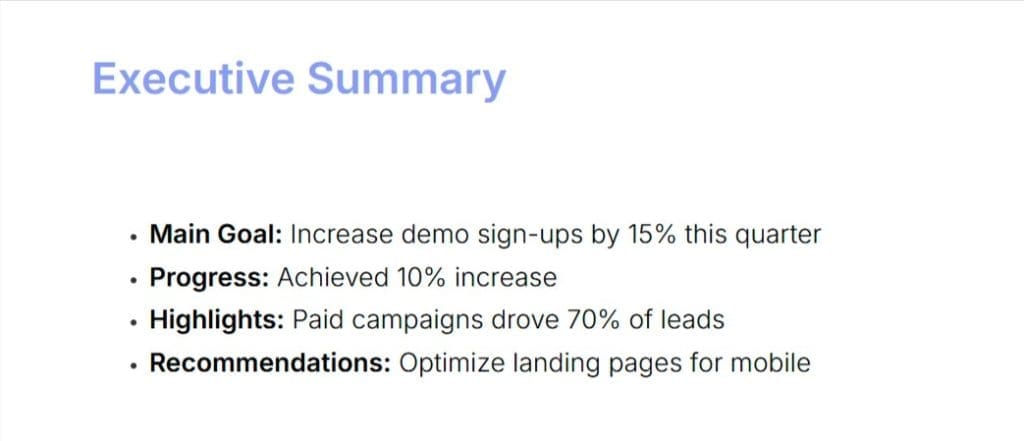
Begin each report with a quick overview that covers:
- Main KPI goals and current progress
- Month-to-month or year-to-year comparisons for key numbers
- Big wins and improvements from this period
- Priority items/suggestions for next period
Keep this part short and clear – use bullet points, headlines, and data pictures instead of long paragraphs. The goal is to give readers a quick understanding of your performance and impact during the reporting period.
How You Got the Numbers
One of the most overlooked parts of client reporting is also one of the simplest: explaining what everything means. Don’t assume your client knows all marketing terms.
Make your KPI reports clear for everyone by adding a quick section that defines all the key numbers you’re reporting on and how you track them. Even better, add typical performance data to give clients context about what’s considered “good” for those KPIs.
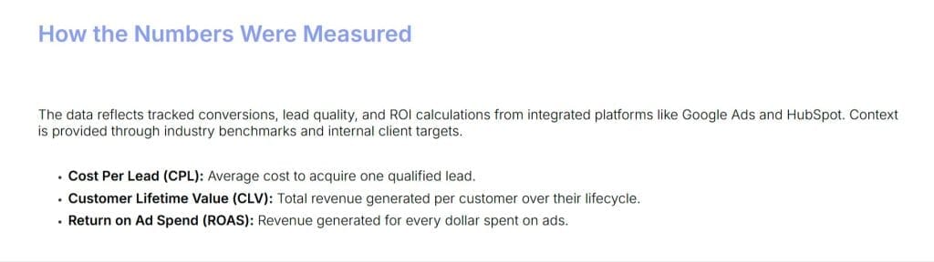
Just as important: be clear about where your data comes from and any limits in how you track it. Point out any gaps in data to avoid confusion and set realistic expectations.
Analysis and Background
KPI numbers don’t mean much without context. Your clients need to know how their current results compare to their goals, industry standards, and their past performance.
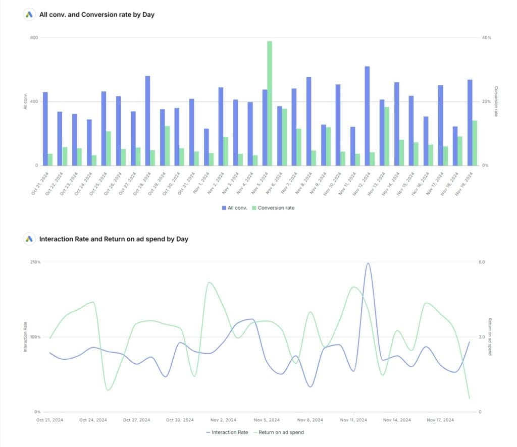
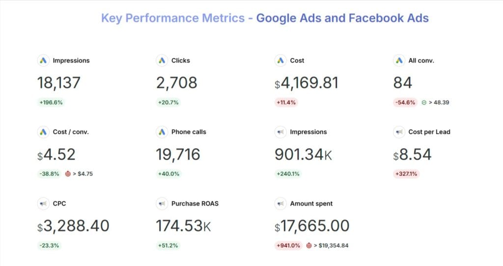
Create data visuals that show key KPI trends over time (line graphs and bar charts work well), plus period-to-period or year-to-year comparisons. If a KPI stays flat or goes down, give that context: is it a normal seasonal drop, or part of a bigger downward trend that needs attention?
When possible, add extra details like marketing spend, major campaign activities, or industry news alongside these KPI trends to help explain what drives performance changes. Show clients you understand their business and market situation, beyond just the numbers.
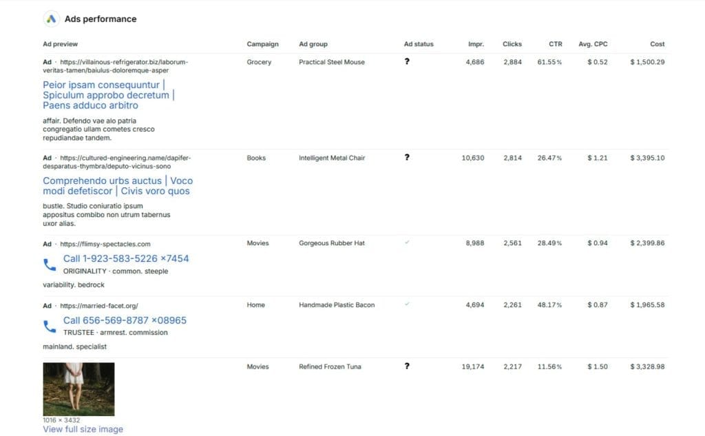
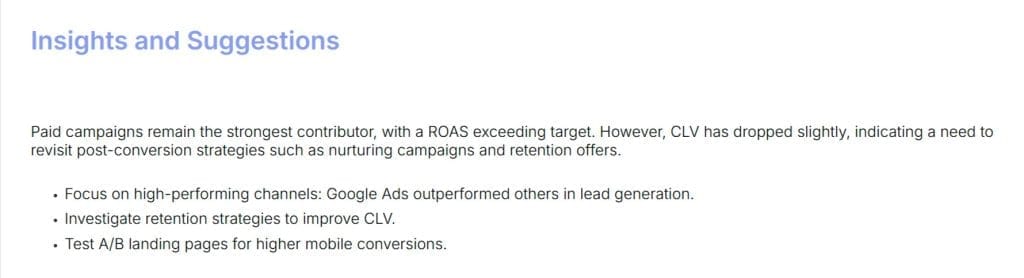
Channel and Group Breakdowns
As mentioned before, looking at KPIs as one big number only tells part of the story. Make your reporting useful by focusing on performance across different parts of your campaigns.
Some key ways to split your reporting:
- Marketing channel (search, display ads, email, affiliate, etc.)
- Customer groups and behaviors (age, gender, interests, etc.)
- Creative versions (ad text, landing page, etc.)
- Product or service types
- Sales funnel steps
Breaking down your data to this detailed level helps you understand which specific campaign parts work and which need fixes. Heat map tables or stacked bar charts make it easy to see this split-up data.
Insights and Suggestions
Here’s the golden rule of KPI reporting: never show data without explaining what it means. It’s not enough to just give clients the numbers – you need to explain what they mean and what to do about them.
For every KPI you include, add context about why it matters and what it says about how your marketing efforts are doing. Tell the story behind both good and bad performance.
Most important, always bring ideas and suggestions based on your KPI insights. What’s working that you can do more of? What’s not working that you should change? What can you test to make things better? How can your fixes help your client’s bottom line?
Connect your insights to the “what now” to show clients you’re not just reporting because you have to, but using data to push their business forward. Show them you’re a strategic advisor, not just someone who sends numbers.
Next Steps and To-Do List
Finally, be very clear about the key points and tasks you want your client to take away. Reporting only matters if it leads to real change and progress.
At the end of your KPI report, list the top 3-5 priorities or next steps for the coming period based on your data and analysis. These could be specific fixes to make, new tests to run, or strategy changes to think about.
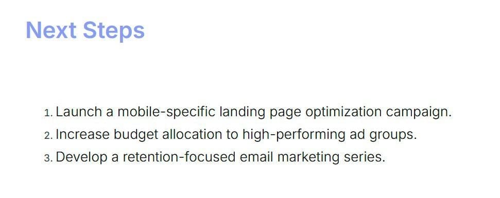
Give clear owners and deadlines for each task so everyone knows what they’re responsible for. Set up a follow-up call to go through the report and get client feedback and agreement on next steps.
KPI reports should be actionable, leading to improvements and outcomes, not just data sharing. Make it easy for your clients to know what they need to do to keep improving.
Extra Tips to Make Your KPI Reports Stand Out
Now that you know the basics of good KPI reporting, here are some expert tips to take your reports from good to great. These small touches can make a big difference in how your clients see and use your reports.
These tips will help you create reports that your clients actually want to read and use.
Fit Your Reports to Different People
Your client’s marketing head will need different information than their demand gen manager or analytics person. Make your reporting relevant by taking time to understand what each person needs and cares about.
Some quick tips to customize:
- Use the numbers and KPIs that matter most to that person’s job
- Change how detailed you get with data and marketing terms based on their expertise
- Link your suggestions to their specific goals and priorities
Take time upfront to understand how each person will use your reports, and build that into your format and design. Small changes for your audience can have a significant impact on how well your work is received and used.
Show Your Data Smart
When it comes to making KPI reports easy to understand, data pictures are your best tool. The human brain processes pictures 60,000 times faster than text – so turning your KPIs into charts, graphs, heat maps, and other visuals is key to getting your message across.
But don’t just throw your data into whatever chart your reporting tool suggests. Pick your visuals based on the type of data you’re showing and the point you want to make.
Some common ways to show data:
- Line or bar graphs to show changes over time
- Pie charts or stacked bars to show parts of a whole
- Scatter plots to show how two things relate to each other
- Heat maps or color scales to show performance levels across many areas
- Icons and info-graphics to make dry data more interesting
When creating your visuals, keep them simple and clear. Don’t try to get too fancy with colors and fonts. Label everything clearly. Remember, you want people to understand, not get confused.
Good data pictures make your KPIs come alive in ways that plain numbers can’t. Take time to do it right and watch your clients pay more attention.
Tell a Story with Your Numbers
The best KPI reports don’t just dump data in front of clients – they weave it into a clear story that makes people want to act.
Think of each KPI report like telling a story, with a start, middle, and end:
- Start: What were our goals for this time?
- Middle: What worked, what didn’t, and what did we learn? What story do the numbers tell about our progress and gaps?
- End: Based on these numbers, what should we change? How will this help the business?
Frame your reporting like a story to get your clients interested in what happens next. Use your overview to set up the story and connect all your data points.
Compare to Their Competition
Clients don’t just want to know how they’re doing compared to their past – they want to know how they stack up against competitors. Give industry standard data for your main KPIs to show what “good” looks like.
Places to find standard data:
- Marketing platform studies (Google, Facebook, HubSpot, etc.)
- Research firms (Gartner, Forrester, eMarketer)
- Industry groups and trade news
If you can get information about specific competitors, even better. Tools like SEMRush, SpyFu, and SimilarWeb can show you their digital marketing results.
When using standard data, look for the most relevant comparisons based on your client’s industry, audience, business type, and sales stage. The closer the match, the better.
Adding “here’s how you compare to X” to your KPI reports helps clients understand where they stand. It also shows you’re going beyond basics to give them a competitive edge.
Make Reporting a Two-Way Talk
Your KPI reporting shouldn’t be just you sending data to the client. Get more value from these reports by making room for discussion, feedback, and working together.
Ways to create ongoing talks about reporting:
- Set regular times to send reports and meet about them
- Ask clients what KPIs and standards they want to track
- Get open feedback on your report format and design
- Welcome questions and ideas from everyone involved
The best KPI reporting relationships are real partnerships, where agency and client work together to find insights and move toward shared goals. Let your clients be curious, question things, and share their views.
Best Practices & FAQs for KPI Reporting
Some guiding principles for excellent KPI reporting:
| Best Practice | Description |
|---|---|
| Keep it focused | Highlight the 5-10 most critical metrics. Don’t drown insights in data overload. |
| Make it visual | Use charts, heatmaps, dashboards to bring data to life. Visuals speak louder than numbers alone. |
| Add context | Raw KPIs mean little. Always include relevant comparisons to targets, history, industry averages. |
| Explain why | Don’t just report results – interpret what’s driving them with root cause analysis. |
| Be consistent | Establish a regular reporting cadence and format. Changing metrics constantly creates confusion. |
| Tie to goals | Connect KPIs to business priorities. Show how they impact revenue, costs, customer experience. |
| Drive action | Reporting is a means, not an end. Always include data-based recommendations and next steps. |
How many KPIs should we track?
Focus on quality over quantity. While 5-10 KPIs might be a good overall guideline, start with 3-5 that are absolutely critical to your client’s core objectives. Too many KPIs can overwhelm clients and dilute your focus. Keep in mind that every KPI should be a clear, actionable narrative. As you demonstrate value and build trust, you can introduce more nuanced KPIs to provide deeper insights.
How often should KPI reports be generated?
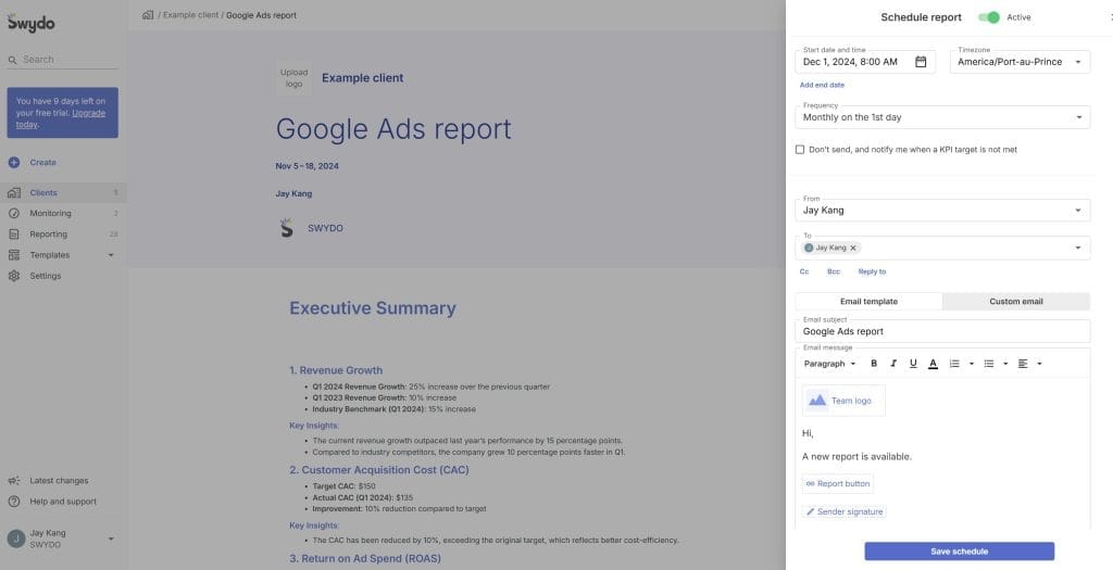
This depends on the client’s needs and the nature of your campaigns. For most agencies, a monthly reporting cadence for strategic review, supplemented by weekly or bi-weekly performance snapshots, strikes a good balance. For campaigns that require rapid adjustments, more frequent reporting may be necessary. Match your reporting schedule to how often your client makes decisions.
What’s the best format for KPI reports?
Ditch the generic templates and create reports that are visually engaging and tell a compelling story. While an executive summary, clear visuals, and action recommendations are essential, consider incorporating interactive dashboards, personalized narratives, and even short video summaries to capture your client’s attention. The key is to present data in a way that is easily digestible, insightful, and relevant to the client’s specific goals.
How can we ensure data quality for KPI reporting?
Data integrity is paramount. Implement robust data integration processes, establish clear data governance standards, and conduct regular data audits to maintain accuracy and consistency. Use data automation tools to reduce manual errors and improve reporting. Be upfront with your clients about data limitations and potential biases to build trust and transparency.
What skills are needed for good KPI analysis?
Beyond data literacy and analytical skills, cultivate a team that excels at critical thinking, creative problem-solving, and persuasive communication. The ability to connect data insights to actionable strategies and communicate them in a clear, compelling narrative is crucial for agency success.
Key Takeaways
Some key points to keep in mind as you make your KPI reports better:
- Don’t try to measure and report everything – focus on the numbers that matter most to your client’s business. Choose well over choosing many.
- Do more than just show numbers – put in the work to find real insights and give suggestions. Reports only matter based on what you do with them.
- Know who you’re writing for and make your reports fit them. The more relevant it is for each person, the more impact it will have.
- Use data pictures and storytelling as your best tools. Make your KPIs easy to understand in ways that get your clients interested and ready to act.
- Use your KPI reports to start ongoing talks and improvements. The insights don’t stop when you send the report.
Your approach to KPIs and reports should be dynamic, adapting to evolving client expectations and business necessities. Always ask how you can get more value and impact from your KPI reporting.
When your clients see you putting in extra effort to help them stay ahead and hit their goals, they’re more likely to stick with you for the long run. Make KPI reporting your agency’s secret weapon for keeping clients happy and coming back.
Want an all-in-one tool to create great KPI reports and dashboards for your clients? Try our free 14-day trial to see why top agencies trust Swydo for their client reporting.
Show clients the KPIs that prove your value
Start Your Free KPI Reporting Trial Today