
It’s 11:47 PM. Your client presentation is tomorrow, and even though your performance metrics look great, something doesn’t feel right. The numbers show success, but you know from experience that good data alone won’t make the quarterly review smooth. A 30-minute presentation can quickly turn into a two-hour defense of your methods when clients struggle to understand the impact of your work.
This late night scene plays out at agencies everywhere. The pressure comes not from getting results, but from turning those results into renewed client confidence, bigger budgets, and stronger partnerships. Your team did great work, but data that clients can’t understand quickly becomes noise in their already busy day.
Modern marketing tools give us more data than we need. The real skill lies in showing these results in ways that make sense to clients with different needs and different comfort levels with data. When clients quickly grasp their data, you stop being just another vendor and become a trusted partner.
Why Clear Data Visualization Matters
Poor data visualization still affects both your agency and your clients, even when all the data is available.
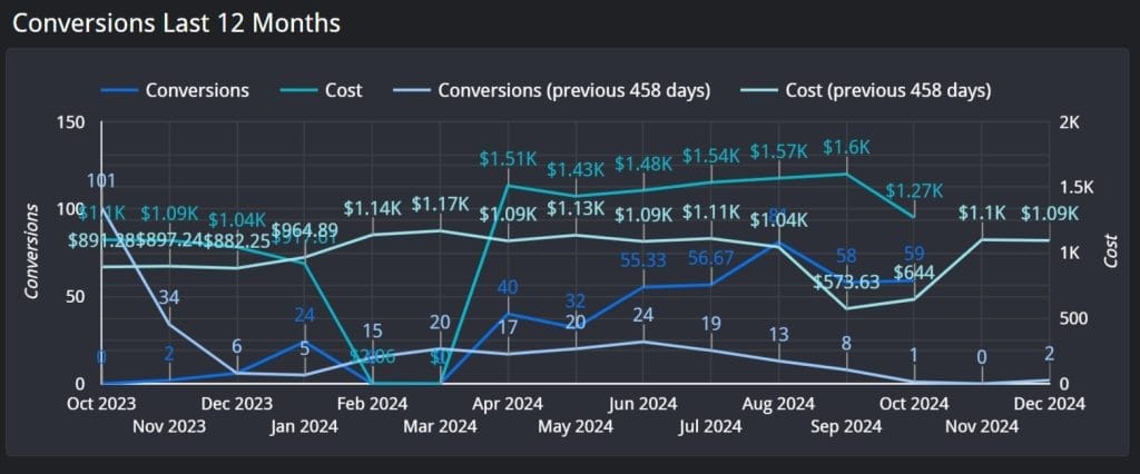
Take this monthly report review, where the data was cluttered. The agency mixed together several important metrics, like conversions, cost, and conversion rate, all in one chart. The colors for each line were too similar, and it wasn’t clear which line represented which metric. As a result, the meeting, which was supposed to focus on strategy, ended up in a 45-minute discussion about which metric contributed to performance changes.
When working with discrete vs continuous data, clarity becomes even more important. Continuous data, like cost trends or traffic volume, needs clean trend lines or area charts, while discrete data, such as total conversions by channel, benefits from bar or pie charts to emphasize distinct values.
Instead of discussing next quarter’s strategy or new opportunities, the meeting gets stuck on basics like:
- “Which line is the conversion rate?”
- “Why is the cost line overlapping with conversions?”
Clear visualization could have turned this confusion into confident decision-making.
How to Pick the Right Visualization to Show Data
Picking the right chart isn’t just about which type looks best – it’s about understanding the people who need to use the data. Every chart needs to answer three basic questions:
- What does your client need to know?
- What decision(s) will they make with this information?
- How will they use or communicate these numbers after your meeting?
Before selecting a visualization type, consider what story your data needs to tell.
Here’s a guide to help you choose:
| Story Type | Best Visualization | When to Use | Example |
|---|---|---|---|
| Trend Analysis | |||
| Performance Over Time | Line Chart | Showing metric trends, goal progress | Monthly ROAS trends, daily click rates |
| Seasonal/Long-term Trends | Spline Chart | Highlighting seasonal patterns, long-term trends | Annual traffic patterns, seasonal conversion trends |
| Cumulative Change Over Time | Stacked Area | Showing cumulative contribution over time | Revenue by channel, traffic source trends |
| Comparison | |||
| Category Comparison | Bar Chart | Comparing performance across different items | Campaign ROAS comparison, channel performance |
| Period Comparison | Column Chart | Showing growth/decline across periods | Month-over-month revenue, year-over-year growth |
| Time-based Composition Comparison | Stacked Column | Displaying composition changes over time | Monthly channel mix, budget allocation trends |
| Distribution | |||
| Part-to-Whole | Donut or Pie Chart | Distribution analysis (5 or fewer categories) | Traffic source breakdown, budget allocation |
| Frequency Distribution | Histogram | Understanding how values are spread across bins | Purchase amount distribution, time on site frequency |
| Geographic | |||
| Regional Performance | Bubble Map | Geographic analysis | Sales by state, click-through rates by country |
| Complex Patterns and Relationships | |||
| Complex Patterns | Heat Map | Time and segment analysis | Hour/day performance, user engagement by day and time |
| Outlier Identification | Box Plot | Spotting outliers and spread | Conversion rates across channels, campaign performance outliers |
| Relationship Between Variables | Scatter Plot | Showing correlations between two variables | Ad spend vs. revenue, time on site vs. conversion rate |
| In-depth Comparison & Relationships | |||
| Comparative Analysis | Table or Bar/Column Chart | Precise metrics, multiple KPIs, detailed comparison | Campaign details, granular performance metrics |
| Hierarchical Data | Tree Map | Showing nested data relationships | Account structure analysis, category performance |
The most effective visualization isn’t always the most complex – it’s the one that makes your data’s story immediately clear to your client.
How to Use Different Types of Charts
Each type of chart serves a specific purpose in your client reports. Your choice of chart can mean the difference between a quick approval and a long explanation. Let’s look at how to pick the right chart type for your data and use it in a way that makes sense to clients.
The key isn’t just picking any chart – it’s choosing one that shows your marketing results in the clearest way possible. A chart that works perfectly for showing campaign trends might fail completely at comparing channel performance. Let’s break down each type and see exactly when and how to use them.
Line Charts That Do More
Line charts excel at showing performance over time, but their effectiveness depends entirely on context. Simply showing a trend line of conversions or costs rarely tells the complete story your clients need to understand.
For example, when presenting a six-month Cost per Lead trend, don’t just show the line dropping from $50 to $35. Add last year’s performance as a lighter line to demonstrate improvement. Include your target to show progress toward goals. Add text notes on significant changes – like campaign optimizations or market events – directly on the chart. This transforms raw data into a clear narrative of success.
Make line charts more effective by:
- Limit to 3-4 metrics to prevent confusion
- Use consistent colors for each metric
- Add context through benchmarks and goals
- Mark important events that explain changes
Avoid common charting mistakes like:
- Starting the Y-Axis Above Zero: This can exaggerate changes, misleading viewers about the scale of differences.
- Mixing Metrics with Different Scales: Combining vastly different metrics on the same chart can confuse viewers. Use dual axes only if necessary, and label them clearly.
- Overloading with Too Much Information: Including too many data points, colors, or labels can clutter the chart and obscure the main message.
- Misusing Pie Charts: Pie charts should be limited to showing parts of a whole with fewer than five categories. Avoid using them for data with similar values.
- Choosing the Wrong Chart Type: Selecting an inappropriate chart type (e.g., pie chart for time series data) can mislead the audience. Choose a chart that fits the data story.
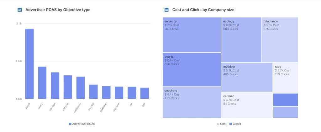
Bar Charts That Make Sense
Bar charts shine when comparing performance across different channels, campaigns, or time periods. Their strength lies in making differences immediately obvious to your clients, especially when you organize them strategically.
Instead of listing channels alphabetically, arrange them by performance. When showing channel ROAS, order them from highest to lowest return. This instantly shows where your marketing budget works hardest. Add year-over-year comparisons next to each bar to show improvement, turning a simple comparison into a story of growth.marketing budget works hardest. Add year-over-year comparisons next to each bar to show improvement, turning a simple comparison into a story of growth.
Make bar charts more effective by:
- Ordering bars by value for quick insights
- Using consistent colors across reports
- Adding comparison data for context
- Keeping labels clear and readable
Avoid comparing too many items at once, which can overwhelm clients. Focus on the top performers and group smaller items together when needed.
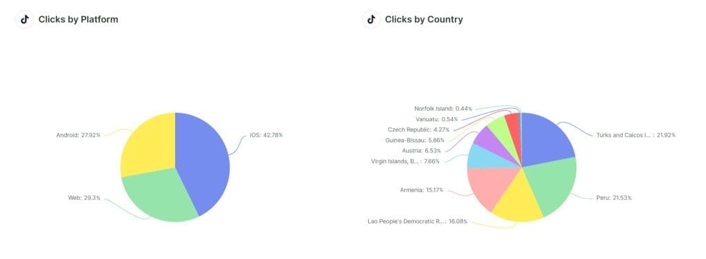
Pie Charts That Show Clear Marketing Splits
Pie charts work best for showing how different parts contribute to a whole, like marketing budget allocation or traffic source distribution. They become powerful when you limit them to showing clear, significant differences.
When presenting channel revenue distribution, focus on your main drivers. For example, if paid social drives 45% of revenue and organic search brings 30%, while five other channels split the remaining 25%, group those smaller channels into “Other.” This keeps the focus on what matters most.
Make pie charts more effective by:
- Limiting to 6 segments maximum
- Starting your largest segment at 12 o’clock
- Using distinct colors for each segment
- Including both percentages and values
Avoid using pie charts when segments are similar in size or when you need to show changes over time.
Geographic Maps That Drive Decisions
Geographic visualizations transform location-based data into actionable insights. Instead of presenting regional performance in tables, maps show patterns across territories at a glance.
When analyzing a national advertising campaign, a bubble map might reveal that while major cities have the highest total spend, smaller markets often deliver better cost per conversion. The bubble size can show total spend while color intensity indicates efficiency, creating an immediate understanding of where to adjust budgets.
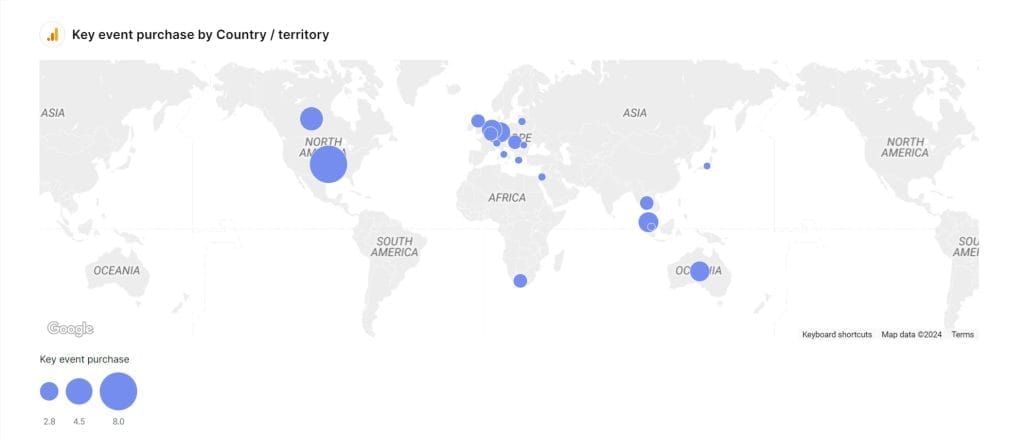
Make geographic maps more effective by:
- Using bubble size for volume metrics
- Applying color intensity for performance metrics
- Including clear region labels
- Providing zoom capabilities for detailed areas
Avoid using maps when you have limited geographic data or when exact metrics are more important than regional patterns.
Tables That Drive Decisions
Tables might seem basic, but they’re essential for providing detailed metrics that charts can’t effectively display. Their power comes from organization and visual hierarchy, turning raw numbers into clear insights.
Instead of showing every possible metric, structure your tables around decisions. For a campaign performance table, lead with the metrics that drive actions – like ROAS or conversion volume – and support them with contributing factors like CTR or CPC. This guides your clients straight to what matters.
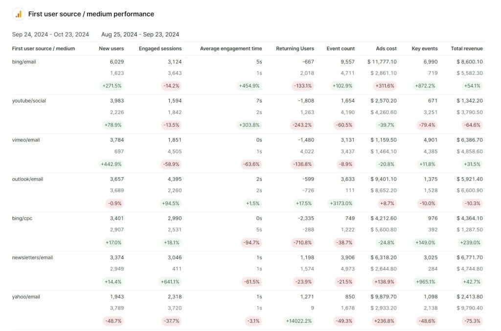
Make tables more effective by:
- Right-aligning numbers for easy scanning
- Using consistent decimal places
- Adding trend indicators (↑↓) for quick insights
- Highlighting significant changes
Avoid cluttering tables with unnecessary metrics or using them when a chart would better show the pattern.
Heat Maps That Reveal Patterns
Heat maps turn complex patterns into visual insights, particularly when dealing with time-based performance or audience behavior. They reveal patterns that might be invisible in standard charts or tables.
When analyzing ad performance across different hours and days, a heat map instantly shows peak engagement periods. Rather than scanning through rows of data, your clients can immediately spot that their B2B campaigns perform best on Tuesday mornings, while their consumer ads drive more conversions on weekend evenings.
Make heat maps more effective by:
- Using a single color in varying intensities
- Providing clear scale references
- Grouping related data points together
- Including clear time period labels
Avoid using heat maps for simple comparisons or when exact values are crucial to the discussion.
Common Visualization Mistakes to Avoid
Even great data can lose impact through poor visualization choices. Here are the most common mistakes and how to fix them:
Too Many Metrics at Once
When you show CPC, CTR, conversion rate, and ROAS all on one line chart, you create a spaghetti of lines that confuses rather than clarifies. Instead, group related metrics (like CTR with CPC, or Conversion Rate with ROAS) into separate charts that tell specific parts of your story.
Scale Manipulation
Starting your Y-axis at 30% instead of 0% might make that 5% improvement look dramatic, but it damages trust. Always start bar charts at zero. For line charts showing trends, you have more flexibility with scale, but always make it clear when you’re not starting at zero.
Rainbow Color Confusion
When you use different colors for every metric might seem helpful, but it often creates visual noise. Instead:
- Use one color in different shades for related metrics
- Save contrasting colors for comparisons
- Keep your color scheme consistent across all charts
- Consider colorblind accessibility – not everyone sees colors the same way
Cluttered Labels and Legends
Tiny text, overlapping numbers, and distant legends force clients to work too hard to understand your data. Make your charts easier to read by:
- Using clear, readable fonts (minimum 12pt)
- Placing labels directly near the data they describe
- Rounding numbers for easier comprehension (2.13487% becomes 2.1%)
- Keeping legends close to the data they explain
Missing Context
Raw numbers without benchmarks or goals are meaningless. Always include:
- Previous period performance
- Goals or targets
- Industry benchmarks when available
- Annotations for significant changes or events
3D Effects and Fancy Formatting
3D charts might look impressive, but they distort data relationships and make accurate comparisons impossible. Stick to clean, 2D visualizations that prioritize clarity over style. That is why the best client reporting tools do not include 3D visualization.
Inconsistent Time Periods
Mixing daily, weekly, and monthly data in the same chart creates confusion. Keep time periods consistent, or clearly separate different time frame analyses
Tips for Picking the Perfect Chart
With so many charts to choose from, it’s not always easy to know which one will get your point across best. Here are some tips to help you pick the chart that tells your data story with style.
1. Start with the End in Mind
Ask yourself what main message you want to communicate.
- Are you comparing key metrics across different segments or campaigns to see what’s working best?
- Do you want to show how performance is trending over time to spot potential problems or opportunities?
- Is your goal to break down how different channels or tactics contribute to your overall results?
- Are you trying to map results across different regions or territories to allocate resources more strategically?
The clearer you are about the story you want to tell, the easier it will be to choose a chart that nails it.
2. Match the Chart to the Data
Different types of data work better with different types of charts.
- Categorical data like marketing channels or audience segments naturally lend themselves to bar charts, column charts, and pie charts that show clear comparisons.
- Continuous data like conversion rates or revenue over time are perfect for line charts and area charts that illustrate trends and trajectories.
- Multi-dimensional data like campaign results broken down by region and product category call for more complex charts like stacked bars or heat maps.
Choosing a chart that fits your data will help you avoid awkward, confusing visuals that muddy your message.
3. Keep It Clean and Simple
One of the biggest data viz mistakes is trying to cram too much into a single chart. Fight the urge to get too fancy and instead:
- Focus on a couple of key metrics or dimensions rather than throwing everything and the kitchen sink into your visual
- Stick to clean, clear designs without a lot of chart junk, special effects, or gaudy color schemes
- Pick a chart type that’s easy for your audience to interpret at a glance – if it takes more than a few seconds to “get it”, it’s probably too complex
The goal is to make your data’s story unmissable, not to wow people with your mad charting skills.
4. Get an Outside Perspective
You’re so close to your data that what seems obvious to you might be baffling to everyone else. That’s why it’s so valuable to get an outsider’s take.
- Put together a rough version of your chart and show it to someone who’s not as familiar with the data as you are
- Ask them to talk you through what they’re seeing and what conclusions they’re drawing
- Pay attention to any parts that seem to trip them up or lead them astray
- Keep tweaking your chart until your test audience is getting the right story with minimal head-scratching
5. Design with Action in Mind
At the end of the day, your chart needs to do more than look pretty – client reporting needs to drive smart decisions and meaningful actions.
- From the very beginning, think about what you want your audience to do with the information in your visual
- What new insight should they walk away with? What next step should they take? What question should they ask?
- Design every element of your chart, from the metrics to the text to the color scheme, to push your audience toward that desired action
- If you’re not sure how your chart leads to better decisions, keep iterating until that connection is crystal clear
Key Takeaway
The point of your data visualization isn’t to show off your tech chops – it’s to make your insights impossible to miss. Focus on finding a chart that gets your message across to your audience, and you can’t go wrong. The right chart turns a screenful of numbers into a story that sticks.
Turn complex data into clear client stories with Swydo’s visualization tools
Start Your Free Trial