We are having an exciting week at Swydo – we refreshed our brand and are thrilled for you to see it. For 2022, our aim was to redefine our brand values and focus on building a smart, simple, and reliable reporting and monitoring tool.
That’s why, when we undertook the first brand refresh in Swydo’s eleven-year history, we wanted to capture the simplicity and ease of use the platform provides our customers. Gradually, across Product + UX, Sales, Support, and Marketing, it’s our endeavor to bring to our customers a simple yet powerful report automation and monitoring platform that makes their jobs easier. We strive to deliver data-driven insights, have open and honest communication with our users, and ensure that the overall experience of using our platform brings joy to the process of reporting.
Today, we are bringing a renewed sense of energy and purpose to not only our mission for the product but also our colors, typeface, logo, and other product elements.
Why a brand refresh?
Since 2011, Swydo has been on a mission to empower marketers to communicate meaningful insights. By helping them build smart, easy-to-decipher, quick-to-make marketing reports and dashboards from one centralized marketing hub. Swydo helps marketers save valuable time that can be spent on optimization, customer retention, and business growth.
About a year ago, we realized that we weren’t fully conveying who we are or what we stand for clearly. We are growing and so it became more important to redefine our brand values to create a sense of alignment across our teams. So after thorough research and multiple company-wide discussions, when we asked ourselves and our customers – Who are we? What do we really stand for? We came up with three brand attributes that suit our personality and how we work together.

Smart – Knowledgeable and playful
Our decisions are data-driven and through user research, we are constantly improving our platform to make them more efficient. We understand that marketers are busy folks and need to work smarter instead of harder and spend less time creating reports and dashboards.

Simple – Easy to use
We want to help marketers save their precious time to do things they genuinely care about. Therefore, we aim to focus on user flows through the product to ensure that each task is completed simply and efficiently.

Reliable – Trustworthy and accurate
At Swydo, we believe in keeping our promises and being accountable to our customers. We are therefore always honest with managing the expectations of our customers and strive to deliver accurate results.
Our logo got a visual uplift
We love our logo and did you know that the acronym Swydo stands for Show What You Do Online? The four colors symbolize the vibrancy and diversity of our company and our job. The very essence of Communication.
The only element we were missing was showcasing our personality. We think and we often get to hear from our users that we are friendly, helpful, and fun people who love building a smart product. Our new logo stays true to the original thought and is yet vibrant and fresh. With rounded edges, improved lighter colors, and better spacing – we believe we have stayed true to the essence of who we are and how we enjoy working together.

Our color palette
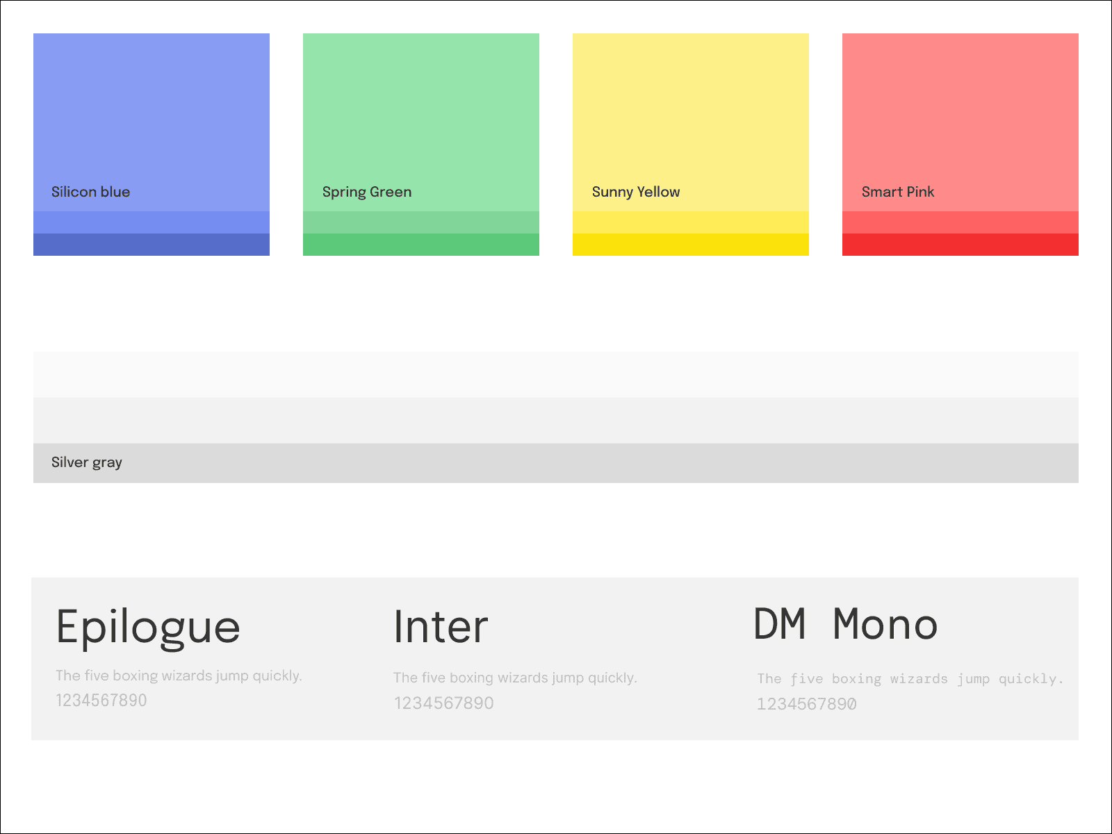
We decided that we wanted Swydo to be accentuated with how we felt while building the product – reflect that versatility and vibrancy in our refreshed color palette. We were born in the Netherlands and we wanted to stay true to our colorful Dutch roots. We call our new color palette Tulip (no prizes for guessing why) and it symbolizes who we are.

Our typeface
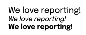
Our new brand typeface is Epilogue. It is fun, simple, and yet quirky in its own way. It coordinates well with what we want to convey and is truly Swydo.

In other words, the refreshed Swydo may be a lot more smart and colorful than the old one – which you will also see in our product, the reporting templates we provide, our website, and communications in the coming year.
And for those of you still wondering how it is pronounced, it’s Swaai-doo and not Sweei-do. 😉
Happy Reporting,
Team Swydo
