
So, your client opens your report and in the first 5 seconds, they’re already forming an opinion. A cluttered dashboard? They’ll wonder what else you’re doing wrong. But a clean visualization — with insights that jump off the page — makes you their right arm in marketing.
Data visualizations, like a pictures, say a thousand words — and pack major decision-making power for both agencies and clients. In fact, 92% of marketers say that well-designed data presentations lead to better marketing decisions.
Want to show clients their ad dollars are in capable hands? Translate mountains of data into visual signals they can spot at first glimpse. This guide will show you how.
You’ll learn to:
- Balance detailed data with clear, easy-to-read visuals
- Turn raw numbers into actionable insights that clients trust
- Build polished, on-brand reports that stand out
- Organize reports logically for better client navigation
- Master key Looker Studio tools and shortcuts to save time
- Optimize report speed and avoid common pitfalls
Learn these skills and deliver reports that impress clients, drive smart decisions, and build trust.
How To Create Stunning Visual Reports With Looker Studio
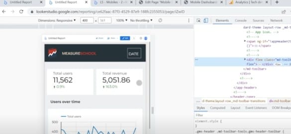
You don’t need to be a data wizard or a coding expert to build solid reports in Looker Studio. Just get to know the tools that save you time and bring the data to life. Learn where to click — and just as importantly, what to ignore — so you’re not stuck fiddling with settings when you could be uncovering insights.
Say you’re building a monthly report for a retail client. You could spend 15 minutes poking around menus trying to add a filter, or you could learn it once and knock it out in 10 seconds next time. That’s time you can spend sharpening the story, not wrestling with the interface.
Data visualizations aren’t one-size-fits-all. For all sizes and types of data, as well as data patterns, there are many ways visualize to them. Choose visual tools to highlight key metrics and others to track trends over time. Arrange layouts so they flow naturally. Use tabs or sections to group related data. Apply your client’s brand colors consistently across every page. Blend data cleanly to avoid clutter and optimize reports for fast loading and easy mobile viewing.
Looker Studio’s visualizations let you to show your client’s data and campaign performance, as well as your expertise and professionalism as a marketer, in the best possible light.
Put Performance in Focus With Widgets
Looker Studio uses widgets — visual components like charts, scorecards, and tables — to display data clearly and effectively. Using these widgets smartly helps you craft reports that aren’t just data dumps but decision-driving roadmaps. Let’s explore the key widgets every marketing agency should know.
Scorecards
Scorecards are your report’s heartbeat. They show metrics like ROAS, CPA, and conversion rate at a glance — no digging, no delays.
Imagine you’re in a weekly check-in with a busy client. You’ve got 15 minutes, tops. They want to know: Are we wasting money? Are we improving? That’s where scorecards shine. Placed right at the top, they give clients an instant read on what’s working — and what’s not.
Put your KPIs front and center. When time is short, clear visuals beat spreadsheets every time.

To add a scorecard to your Looker Studio report:
- Open your Looker Studio report
- Click Insert from the top menu
- Select Scorecard from the dropdown
- Click anywhere on the canvas to place it
- Choose your metric in the right-hand panel, like ROAS or CPA
- Adjust date range, filters, or comparison settings
Example scenario — PPC agency:
- Metric tracked: CPA over 90 days
- Before: Scorecard alone hid cost per conversion trends
- After: Added comparison to previous period — revealed a 27% rise in CPA after budget shift. Prompted immediate course correction
Time Series
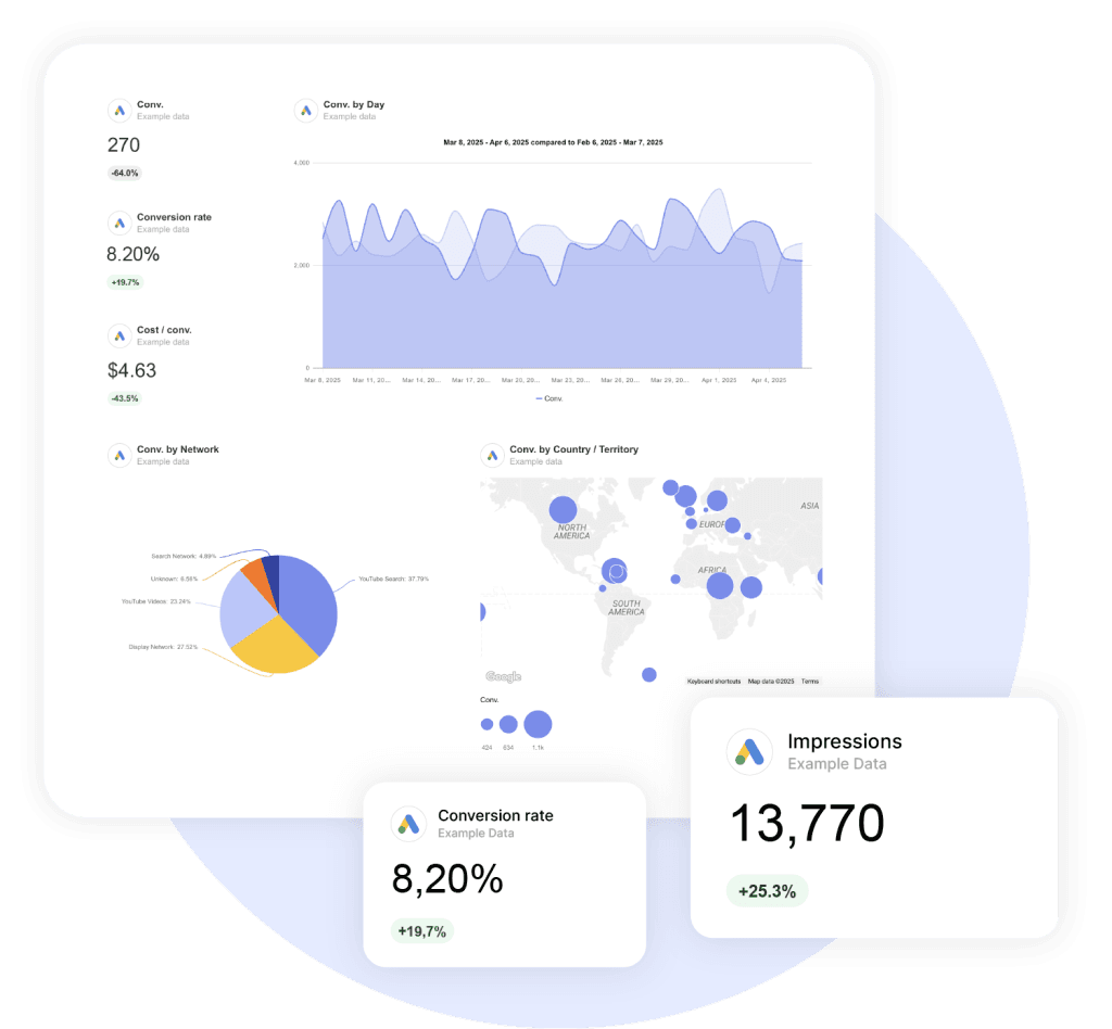
Show when things change. Drop in a time series chart to track ups and downs over time. Did conversions spike during your spring promo? Did traffic dip around the holidays? Use it to spot trends, like end-of-month slowdowns or year-end rushes. Find the pattern, make the fix.
Add this widget to your performance report:
- Open your report
- Click Insert at the top
- Choose the Time Series widget
- Click on the report where you want to place the chart
- Select your metric (e.g., Conversions, Impressions)
- Make sure the date dimension is correctly set (Date)
- Customize styling and filters as needed
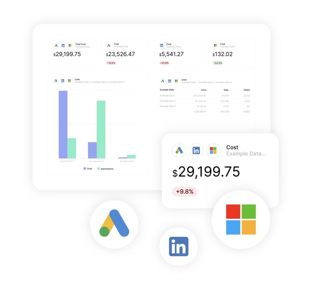
Bar and Column Charts
Bar and column charts clarify comparisons. Use them to rank campaigns, compare channels, or spot top-performing devices. At a glance, clients can see what’s working — and where to shift budget for better results.
Bar charts
Bar charts make it easy to compare multiple elements side by side. Use them to rank campaigns by spend, analyze device performance, or compare audience segments. These visuals bring structure to messy data and help clients see what’s working at a glance.
To add a bar chart to your report:
- Open the report
- Go to Insert in the top menu
- Choose Bar chart
- Click to place it in the report
- Set your dimension (e.g., Campaign, Device)
- Pick a metric to compare (e.g., Clicks, ROAS)
- Adjust sorting, axis settings, or colors to highlight key takeaways
Column Charts
Column charts work best when you’re comparing vertical categories, like conversions by channel or impressions by day. They’re great for showing change over time, like before-and-after results from campaign tweaks.
To add a column chart to your report:
- Open the report
- Go to Insert
- Choose Column chart
- Click to add it to your page
- Choose a dimension (e.g., Channel, Date)
- Add a metric (e.g., Impressions, Conversions)
- Use the Style tab to clean up the layout — remove clutter, fine-tune spacing, and apply brand colors
Funnel Charts
Funnel charts visualize the full conversion journey, from the first impression all the way to the final action, like a sale, a call, or a signup. These widgets are useful when you need to highlight where drop-offs happen.
When it comes to low CTRs, weak landing pages, or checkout abandonment, the funnel layout helps identify exactly where attention is needed. It’s a powerful way to show how small tweaks could drive better results across the board.
Tip: Avoid funnels when your conversion path loops back or includes multiple goal types — for example, newsletter to webinar to sale. Use a Sankey chart instead.

To add funnel charts:
- Open your Looker Studio report
- Click Insert in the toolbar
- Select the Funnel chart
- Click on the canvas to place the chart
- Add multiple metrics in order, like Impressions, then Clicks, then Conversions
- Check whether the funnel layout is displayed correctly
- Lastly, adjust colors or labels for better readability
Combo Charts
Use combo charts to show how two metrics move together — or move independently. Plot ad spend as bars and overlay revenue as a line to track ROI. Spot patterns you’d miss in separate charts. Perfect for strategy reviews: catch trends like rising spend and falling sales before they get costly.
Combo charts in your Looker Studio report can work wonders. Here’s how to add one:
- Open your report
- Click on the Insert menu
- Select Combo chart from the list
- Click to place it in your report
- Choose one dimension, like Date or Campaign
- Add two metrics, one for the bars and one for the line, for example, Spend and Revenue
- Use the Style tab to adjust axes and layout
- Add filters or breakdowns if needed
Tip: Want to show the strength of the relationship between two metrics, like spend and revenue? Add a trendline or R² label in Looker Studio’s Style panel. It’s a fast way to quantify correlation and back your recommendations with data.
Geo Charts
Drop in a geo chart to show where campaigns hit — and where they miss. Spot top cities, weak regions, and new market opportunities fast. If you’re running local ads or testing messages by location, map the results. Let clients see exactly where to double down.
Tip: If coverage is granular (city-level), consider a heatmap-style scatter chart with tooltips — it’s more precise.
If you want to add a geo chart to your client’s dashboard or report:
- Click on Insert at the top menu
- Then, select the Geo chart
- Click on the report to insert it
- Choose a geographic dimension (e.g., Country, Region, or City)
- Select the metric to visualize (e.g., Sessions, Revenue)
- Check whether your data source includes location data
- Customize map style, colors, and tooltips in the Style tab
Keep Your Looker Studio Reports Looking Professional
In the past, a simple Word file with key metrics was enough for clients. But in 2025, presentation matters just as much as performance. Go through this list and make sure you check all of the boxes for the best-looking reports.
Visual Polish
Use Rounded Edges and Gradients
Add rounded corners and your charts feel cleaner — more modern, less stiff. Then layer in subtle gradients to give the colors depth without drowning the data.
It might seem like a small tweak. But together, these design touches polish your dashboard the way good lighting flatters a photo. The whole thing feels smoother, easier on the eyes — and more professional.
Apply Brand Color
Start with your client’s existing palette — logo colors, website tones, or brand guidelines — and build your chart colors around it. When every widget speaks the same visual language, the report feels cohesive. It tells the client, instantly, that this wasn’t some off-the-shelf dashboard. It was made for them.
Layout Consistency
Standardize Fonts, Spacing, and Charts
Even great data looks sloppy if the design feels off. Inconsistent font sizes, uneven spacing, and misaligned charts make the whole report harder to read — and harder to trust. Stick to one or two fonts, line things up, and keep margins and padding consistent across every page. These small tweaks go a long way. They make your work look sharper and easier to digest.
Organize Data into Sections and Tabs
Break down your report into pages or sections. For example:
- Overview
- Channel Breakdown
- Conversions
- Geography
A well-structured report helps with the information overload and makes navigation easier for clients who want to scan, click, and get to the point.
Breaking the report into sections also helps with the overall performance of Looker Studio. Advanced calculations, geo charts, and other resource-intensive widgets slow the responsiveness and load time of reports.
Performance & Usability
Make Your Reports Work on Any Device
Clients check dashboards at work or on the go on phones, tablets and laptops. If your report only looks good on a big screen, you’re risking miscommunication. A key number might be cut off or buried below the fold.
Looker Studio lets you design fully responsive reports that adapt to any screen size. That means smoother experiences and fewer confused messages asking, “Why is half the chart missing?”
Responsive mode — which auto-adjusts layout for smaller screens — shines on mobile but can feel limited on desktop. Freeform works best for desktop but looks clunky on mobile. Choose based on how your clients mainly view the report.
Make your report adjust to mobile screens:
- Open a new or existing report
- At the top menu, click Theme and layout
- Choose the Layout tab
- Change the layout type from Freeform to Responsive
- Reload the report — your components will now group into sections that scale based on screen size
| Device Layout Guide | ||
|---|---|---|
| Device | Best Layout Setting | Pro Tip |
| Desktop | Freeform | Use full-width charts and scorecards |
| Tablet | Responsive | Keep enough spacing between columns |
| Mobile | Responsive | Shrink canvas, move top metrics first |
Add Comments
Visuals show the data, but context helps to explain it. Use dynamic text boxes, tooltips, or simple labels to spotlight the why behind the performance changes. A short note next to a spike or drop can save your clients time.
How to Visualize Marketing Data
Your dashboard must do two things well: give execs a high‑level summary, and give marketers the deep dive when they need it. With all that data, structure is crucial.
High-level KPIs for Executives
Give key stakeholders quick answers — don’t make them hunt. Try this:
- Use scorecards for must-know metrics. Add essential data points, like ROAS, CPA, and Conversion Rate, to your Looker Studio report.
- Focus on trends, not data quantity. Drop in a time series chart to track key KPIs over time. Make sure to highlight changes from previous periods. It’s a small tweak that makes a big difference to clients.
- Add progress indicators. Use bar or bullet charts to show how close they are to hitting their set goals.
- Keep the layout minimal. Remember — a few powerful visuals beat a long list of metrics and charts.
| Executive KPI Cheat Sheet | ||
|---|---|---|
| KPI Type | Recommended Feature | Purpose |
| ROAS, CPA, Conv % | Scorecards | Show critical KPIs at a glance |
| Trend over time | Time-series chart | Highlight shifts and growth |
| Goal progress | Bar or bullet charts | Track progress to targets |
Design Tip: Use a minimal layout with plenty of whitespace to focus attention, reduce clutter, and help busy clients spot insights faster.
Depth for Marketing Specialists
Marketers want the full story — which channels, campaigns, or creatives perform best? Show them:
- Tables packed with performance data. Add campaign-level metrics, like clicks, conversions, cost, and use breakdowns like Campaign name or Ad group.
- Bar charts to compare channels. Want to show how Meta campaigns hold up against Google? Add a bar chart, select Channel as your dimension, and plug in any performance metric.
- Interactive filters. Let them filter the data by campaign, region, or audience for in-depth performance analysis.
Visualize Cross-Channel Data
Use cross‑channel attribution to show which platform delivers the best ROAS. Here’s how with Google Ads and LinkedIn Ads:
Connect Data Sources
To begin, you’ll need to connect both data sources to your report:
- Open Looker Studio
- Click Create > Data source
- Select Google Ads, authorize access, choose your account, then click Save
- Repeat for LinkedIn (use third‑party connector if needed)
Heads up – you’ll need a third-party connector if the data source is outside Google’s ecosystem, and that could cost extra.

Blend Data
After all of the sources are connected, you’ll need to blend the data:
- Open report → Resource → Manage blends → + Add a blend
- Select Google Ads + LinkedIn Ads
- Join by Date
- Pick Impressions, Clicks, Cost, Conversions
- Save and use in widgets
Pro tip: Limit blends to key dimensions to keep it snappy.
Standardize UTM Parameters
Well-structured UTMs help attribute traffic or conversion events accurately to each channel. And when it comes to cross-channel visualization, standardized tags help to blend data with fewer possible errors.
Start by auditing your current UTM parameters. Check whether your campaigns use standardized UTM parameters, for example, utm_source=google, utm_medium=cpc.
Then, set up calculated fields in Looker Studio:
- Go to your report and click on Resource, then Manage added data sources
- Select your data source and click Edit
- Click on + ADD A FIELD and then Add calculated field
- Name the field, for example, Standard source
- Group similar UTM source values under a common name. For example, if you have sources like li, linkedin, and linkedin.com, you can group them as LinkedIn
- Click Save to add the new field to your data source
- In your report, use the Standard source field in widgets to have a unified UTM attribution
Example scenario — Advertiser with inconsistent UTM tags
- Metric tracked: Traffic sources over 90 days
- Before: Mixed utm_source tags like “linkedin” and “li” caused fragmented data and inflated ‘Direct (none)’ traffic
- After: Standardized UTM tags led to a 15% drop in ‘Direct (none)’ and a clearer, more accurate channel breakdown
Add Custom Calculations
With blended data and standardized UTMs, you can now calculate metrics that provide a holistic view of your agency’s efforts.
For example, if you want to calculate the total reach of both Google Ads and LinkedIn Ads:
- Click Add a chart at the top menu, like a scorecard, to your report
- Then, choose the blended data source from your list
- Create a calculated field from + Add dimension from Total reach with the formula – Impressions_Google + Impressions_Linkedin
- Add this metric to your chart to visualize the combined reach across platforms
If you need to calculate the ROAS from both channels:
- Create a calculated field for total cost – Cost_Google + Cost_Linkedin
- Create a second calculated field for total conversions – ConversionValue_Google + ConversionValue_LinkedIn
- Then, set up a calculated field for ROAS – Total Conversion Value / Total Cost
- Add this calculation as a widget to your report for the total ROAS for both Google Ads and LinkedIn Ads
Formula:
Total_ROAS = (ConversionValue_Google + ConversionValue_LinkedIn) / (Cost_Google + Cost_LinkedIn)
Advanced Filtering Tips for Your Looker Studio Reports
After all these steps, your agency’s report should look informative yet easy to digest for every stakeholder. But there are still a couple of advanced tweaks you can do before sending it to your client.
Next-level filters let clients explore without needing to contact you for data requests.
Dynamic Filtering
Interactive filters turn a static dashboard into a dynamic tool that lets clients explore data on their own. And Looker Studio has quite a few options for this:
Date range controls help users to adjust the timeframe of reports without changing the underlying configuration. To add it:
- In your report, click Add a Control, then choose Date range control
- Place it at the top of your report
- Configure the default date range or leave it set to Auto date range
- Refresh the report for the date range to apply

Channel and campaign filters allow clients to check the performance of a specific channel or a single campaign. You can add it to your report by:
- In the report, click Add a Control, then select Drop-down list or Fixed-size list
- Place it at the top of your report
- With the control selected, go to the Properties panel
- Under the Control field, choose the dimension you want to filter by, like Campaign or Channel
- Add additional filters and click Save
Drill-down filters help to focus on navigation through various data points in a single widget. To add a drill-down filter:
- Create a chart, for example, a bar chart
- Click on the chart and enable Drill Down in the Properties panel
- Add dimensions to the drill-down levels
- Click Save
Parameter controls give your clients what-if scenario modeling, allowing them to add variables and check the potential outcomes. To add this feature to your Looker Studio report:
- In your data source, click Add a parameter
- Set the Data type to Number
- Describe the values and set them by clicking Save
- Come back to your report and click Add a control
- Choose the Input box or Slider
- Add the control to your report
- In the Properties panel, set the Control field to the parameter you created
- Create a new calculated field and save it
- Choose the calculated field as a metric in the specific widget or apply it to the whole report
Data Blending for Marketing Agencies
Looker Studio’s range of data blending features help marketers mix different channels’ data into one bird’s-eye view. You can pool information from Google Ads, Facebook, email marketing platforms, and your client’s website for a unified view of campaign performance.
Blend Paid & Organic Search
Mix Google Ads and GA4 data to see how paid and organic search work together.
- Add Google Ads and GA4 as data sources
- Go Resource → Manage blended data → + Add a blend
- Select both sources and join by Date
- Pick Clicks and Sessions as metrics
- Click Save and insert your blended widget to visualize combined performance
Blend Paid & Organic Social Data
Combine Facebook Ads spend with Facebook Insights engagement for the full social picture.
- Add Facebook Ads and Facebook Insights as data sources
- Open Resource → Manage blended data → + Add a blend
- Set Facebook Ads as primary and Facebook Insights as secondary
- Join on Date and Post ID
- Select Ad Spend (paid) and Engagement (organic)
- Click Save, then add the blended chart to your report
Blend Search & Display Campaigns
Show how your awareness (display) and conversion (search) efforts complement each other.
- Add search and display campaign sources to Looker Studio
- Navigate to Resource → Manage blended data → + Add a blend
- Choose your search source as primary and display as secondary
- Join on Campaign name and Date
- Pick Impressions, Clicks, and Conversions
- Click Save and place the blended widget to reveal cross-campaign insights
Data Blending Limitations
Looker Studio caps data blending at five sources per report, but this limitation is easier to manage than you might think.
Start by auditing your reporting needs. Many agencies can tell a complete story with surprisingly few sources. Focus on data sources that directly impact key performance metrics and client goals. Often, three well-chosen sources provide more actionable insights than five loosely related ones.
When you need more than five sources, preprocess your data into BigQuery or a single Google Sheet before connecting to Looker Studio (BigQuery scales better than sheet blends).
Tip: Prioritize blending only metrics and dimensions you actually use in your report — extra fields slow down performance.

Optimize Data Blending
To keep your blended reports running fast, follow a few expert-backed tips:
- Use simple join keys like Date or Campaign Name to keep joins easy.
- Limit fields to only the essential dimensions and metrics to prevent report overload.
- Apply date filters for specific ranges to speed up load times and focus your analysis.
Data Blending Workflow
Step-by-step process for combining multiple data sources
Connect Data Sources
Google Ads
Facebook Ads
GA4
Email Platform
Standardize UTM Parameters
Before (Inconsistent)
After (Standardized)
Create Data Blend
Primary Source
Google Ads
Join by:
Secondary Source
Facebook Ads
Create Custom Calculations
Total ROAS
(Revenue_Google + Revenue_Facebook) / (Cost_Google + Cost_Facebook)
Combined Reach
Impressions_Google + Impressions_Facebook
Unified Reporting
4.2x
Total ROAS
2.1M
Combined Reach
$15.2K
Total Spend
Pro Tip: Limit Blended Sources
Looker Studio caps blending at 5 sources per report. Focus on the most impactful data sources for better performance.
Best Practice: Simple Join Keys
Use Date or Campaign Name as join keys. Complex joins slow down report loading and can cause data mismatches.
Performance Optimization
Apply date filters for specific ranges and limit fields to essential metrics to keep reports fast and responsive.
Keep Clients Engaged in Performance Reports
Some clients are more invested in your agency’s performance than others. And that’s all right. But as a marketing agency, you should always provide a report that’s insightful and responsive.
Use AI Features
Looker Studio now includes AI features that simplify data analysis, especially for non-technical users.
The Conversational Analytics feature lets you ask questions about your campaigns. Instead of building complex calculations, you can simply ask, Which campaign performed best last month? and get answers. If you have a Looker Studio Pro subscription and want to try out Gemini-powered data analysis:
- Open your report and select Conversational Analytics from the navigation, or choose Create, then Conversation
- Click + Create conversation and choose your data source.
- Enter the question into the chat
- Optionally, you can save a template that reports on a specific data source by clicking + Create agent

There’s also a Formula Assistant that helps you create custom metrics without the need to build formulas from scratch. Just describe what you want to calculate, and it suggests the right formula using your data fields.
- Open your report and click Add a field, then choose Add calculated field.
- In the editor, click the Help me write icon at the bottom.
- Describe what formula you need, for example, the Total sales number.
- Gemini will then suggest a formula based on your request.
- Click Apply to insert it into the field.
- If the formula needs adjustment, use Refine or edit the prompt yourself.
- Click Save, and your formula will be applied.
Example scenario: Ask, “Which campaign performed best last month?” The Conversational Analytics feature returns top campaign and spend. Embed it as a saved agent, and voila — automated insights each month.
Variables & Dynamic Content
Looker Studio also has some handy features that make your reports feel more responsive.
For example, the Query result variables (or Chips) feature lets you drop live data right into your text. So instead of writing Campaign performance was good last month, you can have it automatically say Campaign performance increased by 23% last month and that number updates as new data comes in.
You can also set up parameters that change what clients see based on their selections. When a user picks a different campaign or date range, the text explanations update to match what they’re looking at.
To add a chip to your report:
- Add a text box
- Type @, choose variable & data source
- Select the value cell
- Name, style, and save the chip
Don’t Skip Quality Checks
Just as your team reviews pitches before sending them to clients, review performance reports before delivery. Before you hit send, view your report one more time.
- Compare platform numbers weekly (Google Ads, FB)
- Clarify attribution differences (last‑click vs. GA4)
- Confirm time zone & currency alignment
Verify Data Accuracy
To make sure your reports show the right numbers:
- Double-check your data by comparing key metrics in Looker Studio with your original platforms like Google Ads or Facebook Ads Manager. Do this weekly to spot issues before your client does.
- Check your attribution models. Different platforms count conversions in different ways. Google Ads might credit the last click, while GA4 uses smart attribution. Understand these differences and explain them clearly in your reports to avoid client confusion.
- Keep everything consistent. Use the same timezone and currency across all data sources. This prevents mismatches caused by one platform set to Pacific Time and another to Eastern Time.
Test Your Report on Different Devices
Make sure your reports look good, whether clients are checking them on their phone during lunch or pulling them up on their desktop in meetings, in three simple steps:
- Choose the Responsive layout from the start when building a new report. This lets your dashboard automatically adjust to phones and tablets.
- Use Looker Studio’s preview to check how your report looks on desktop, tablet, and phone. Adjust layouts if charts get squished or text is hard to read.
- For clients who check reports on mobile, duplicate main pages and shrink the canvas so key metrics appear first — no scrolling needed.
Collect Feedback
Build a feedback loop with your client. Talk often about what’s working — and what’s not. Keep these chats regular, monthly or quarterly. Remember a quick call can save you hours later.
Clients’ needs change. Sometimes they can’t find what they want in your reports. Without feedback, you’re just guessing, which leads to dashboards that look nice but don’t help. Stay connected and listen closely. The more you hear, the better your reports get.
Marketing Performance That Shows
Effective reporting maintains client satisfaction — and contract renewals. Looker Studio isn’t just a place to make nice-looking charts. It’s where you prove your competence in campaign management. Use visuals that speak clearly. Then add AI tools and give clients space to explore the data themselves. Let clients see for themselves why you’re a partner worth keeping.
You can give it a spin with a 14-day free trial. No commitment. Just a chance to see how much easier reporting can feel.
Key Takeaways
- Clean visuals = trusted agency
- Modern charts + AI tools = competitive edge
- Blended data = full story
- Interactive controls = fewer data requests
A Complete Checklist for Your Agency
Responsive Looker Studio Design Checklist
Ensure your reports work perfectly on every device
Desktop
Freeform Layout
Use full-width charts and scorecards
Tablet
Responsive Layout
Keep enough spacing between columns
Mobile
Responsive Layout
Shrink canvas, move top metrics first
📱 Layout & Design
📊 Content Prioritization
🎨 Visual Elements
⚡ Performance
🧪 Testing
0 of 15 items completed
Common Mobile Mistake
Don’t just shrink your desktop report. Redesign the mobile experience by prioritizing key metrics and removing unnecessary complexity.
Quick Win
Create separate mobile-optimized pages with only essential KPIs. Link them in your navigation for the best mobile experience.
Looker Studio Visualization FAQ
Specific questions about charts, widgets, and visual design for marketing reports
Use a time series chart with ROAS as the metric and Date as the dimension. Add period comparison (previous month/year) to show performance trends. This clearly shows whether ROAS is improving or declining over specific periods.
Use a bar chart with Channel as the dimension and key metrics like ROAS, CPA, or Conversion Rate as metrics. Sort by performance to instantly show which channels deliver the best results. Bar charts make side-by-side comparisons immediately clear.
Use funnel charts to show conversion drop-offs visually (Impressions → Clicks → Conversions). Use tables when you need detailed campaign-level data with multiple metrics. Funnels highlight problems; tables provide actionable details for optimization.
Use a combo chart with Ad Spend as bars and Revenue as a line, both plotted over time. This shows whether increased spending correlates with higher revenue. Add a trendline in the Style panel to quantify the relationship strength.
Use geo charts for country/state-level performance overview. For city-level data, consider a table or bar chart instead—geo charts become cluttered with too many data points. Include tooltips showing key metrics like ROAS and conversion volume.
Add rounded corners, use gradient backgrounds with brand colors, and include period comparisons with up/down arrows. Use large, bold fonts for the main metric and smaller text for context. Apply consistent spacing and alignment across all scorecards.
Use green for positive metrics (increasing ROAS, decreasing CPA) and red for negative trends. For neutral data, stick to your brand colors. Avoid red/green for colorblind accessibility—use blue and orange instead, or add icons alongside colors.
Create a color palette from your client’s brand guidelines. Apply these colors consistently across charts, use the same fonts throughout, standardize chart spacing and margins, and add your agency logo. Use the Theme settings to apply consistent styling automatically.
Avoid 3D charts—they distort data perception and look outdated. Use subtle gradients sparingly for visual appeal, but ensure they don’t interfere with data readability. Focus on clean, modern design with plenty of whitespace and clear typography.
Limit to 5-7 colors maximum per chart for readability. Use one primary brand color for the most important data, secondary colors for supporting data, and neutral colors for less critical information. Too many colors create visual chaos.
Click “Add a field” → “Create calculated field.” For ROAS, use: Revenue/Cost. For CPA, use: Cost/Conversions. For CTR, use: (Clicks/Impressions)*100. Save with descriptive names and apply consistent formatting across all calculated metrics.
Use a table widget sorted by your key metric (ROAS, conversions, etc.). Add conditional formatting to highlight top performers in green and poor performers in red. Include only essential columns—Campaign Name, Spend, ROAS, and Conversions are usually sufficient.
Place essential filters (date range, channel) at the top of your report. Use dropdown lists for campaigns and fixed-size lists for fewer options. Group related filters together and use consistent styling. Limit to 3-4 filters maximum to avoid overwhelming users.
Use bullet charts or gauge charts for goal tracking. Create a calculated field comparing actual vs target performance: (Actual/Target)*100. Apply conditional formatting: green for above target, yellow for close, red for below. Include both percentage and absolute values.
Use Sankey diagrams for complex customer journeys with multiple touchpoints. For simpler attribution, use stacked bar charts showing first-touch vs last-touch attribution by channel. Include tables with detailed attribution model comparisons for deeper analysis.
Create an executive summary page with 4-6 key scorecards and one trend chart. Add detailed pages for specialists with campaign tables, channel breakdowns, and interactive filters. Use tabs to separate content levels—executives see outcomes, specialists see optimization opportunities.
Start with month-over-month comparison scorecards for key KPIs. Include a time series showing daily performance trends, a bar chart comparing channel performance, and a table highlighting top/bottom performing campaigns. Keep it to 5-7 visualizations maximum.
Use conditional formatting in tables to highlight values above/below thresholds. Add text annotations on time series charts pointing out significant events. Use contrasting colors for outliers and include context in text boxes explaining what caused the changes.
Include one summary table with key metrics only—Campaign Name, Spend, ROAS, Conversions. Place detailed tables on separate pages or tabs for clients who want to explore. Most executives prefer visual summaries over raw data dumps.
Use Responsive layout mode and prioritize scorecards at the top. Limit widgets per page (3-4 maximum on mobile). Use larger fonts and touch-friendly filter controls. Test on actual mobile devices—what looks good on desktop often needs adjustment for mobile viewing.
Add brief text explanations for complex charts, include industry benchmark comparisons where relevant, explain any data anomalies or missing periods, and provide clear labels and units for all metrics. Use dynamic text to automatically update context based on current data.
Stop wrestling with complex Looker Studio reports. Create stunning client dashboards in minutes.
Start Your Free Trial Today