
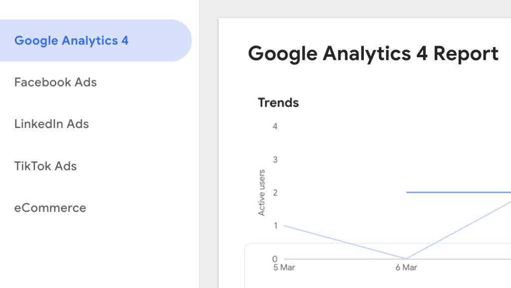
Marketing agencies must show clients what they want: clarity, not clutter. Your team needs a tool to make client reporting easy—without wasting hours doing it manually. Looker Studio (formerly Google Data Studio) offers free custom reporting and integrates easily with other Google tools. But as popular as the platform is, one size rarely fits all. You need to see how Looker Studio works in action to decide if it’s the best fit for your agency.
Whether you’re a marketing analyst, business owner, or just someone who loves data, Looker Studio helps turn raw data into simple dashboards and reports. In this guide, we provide a helpful introduction to Looker Studio: key things to know, common mistakes, and tips to get the most from the platform.
Why Looker Studio?
Why choose Looker Studio over other reporting platforms? Let’s break it down.
- Data visualization – turn raw data into charts, graphs, and maps that tell a story in just a few clicks.
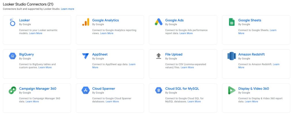
- Data connectivity – connect data from Google Sheets, Google Analytics, Google Ads, and databases directly to your Looker Studio reports.
- Customization – design reports that match your brand and adjust them to fit specific needs.
- Collaboration – share the report with your colleague or client with a single click.
- Free – Looker Studio has a powerful free version that’s perfect for basic reporting needs.
But does it offer enough power for a fast-growing agency—or will you outgrow it? Let’s break it down.
Looker Studio vs. Google Sheets
While both Looker Studio and Google Sheets handle data, marketers often use them for different use cases.
Google Sheets is a great tool, and recent updates have further enhanced its capabilities. For example, new formatting settings let you customize tables and data display. It’s best for the following tasks:
- Basic data entry, calculations, and analysis.
- Budgeting, project tracking, and maintaining simple databases.
Looker Studio, on the other hand, allows users to render data in polished client-facing reports. It’s better for users who want to:
- Visualize data and create interactive reports.
- Easily import data from tools in Google’s ecosystem with a few clicks.
- Import data from another 1,000+ platforms with third-party Looker Studio connectors.
- Create visually appealing and insightful reports not possible with Google Sheets alone.
What is Data Modeling?
Data modeling organizes your data into a clear structure so anyone can easily understand and use it. This step is very important for changing raw data in ways that help people get useful ideas, making analysing and visualizing information much simpler and more effective.
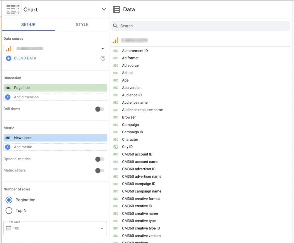
In Looker Studio, data is arranged in fields. These fields fall under two categories: dimensions and metrics.
Dimensions are qualitative attributes, such as Channel, Country, or Product Name, that categorize and label data.
Metrics are quantitative measurements, like Sales Revenue or Quantity Sold, meant for aggregation and analysis.
Keep these fields organized, and your reports will always have accurate and easy-to-analyze data.
Looker Studio’s use of LookML (Looker Modeling Language) is a powerful feature. This language is designed to:
- Describe dimensions, calculations, and data relationships in SQL databases.
- Let users specify how to display data so they can explore data without writing complex SQL queries themselves.
If you’re a beginner and want to learn more about data modeling with Looker Studio, here are some friendly tips to get you started:
- Know your data sources. Before going in deep, become familiar with the data sources you plan to connect. Know what data is available, its format, and how it’s structured.
- Define clear dimensions and metrics. Clearly separate the dimensions and metrics in your data source. Dimensions are your descriptions (like Region or Product Type), while metrics are the numbers you want to analyze (like Total Sales or Average Rating).
- Start with templates. Looker Studio offers many templates that you can use to begin your reports. These templates help you skip the complicated work of data modeling and show you how to organize your reports effectively.
Looker Studio Glossary
Before setting up Looker Studio and building reports, review the most popular terms you might see when exploring the platform.
| Term | Description |
|---|---|
| Data source | The origin of the data you connect to Looker Studio. For example, Google Analytics 4, Google Sheets, or LinkedIn Ads. |
| Report | A collection of charts, tables, and graphs that visualize data from your data sources. |
| Dashboard | An interactive interface that displays multiple reports and visualizations, providing a complete view of your data. |
| Metric | Numbers to group together and analyze. For example, Quantity Sold or Total Sales per Channel. |
| Dimension | Qualitative metrics to describe and categorize data. For example, Origin Country, Product Name, or Channel. |
| Connector | A feature linking your data source to Looker Studio to pull data for reporting. |
| Charts | Visualizations of your data, including tables, graphs, and maps to understand and display information. |
| Filters | A feature that lets you include or exclude certain data in reports based on set criteria. |
| Dashboard | An interactive interface that displays multiple reports and visualizations, providing a complete view of your data. |
Getting Started with Looker Studio
Looker Studio is your home base for building reports that clients love. Setting things up the right way now will save you time later and keep everything organized.
How to Get Started
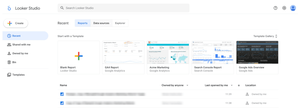
- Go to Looker Studio – Open your browser and go to Looker Studio. This is where all your reports live.
- Sign in with Google – Use your Google account (or one if needed). This keeps access simple and secure.
- Take a quick tour – On the home screen, you can:
- Find recent reports so you’re never hunting for them.
- Check out templates to save time instead of starting from scratch.
- Set up team access so the right people can view or edit reports.
- Find recent reports so you’re never hunting for them.
- Keep things organized from the start – A messy Looker Studio workspace slows you down. Label and sort reports to keep everything running smoothly.
Creating Your First Report
Creating a report in Looker Studio is easier than you think, and once you set it up, you’ll never waste time pulling data manually again.
How to Build a Report (Takes <5 Minutes)
- Pick a template – Start with a ready-made template or go freestyle. Templates make reports look clean without extra effort.
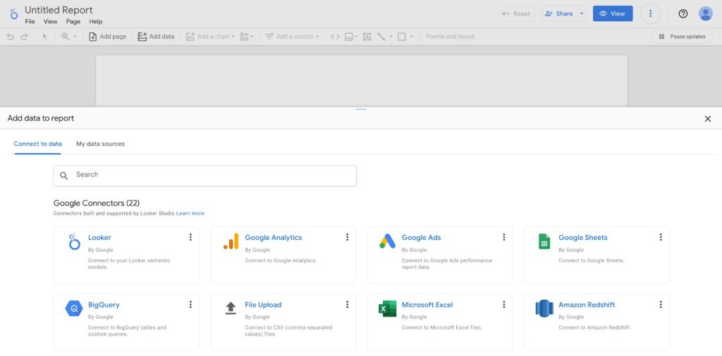
- Link your data – Click “Add Data”, then choose from:
- Google tools like Ads, Analytics, and Search Console.
- Third-party platforms like Facebook Ads, LinkedIn, or HubSpot (some need paid connectors).
- A CSV or Google Sheet if you have offline data.
- Google tools like Ads, Analytics, and Search Console.
- Double-check your data sources – If they’re not set up right, you could end up with missing info or outdated numbers.
- Give Looker Studio permission – This lets your data update automatically, so you don’t have to refresh it manually.
- Customize your report – Drop in charts, key metrics, and filters to highlight what matters most to your client.
- Automate updates – Set Looker Studio to refresh data on its own, so reports stay current without extra work.
- Make it clear and useful – Don’t just dump numbers—highlight key takeaways to give clients insights they can act on.
- Share it – Send a PDF, live link, or embed it on a website, whatever works best for your clients.
Adding Charts and Controls
Charts turn boring numbers into something meaningful to your clients. The right visuals make it easy for them to see what’s working and what’s not.
How to Add Charts and Filters
- Click “Add a Chart” – Pick one from the toolbar. A good chart makes insights pop instead of getting lost in a sea of numbers.
- Choose the right type – Each chart tells a different story. Use:
- Bar charts for trends.
- Pie charts for percentages.
- Tables for detailed breakdowns.
- Drop it into your report – Click anywhere to place it. Keep it where it makes the most sense in your layout.
- Pick the right data – Use the Data tab to select the numbers that matter.
- Make it interactive – Click “Add a Control,” then add a filter (like a date range) so clients can explore the data on their own.
- Tell a clear story – Arrange your charts in a way that guides clients through key insights, making it obvious what they should focus on.
For insights on selecting appropriate visuals, see our Data Visualization Techniques Every Marketer Should Know article.
Styling Your Report
A clean, well-designed report makes you look professional and keeps clients engaged.
How to Make Your Report Look Great
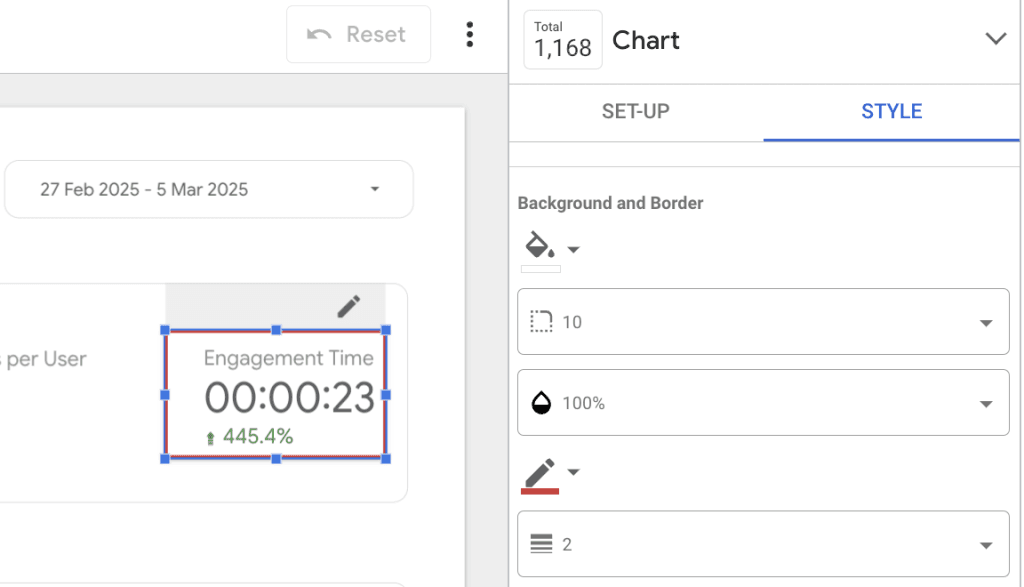
- Click on a chart or widget – You can tweak the design of anything in your report.
- Use the Style tab – Change colors, fonts, and labels to match your agency’s brand. This keeps everything consistent and polished.
- Add extra elements – Drop in shapes, images, or text boxes to call out important points. A little design effort goes a long way.
- Set a theme – Click “Theme” to apply a clean, professional look across the whole report.
- Keep it simple – Too many colors or clutter distracts from the data. A clean layout keeps the focus where it belongs.
- Make sure it’s easy to read – Clients should be able to scan the report quickly and still understand the big picture.
Sharing and Collaborating
Nobody likes messy email chains or outdated reports. Set up sharing the right way to keep everyone on the same page.
How to Share Reports Efficiently
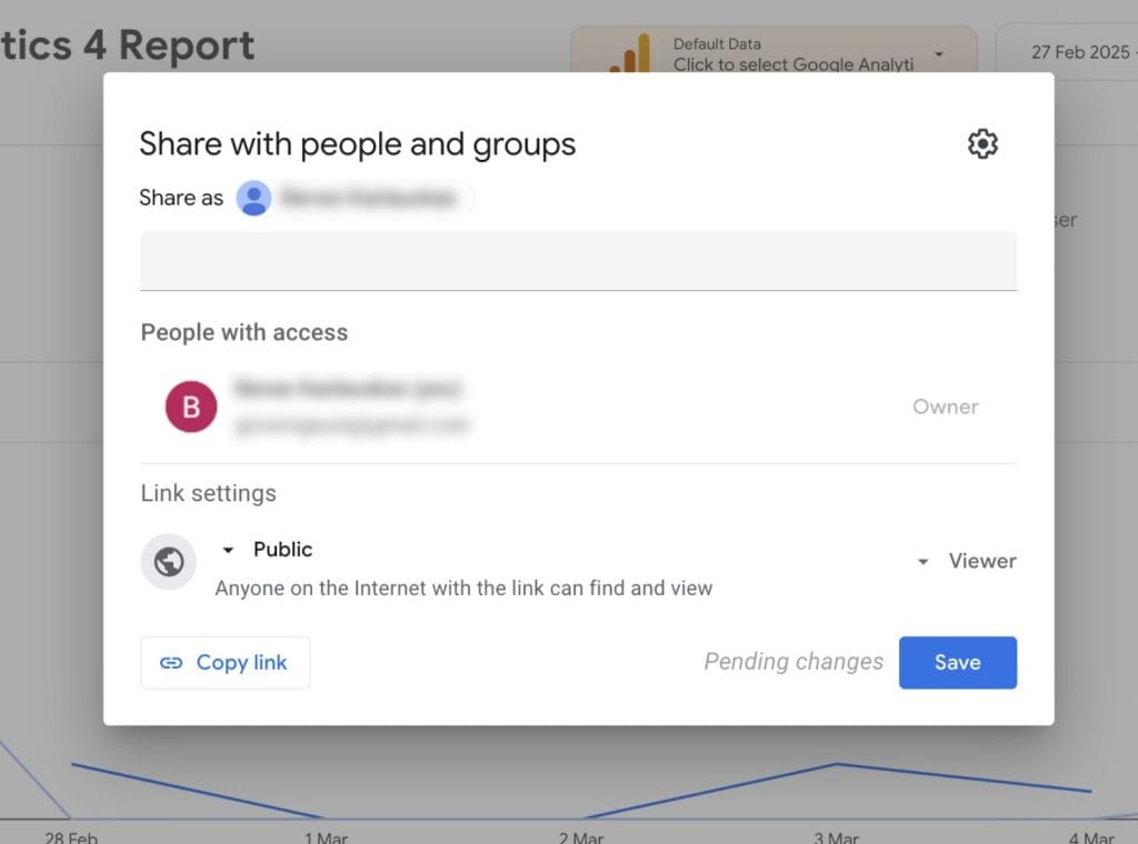
- Click “Share” in the top-right corner.
- Add your team or clients – Enter their emails so they always have access to the latest version.
- Choose who can edit – Give view-only access to clients so they don’t accidentally change anything.
- Automate report deliveries – Schedule emails to send reports automatically, so clients don’t have to ask for updates.
- Send and confirm – Click “Send” and double-check that the right people got it.
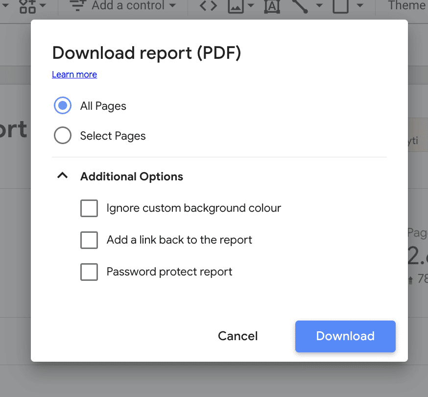
Downloading Reports
Live reports are great for real-time updates, but sometimes you need a PDF or offline copy for a meeting or archive.
How to Download Reports
- Click “Download” in the top-right corner.
- Pick a format – Choose PDF or Google Sheets, depending on how you want to use it.
- Adjust settings – If exporting a PDF, choose page range and background options to make sure everything looks right.
- Save a backup – Keep important reports in Google Drive or your internal system so you can reference them later.
- Send it where it needs to go – Share the file with clients, executives, or whoever needs it.
When you’re report adjustments, remember to save the report regularly. This prevents unsaved changes if the platform crashes or you lose your internet connection.
Best Looker Studio Tips & Tricks
Here are some tips and tricks for beginners to help you master the reporting platform’s essential features.
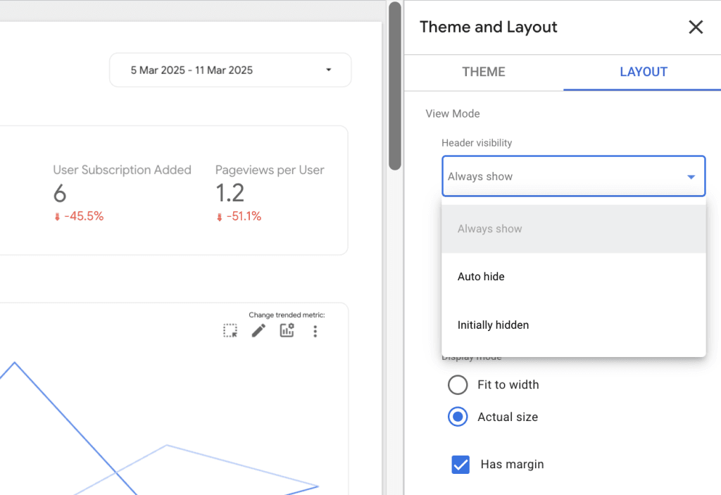
Building a Report
Master report-level components for consistency across your report’s pages.
- Place elements like headers or footers uniformly on every page for a branded look and feel.
- Manage positioning of elements under the Theme & Layout settings.
Establish a clear layout by putting the most important metrics at the top or center of your report, where viewers typically look first.
- Highlight key data points with larger or bolder elements.
- Group related information together with clear separations to create intuitive clusters.
Keep your dashboard clean by including only essential metrics and visualizations.
- Don’t add all channels to a single page.
- For reports with multiple channels, dedicate a separate report tab for each channel.
- You can split pages and rename them by clicking on the Page __ of __ button in the toolbar.
Handling Data
Use Looker Studios’ data connectors, instead of manual data entries, to import data from various sources with one click.
- Automate data sourcing to reduce the risk of human error from manual entry.
- Use pre-built data connectors and third-party integrations form Looker Studio’s data connectors marketplace.
Prepare data by cleaning and structuring it before loading it into Looker Studio.
- Data prep reduces the need for later changes and lowers the risk of errors.
- Use Google Sheets for easy data preparation.
- Enter all data points into tables and perform custom calculations, then connect the source to Looker Studio.
Analyzing Reports
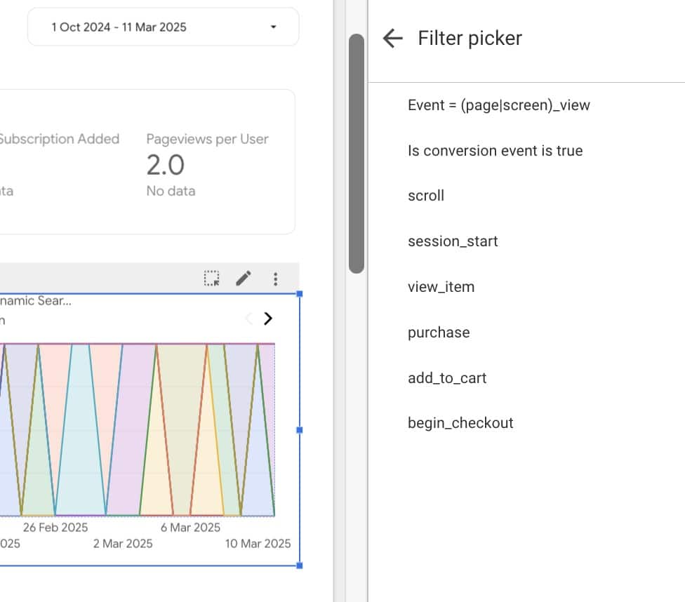
Add interactive filters, like drop-down filters, date range selectors, and clickable drill-downs to reports to gain faster insights from specific data points.
- Add an interactive filter by going to the Setup tab in the Properties panel. Click Add a filter, and choose one to apply.
Use charts as filters to analyze a certain data segment throughout the report.
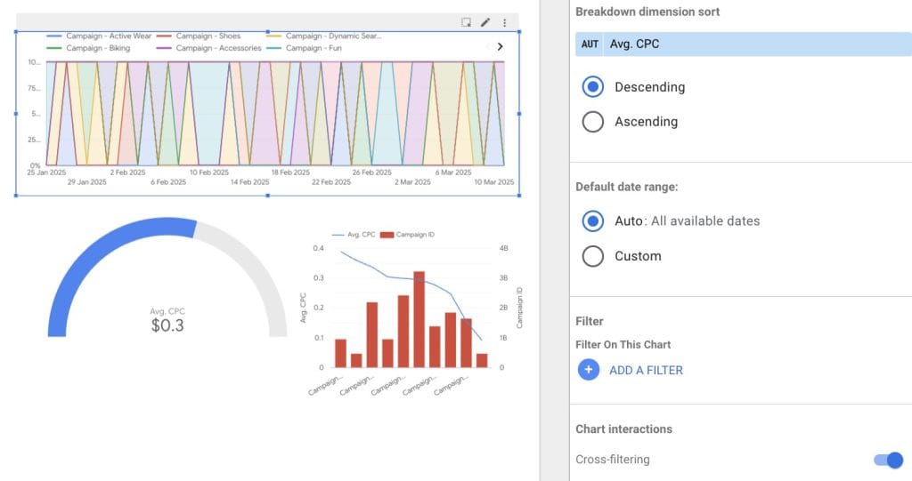
- Simply toggle Cross-filtering in the Charts interaction section of the right-hand panel, under the Data tab.
Looker Studio Limitations
Looker Studio works well for basic data analysis and, with the right setup, can be a powerful tool for small agencies. However, as your needs for advanced data handling and analysis grow, you’ll quickly find that the Looker has some major limitations.
1. Performance Bottlenecks → Reports slow down with large datasets. This can frustrate clients expecting real-time insights.
2. Limited Automation → No built-in scheduling for report delivery. Your team may waste hours manually updating reports.
3. No Predictive Analytics → You’ll need extra tools if clients want advanced forecasting beyond standard KPIs.
4. Third-Party Connectors Cost Extra → Want to pull in Facebook, LinkedIn, or other non-Google data? Expect to pay $20–$350 per connector, per month.
If any of these are a deal breaker, you might want to check out Looker Studio alternatives Swydo and Power BI. Let’s compare the pros and cons of each tool:
| Feature | Looker Studio | Swydo | Power BI |
|---|---|---|---|
| Best for | Small to mid-sized agencies | Agencies needing automation | Enterprise-level data analysis |
| Pricing | Free (Pro at $9/user) | From $69/month | From $10.99/user |
| Ease of Use | Moderate | Easy | Steep learning curve |
| Automation | Limited | Extensive | Advanced but complex |
| White Labeling | No | Yes | Yes |
| Pre-Made Templates | Yes, but basic | Yes, marketing-focused | Yes, but technical |
| Client-Friendly Reports | Moderate | Optimized for agencies | Requires setup |
Key Takeaways:
- Looker Studio is great for basic reporting but lacks deep automation & scalability.
- Swydo is built for agencies, offering white-labeling, automated reports, and 30+ integrations.
- Power BI is a data powerhouse but requires tech expertise.
Common Looker Studio Mistakes (and How to Avoid Them)
With so many buttons in the Looker’s setup, it’s easy to get lost and miss something crucial for your data analysis. To help you avoid wasting hours on community forums, we’ve gathered all of the mistakes even the power users make when building reports in Looker Studio.
Missing or invalid data sources – Make sure your charts connect to valid data sources to avoid errors or missing insights.
Ignoring data refresh – Outdated data leads to bad decisions. Adjust refresh settings to keep reports accurate.
Cluttering dashboards – Too many metrics overwhelm users and slow reports. Focus on key data points for clarity. (For a breakdown of which visualizations work best for different data types, see our How to Choose the Right Data Visualization for Client Reporting guide.)
Unneeded custom calculations – Check if you really need pre-built widgets before creating complex formulas. Custom calculations increase error risks.
Skipping quick fixes – Don’t delete and restart! Many errors can be fixed by refreshing data, reconnecting sources, or disabling browser add-ons.
Troubleshooting Looker Studio Errors
From data source misconfigurations to backend glitches, here are the tips on how to solve the most common errors.
Connection Issues
Errors such as Missing data source, Data set configuration error, or No data set access often happen due to incomplete configurations, expired authorizations, or incorrect data source details.
To fix this, go ahead and refresh the data source fields, reconnect the broken data source, or revoke and restore Looker Studio’s access to your third-party connector.
Chart Configuration Problems
Errors like System error or Invalid combination of metrics and dimensions happen when charts use incompatible fields or configurations.
To solve these errors, refresh fields or reconfigure the chart with valid metrics/dimensions. If this doesn’t help, remove the broken widget or chart and add a new one.
Date Range Error
If you encounter a Missing or invalid date range error, the most likely cause is a bug in Looker’s backend.
You can adjust the date range, refresh fields, or reconnect the data source to fix it.
Broken Interface
Problems like missing UI elements or unresponsive dashboards may result from incompatible browser extensions.
To resolve interface issues, try turning off your browser extensions, switching between browsers, or cleaning your cache.
Best Looker Studio Online Courses
And if you’re ready to take your Looker Studio knowledge to the next level, we recommend taking an online course. Data analysts and Looker’s power users will help you to understand the platform’s advanced features, share best reporting practices, and show you how to make the most out of Looker Studio.
Here’s a list of resources for you to check out:
| Platform | Courses |
|---|---|
| Coursera | Analyzing and Visualizing Data in Looker Studio |
| Coursera | Filtering and Sorting Data in Looker Studio |
| Jellyfish | Looker Studio 1-day course |
| Udemy | Looker Studio Essentials |
| Udemy | Looker Studio Complete Advanced Tutorial |
| Google Cloud | Looker Studio Pro Essentials |
Bottom Line
Should your agency adopt Looker Studio?
It depends. Looking at your specific use case and reporting needs will help you choose the right tool.
When you’re just starting with data analysis, Looker Studio is an easily available tool for building interactive reports. Just as with any tool, you’ll have to learn its ins and outs to make the most of it.
Is ease of use your top priority? Note that Looker Studio may not be the easiest tool to learn. Also, if you manage multiple clients and need automation, you may outgrow it fast.
Need an alternative? Try Swydo—built for agencies, 30+ integrations, and white-label reporting.
Looker Studio Tutorial FAQ
Essential knowledge for creating professional client reports
Start by going to Looker Studio and signing in with your Google account. From the home screen, click “Create” and select either “Report” for a blank canvas or choose a template to jumpstart your design.
When prompted, connect your first data source by selecting from available options like Google Analytics, Google Sheets, or CSV upload. Once connected, you’ll enter the report editor where you can drag and drop visualizations from the “Add a chart” menu. Save frequently as you build your report, and use the “Share” button when you’re ready to give access to team members or clients.
Data sources are the connections to your raw data (like Google Analytics accounts, spreadsheets, or databases). They define which fields are available and how they’re formatted. You create these once and can reuse them across multiple reports.
Reports are the visual presentations built on top of data sources. They contain charts, tables, filters, and text elements arranged on pages. A single report can connect to multiple data sources, and you can share reports with specific people while maintaining separate access permissions for the underlying data sources.
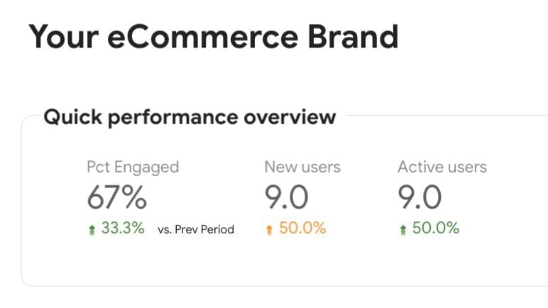
Start with an executive summary page featuring 4-6 key metrics that provide a high-level overview of performance. Use consistent branding with your client’s logo, colors, and fonts throughout the report to create a professional, customized experience.
Create dedicated pages for each marketing channel or focus area with similar layouts for easier navigation. Place the most important metrics at the top of each page where they’ll get immediate attention. Include clear titles and contextual text to explain what the data means and why it matters to your client’s business objectives. Finish with a recommendations section that translates data insights into actionable next steps.
Dimensions are categories that help segment your data (like Country, Device, or Campaign). They appear as blue fields in Looker Studio and are typically used as row headers in tables or as category groupings on charts. Think of dimensions as answering “which one” or “what type” questions.
Metrics are quantitative measurements (like Sessions, Revenue, or Conversion Rate) that appear as green fields. They represent the values you want to analyze and are used for calculations. In practice, you’ll use dimensions to slice your data and metrics to measure performance within those segments. The proper use of dimensions and metrics is fundamental to creating meaningful visualizations.
Looker Studio offers three permission levels: Viewer (can only view the report without making changes), Editor (can make changes to the report design but not the underlying data source), and Owner (has full control over the report).
When sharing with clients, typically use “Viewer” access to prevent accidental changes. For team collaboration, “Editor” access allows colleagues to update visualizations. You can set permissions separately for reports and data sources, meaning someone might be able to see a report but not directly access the underlying data. This is useful when sharing sensitive data through summarized visualizations.
Looker Studio connects to all Google products for free, including Analytics, Ads, Search Console, Sheets, and BigQuery. For non-Google platforms like Facebook, Instagram, LinkedIn, TikTok, HubSpot, and many others, you’ll need third-party connectors that typically cost between $20-$350 per connection monthly.
For budget-friendly options, you can export data to Google Sheets or CSV files as an intermediary step. Looker Studio also supports direct database connections to MySQL, PostgreSQL, and other database types. In total, over 1,000 data sources are accessible through various connector options.
Structure your data as a clean table with clear header names in the first row that will become your dimensions and metrics. Avoid merged cells and keep all data in a single sheet rather than split across tabs. Use consistent date formatting (YYYY-MM-DD) and number formats throughout.
For time-series data, include a complete date column with no gaps. Remove any empty rows or columns, and perform calculations in Sheets rather than in Looker Studio when possible for better performance. After connecting, verify that Looker Studio correctly identified your dimensions (categories) and metrics (numbers) in the data panel.
Use data blending to combine data from separate sources in a single visualization. Click on a chart, select “Blend data” from the Data panel, then add your additional data sources. You’ll need to define join keys (matching fields like Date or Campaign ID) that exist in both data sources to properly align the data.
Alternatively, create separate charts for each data source on the same page. For more complex combinations, consider pre-joining your data in Google Sheets or BigQuery before connecting to Looker Studio, as this approach tends to be more performant than blending within Looker Studio, especially for large datasets.
Click “Add a field” in the data panel, then enter a name and formula for your calculation. You can create simple math (like Revenue – Cost), combine fields (CONCAT(First Name, ” “, Last Name)), or build complex formulas using IF statements and other functions.
For date calculations, use functions like TODATE to convert strings to date objects. For percentage calculations, simply divide one metric by another (Conversions/Sessions) and then format the result as a percentage. Calculated fields can be either dimensions (categorizing data) or metrics (measuring values) depending on what they return.
Yes, Looker Studio refreshes data automatically when someone views a report, but the refresh frequency depends on the data source. Google Analytics data typically updates hourly, while Google Sheets connections refresh whenever the underlying sheet changes.
You can manually refresh data anytime by clicking the “Refresh data” button in the top-right corner. For scheduled refreshes in the background, you’ll need Looker Studio Pro. To keep reports current for clients without them needing to manually refresh, consider setting up automated email deliveries that send the latest version on a regular schedule.
For trends over time (like website traffic or conversions by day/week/month), use line charts. For comparing performance across categories (like channel performance or campaign ROI), horizontal bar charts provide the clearest view. For showing composition and percentages (like traffic sources or audience segments), use pie or donut charts.
To highlight KPIs and important numbers, use scorecard charts with comparison arrows to show change vs. previous periods. For geographic analysis, use geo maps. For detailed exploration, use tables with conditional formatting to highlight important values. Always match your chart type to the specific question you’re trying to answer with the data.
Click “Add a control” from the toolbar and select your filter type (date range, drop-down, checkbox). Configure the control by selecting which dimension it should filter and whether it applies to the current page or the entire report. Place filters at the top of your report for easy access.
Enable more advanced interactivity by turning charts into filters themselves. Select any chart, go to the Data tab, and toggle “Cross-filtering” in the Charts interaction section. This allows users to click on segments within charts to automatically filter the entire dashboard, creating a more dynamic exploration experience.
Start with a cohesive color scheme that matches your client’s brand. Use the theme editor (under the “Theme and layout” menu) to set consistent colors, fonts, and chart styles across the entire report. Use report-level components for headers, navigation, and logos to maintain consistency across pages.
Group related metrics together with clear section headers and add text boxes with context and insights. Use white space strategically—don’t overcrowd pages with too many visualizations. Limit each page to 8-10 charts maximum. For emphasis, use size hierarchy with larger elements for most important metrics and consistent alignment for a clean, professional look.
Select any visualization, then click on a metric in the Data tab and look for the “123” number formatting icon. From there, you can choose formats like currency, percentage, or custom number formats with specific decimal places. For readability, use thousands separators and round to appropriate decimal places (usually 0-2) based on the metric.
For dates, select a date dimension in the Data tab and click the date formatting icon to choose how dates should appear (month/day/year, abbreviated months, etc.). You can also format dates within calculated fields using functions like FORMAT_DATETIME. Consistent formatting across your report significantly improves readability and professionalism.
Yes, click “Insert” from the menu and select “Image” to add logos. You can upload images directly or use image URLs. For consistent branding across all pages, add the logo to a report-level header by going to “Theme and layout” → “Current theme” → “Report header.”
While you can customize colors, fonts, and add logos, you cannot completely remove Google branding from the free version of Looker Studio. For fully white-labeled reports where only your brand appears, you’ll need a third-party solution like Swydo, which starts at $69/month and offers complete white-labeling specifically designed for agencies.
The most common cause is pulling too much data. Limit your date ranges to only what’s necessary—avoid “all time” selections for large datasets. Reduce the number of visualizations per page to under 8-10. Use data sampling or pre-filtered data sources that focus only on relevant segments.
Avoid excessive data blending, which significantly impacts performance. For complex reports, split them into multiple smaller reports organized by topic. If using Google Analytics as a source, create filtered views in GA rather than applying all filters in Looker Studio. For large datasets, consider pre-aggregating data in Google Sheets or BigQuery first.
This error occurs when you’ve selected incompatible fields for a visualization. Time metrics (like Date) can’t be combined with certain non-time dimensions in time-based charts. Some metrics only work with specific dimensions from the same group in your data source.
To troubleshoot, try removing fields one by one to identify the problematic combination. Check if you’re mixing fields from different data sources without proper blending. As a workaround, try a different chart type that supports your desired field combination, or create calculated fields that transform the data into compatible formats.
First, check if your data source connection is still valid—authorizations sometimes expire and need to be reconnected. Go to “Resource” → “Manage added data sources” → click on the three dots next to your data source → “Edit” → “Reconnect.” Verify your date range filter isn’t excluding all data, and that you haven’t applied filters that eliminate all records.
For Google Analytics connections, make sure you’re using the correct view/property. For Google Sheets, check that the structure hasn’t changed and column headers match what Looker Studio expects. If using calculated fields, verify your formulas aren’t resulting in null values. Try refreshing the browser or clearing cache if issues persist.
Check for data type mismatches where you might be mixing text values with numbers. Confirm your aggregation settings—metrics using SUM when they should use AVG (or vice versa) will show incorrect totals. For percentage calculations, make sure you’re using the correct formula (numerator/denominator) and applying percentage formatting afterward.
For date calculations, verify your date formatting is consistent. Complex calculations should be broken down into simpler steps to identify where errors occur. If one calculation depends on another calculated field, check that the first calculation is working correctly. Finally, confirm that your filter context isn’t inadvertently affecting the calculation results.
Verify you’ve shared the report with the exact email address your client uses for Google services. Check if you’ve set appropriate permissions—they need at least “Viewer” access to see the report. If the client sees a message about missing access to the underlying data source, you’ll need to share both the report and the data source separately.
For clients without Google accounts, use the “Anyone with the link” sharing option, which doesn’t require sign-in. Alternatively, schedule email deliveries as PDFs for clients who have difficulty accessing the interactive version. If sharing reports with multiple stakeholders, consider creating a dedicated view-only link to avoid confusion with different permission levels.
Better client reports than Looker Studio.
Start Free Trial