
Agency leaders say reporting plays a critical role in client retention, and point to communication as a key factor in whether clients stay or leave. Your report is your communication. It’s how clients decide if you understand their business and if you’re worth the investment.
This guide covers how reporting works right now in 2026. Every tool price, platform feature, and benchmark has been verified against official sources as of early 2026. Where things have changed, you’ll know what’s current and what’s outdated.
What Marketing Reporting Actually Is and Why Most Agencies Get It Wrong
Marketing reporting is the process of collecting, organizing, and presenting performance data so people can make better decisions. That’s the textbook version. But it misses the point.
Think of it like a doctor visit. Marketing analytics is the lab work—blood tests, MRIs, raw diagnostic data. Marketing reporting is the conversation afterward. A good doctor doesn’t hand you a printout of lab values and say “good luck.” They translate what the numbers mean, explain what’s healthy, flag what needs attention, and lay out a plan. If they skip that conversation—even if the lab work was perfect—they’ve failed you.
Most agencies fail at that exact step. They confuse reporting with analytics, and they confuse dashboards with strategy. The result? Beautifully designed dashboards that nobody reads and clients who feel ignored even though the data is technically available to them.
How Reporting, Analytics, and Business Intelligence Are Different
Marketing analytics is investigative. It’s the work of digging into raw data to find patterns and answer questions like “why did conversion rates drop last Tuesday?” Specialists do this work, and it often happens in tools like GA4, SQL queries, or Python notebooks.
Marketing reporting is presentational. It takes what analytics uncovered and packages it for a specific person—a client, a CMO, a board member. Good reporting is opinionated. It doesn’t just show numbers. It tells you what those numbers mean and what to do about them.
Business intelligence (BI) is the infrastructure underneath both. Data warehouses, transformation pipelines, visualization platforms. BI is the kitchen. Analytics is the recipe development. Reporting is the plated dish that gets served to the table.
BI, Analytics & Reporting Are Not the Same Thing
Understanding the difference stops agencies from treating reports as analytics exercises
Business Intelligence
The infrastructure underneath everything else. Data warehouses, transformation pipelines, and visualization platforms that make analysis possible.
“The kitchen — the equipment, setup, and infrastructure.”
Marketing Analytics
The work of digging into raw data to find patterns. Answering “why did conversion rates drop last Tuesday?” Specialists do this work.
“Recipe development — experimenting to find what works.”
Marketing Reporting
Takes what analytics uncovered and packages it for a specific person. Good reporting is opinionated — it tells you what numbers mean and what to do next.
“The plated dish served to the table — this is what clients pay for.”
Infrastructure enables investigation
Investigation powers presentation
Presentation drives client decisions
Why does this matter for you? Because if your team treats reporting as an analytics exercise, you end up with dashboards full of data that clients never look at. And if you treat it as a BI project, you spend months on infrastructure instead of serving clients.
Why Your Reporting Quality Directly Affects Client Retention
Agency reporting has shifted from backward-looking “proof of work” documents to forward-looking strategic conversations. The agencies that still treat reports as accountability artifacts—“here’s what we did this month”—are losing to agencies that use reports as strategic tools—“here’s what we learned and here’s what we’re doing about it.”
Think about your own clients for a second. They already have access to their Google Ads dashboard. They can log into Meta and see the numbers themselves. What they’re paying you for is the interpretation, the strategy, and the “what’s next” that sits on top of those numbers. If your report doesn’t deliver that, you’re competing with a free dashboard.
Every Type of Marketing Report Your Agency Should Know
There’s no single “marketing report.” The format, depth, and focus should change based on who’s reading it, how often they need it, and what it covers. If you send the same report to a CEO and a channel manager, you’ve already lost both of them.
Match the Report to the Reader
Executive and C-suite reports should be short. One to two pages max, or a single dashboard view. Executives care about business impact—revenue influenced, pipeline generated, cost efficiency, whether marketing is on track to hit quarterly targets. They don’t care about individual ad click-through rates. Use high-level KPIs, trend arrows, and clear summaries. If an executive has to ask “what does this mean?” your report missed the mark.
Marketing leadership reports (VP or Director level) need a balance of strategic and tactical. Performance against goals by channel, what’s working, what isn’t, and how resources are being used. Two to five pages, updated monthly.
Practitioner reports are where the granularity lives. A PPC specialist needs keyword-level performance, quality scores, and auction insights. An SEO specialist needs ranking movements and technical health scores. These are operational tools meant to drive daily decisions, not client-facing documents.
Client-facing agency reports serve a dual purpose. They demonstrate value and they educate clients who may not be marketing experts. The best ones open with a plain-English executive summary, present 5–10 key metrics tied to the client’s business goals, and close with clear next-step recommendations.
When to Report What
Not every metric needs the same frequency. Report too often on slow-moving metrics and you create noise. Report too rarely on fast-moving ones and you miss problems.
Here’s a quick reference for how to think about cadence:
Reference Guide
Reporting Cadence by Use Case
Match your reporting frequency to how fast each metric actually moves
Frequency
Best For
Format & Delivery
Paid media budget pacing, social crisis monitoring, product launch days
Live dashboard with automated alerts and spend thresholds
Google Ads, Meta live dashboardsCampaign pulse checks, content performance, social engagement
One-page summary with brief narrative — under 2 minutes to read
Email or client portalFull-channel performance, goal progress, strategic recommendations
3–5 page report with data and commentary + Loom walkthrough video
Hybrid: email + async videoStrategy review, goal achievement, competitive landscape, next-quarter planning
Live presentation delivered in person or via video call — never just emailed
Slides + live Q&A sessionYear-in-review, long-term trends, brand health, budget planning for next year
Comprehensive deck with executive summary — budget and strategy discussion
Full presentation + written summaryChannel-Specific Reports
Every channel has its own set of relevant metrics. Here are the core reports most agencies should have ready:
- SEO performance – organic traffic trends, keyword ranking movements (branded vs. non-branded), backlink acquisition, Core Web Vitals, and organic conversion rates
- PPC and paid media – spend vs. budget, ROAS or CPA by campaign, impression share, quality scores, creative performance, and search term analysis
- Social media – follower growth, engagement rate by platform, content performance, reach vs. impressions, and social-driven conversions
- Email marketing – open rates, click rates, unsubscribe rates, deliverability, revenue per email, and automation flow performance
- Content marketing – pageviews, time on page, scroll depth, organic entry rates, and content-assisted conversions
The Report Types That Separate Good Agencies from Great Ones
Most agencies only report on digital performance metrics. That’s a huge blind spot. Here are the report types that your competitors probably aren’t producing—and that’s exactly why they’re valuable.
Brand health reports measure how your client’s brand is perceived over time. Aided and unaided awareness, Net Promoter Score, brand sentiment, share of voice vs. competitors. Brand health changes slowly, so quarterly or semi-annual cadence works best. But this is the kind of report that keeps a client with you for years because it shows you care about their business beyond clicks.
Competitive intelligence reports track what competitors are doing—their share of voice, estimated ad spend, content strategy shifts, and product launch activity. How many of your clients would love to get a quarterly report showing exactly how they stack up against their top three competitors? Probably all of them. And almost no agency provides this.
Customer journey and attribution reports show how customers actually move through the funnel across multiple touchpoints. These go beyond single-channel metrics to map the full path from first awareness to purchase, including the messy middle where most models break down.
Marketing mix and incrementality reports answer the hardest question in marketing—which channels are actually driving results, and which are just taking credit? Google’s open-source Meridian MMM tool launched in early 2025 and made this kind of analysis accessible to agencies of all sizes for the first time.
The KPIs and Metrics That Actually Matter
Most reporting guides hand you a giant list of metrics without explaining when or why to use them. A metric without context is just a number. What makes it a KPI is the decision it helps you make.
So before you add any metric to a report, run it through a simple test: can you complete this sentence? “We’re tracking [metric] because it helps us understand [question], which affects [business outcome].” If you can’t finish that sentence, the metric doesn’t belong in the report—even if it looks impressive.
Use a KPI Tree to Stay Focused
A framework called the KPI Tree is one of the most practical ways to organize your metrics. Put one North Star Metric at the top—the single most important measure of marketing success for the business. Then branch down into business KPIs, marketing KPIs, channel KPIs, and campaign KPIs.
Here’s what that looks like for a B2B SaaS company: the North Star is ARR growth. That breaks down into new customer acquisition rate and expansion revenue (business KPIs), which feed from MQLs, SQL conversion rate, and pipeline contribution (marketing KPIs), which connect to organic traffic growth, cost per MQL, and demo requests (channel KPIs). Every metric can trace a clear line back to the business outcome. If it can’t, cut it.
Framework
The KPI Tree
Every metric should trace a clear line back to your North Star
North Star MetricARR Growth
Business KPINew Customer Acquisition Rate
Business KPIExpansion Revenue
Marketing KPIMQLs
Marketing KPISQL Conversion Rate
Marketing KPIPipeline Contribution
ChannelOrganic Traffic Growth
ChannelCost per MQL
ChannelDemo Requests
ChannelEmail CTR
North Star / Business
Marketing KPIs
Channel KPIs
Metrics Grouped by the Question They Answer
Rather than dumping every metric into one list, organize them by what they help you understand. Here’s a breakdown:
| Category | What It Answers | Key Metrics |
| Awareness | Do people know we exist and what do they think of us? | Brand awareness (aided/unaided), share of voice, brand sentiment, NPS |
| Acquisition | Are we reaching the right people and are they showing up? | Sessions, unique users, traffic by source/medium, branded vs. non-branded search split |
| Engagement | Once people arrive, are they interested? | Engagement rate, avg. time on page, scroll depth, pages per session, email CTR |
| Conversion | Are people taking the actions we want? | Conversion rate by channel/device, MQLs, SQLs, lead-to-opp ratio, micro-conversions |
| Revenue/ROI | Is this actually profitable? | ROAS, CPA, CLV, CAC, MER, POAS, pipeline contribution, ROMI |
| Retention | Are customers staying and coming back? | Churn rate, repeat purchase rate, NPS, customer satisfaction (CSAT) |
A few of those revenue metrics might be unfamiliar, so let’s break them down quickly:
- POAS (Profit on Ad Spend) works like ROAS but uses profit margin instead of revenue. For ecommerce brands with variable product margins, this gives a much more honest picture of what’s actually working.
- MER (Marketing Efficiency Ratio) is total revenue divided by total marketing spend. It’s a blended, top-down metric that sidesteps the attribution problem entirely. Think of it as a health check for your overall marketing investment.
- CLV:CAC ratio compares the total revenue expected from a customer over their lifetime against the cost to acquire them. A ratio below 3:1 usually means you’re spending too much to acquire customers who don’t stick around.
New Metrics You Should Pay Attention to Right Now
Three metric categories have gained real traction in the past year, and they’re worth understanding:
Attention metrics got a major boost when the IAB and MRC released standardized attention measurement guidelines. This created an industry framework for measuring whether ads are actually being noticed—not just served. Attention scores go beyond viewability (which only tracks whether an ad appeared on screen) to assess whether a human engaged with it. This is still early, but agencies that start incorporating attention data now will be ahead of most competitors.
Incrementality metrics come from controlled experiments like geo-holdout tests that measure the true causal impact of a campaign. This is different from attribution, which assigns credit but doesn’t prove causation. What would have happened if you hadn’t run that campaign at all? That’s the question incrementality answers.
Predictive metrics are now natively available in GA4—purchase probability, churn probability, and predicted revenue for user segments. These let you shift your reporting from purely backward-looking (“what happened”) to forward-looking (“what’s likely to happen”).
How to Build a Marketing Report from Scratch
You don’t need a template to build a good report. You need a process that starts with the reader and works backward to the data. Here’s how that works in practice.
Step 1 – Start with the Person Who Will Read It
Before you open any analytics platform, answer three questions. Who will read this? What decisions are they trying to make? How much detail do they need? We can call this the “Who, Why, What” framework, and it sounds simple, but most agencies skip it. They go straight to pulling data. The result is a report that’s comprehensive but not useful because it answers questions nobody asked.
Step 2 – Pick KPIs That Trace Back to Business Outcomes
Use the KPI Tree. For every metric in your report, complete that sentence from earlier: “We’re tracking [KPI] because it helps us understand [business question], which affects [business outcome].” The most effective reports resist the urge to show everything. Keep your primary KPIs to 5–10. You can put supporting metrics in the detail sections, but your executive summary should be focused.
Step 3 – Pull Your Data Together Cleanly
For most agencies, data lives across a dozen or more platforms. Google Analytics, Google Ads, Meta, LinkedIn, email tools, CRMs, call tracking. You have three options for bringing that data together:
- Manual export and assembly. Pull CSVs from each platform and combine them in a spreadsheet. This works when you have two or three clients but falls apart fast. Every manual step is a chance for error.
- Data connectors (Supermetrics, Funnel.io, Coupler.io). These tools pull data from platforms and send it to Google Sheets, Looker Studio, or a data warehouse. They automate collection but you still need to build the visualization and narrative.
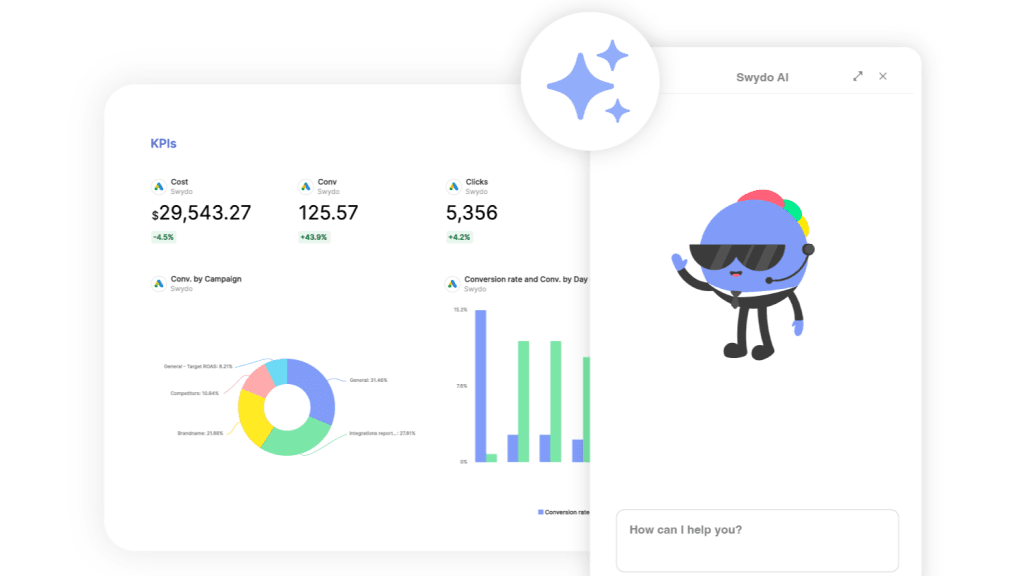
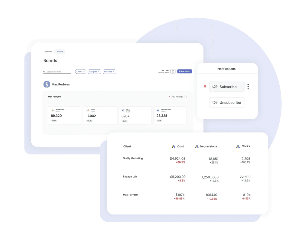
- Dedicated client reporting platforms (Swydo, AgencyAnalytics, DashThis, Whatagraph). These handle collection, visualization, and delivery in one package. They’re built for agencies and typically include white-labeling, scheduling, and client portals.
Whichever approach you choose, data quality starts with governance. That means consistent UTM tagging, standardized campaign naming across platforms, and regular audits to catch broken tracking before it corrupts your reports.
Step 4 – Add Context That Makes Data Mean Something
Raw numbers without context are useless. A 15% traffic increase sounds great until you realize it’s a seasonal spike that happens every year. A 20% conversion drop sounds terrible until you learn a website redesign changed how conversions are tracked.
For every data point, add at least one layer of context. How does it compare to last month or last year? Are you on track against the goal you set? How does it compare to industry benchmarks? Was there an external event—a competitor launch, an algorithm update, a holiday—that explains the trend?
For agencies with international clients, this step also means handling currency conversion consistently and accounting for regional seasonality differences. A campaign that looks like it underperformed might just be a victim of exchange rate fluctuation.
Step 5 – Choose Visuals That Clarify, Not Decorate
Bad visualization misleads people. Good visualization makes the insight obvious. A few rules:
Use line charts for trends over time. Use bar charts to compare categories. Use tables when the reader needs exact numbers. Use gauges or progress bars in executive summaries for instant “on track / off track” signals. Use funnel charts for conversion paths.
Avoid pie charts with more than three categories (they become unreadable) and skip 3D effects entirely (they distort how people perceive values). Research confirms that clean, minimal design consistently outperforms visually complex reports in reader comprehension.
Step 6 – Write the Story, Not Just the Numbers
This is where the doctor analogy comes full circle. The narrative is what separates a report that gets skimmed from one that drives decisions. Every section of your report should answer four things:
- What happened. State the results in plain language. “Organic traffic grew 12% month-over-month to 45,000 sessions.”
- Why it happened. Give the explanation. “Three new blog posts ranked on page one for high-volume keywords, and seasonal search interest in the topic spiked.”
- What you recommend. Turn the insight into action. “Double down on this content cluster next month and test paid amplification for the top posts.”
- What’s next. Set expectations. “Search volume typically dips in March. We’ll offset that with accelerated email campaigns.”
And when the numbers are bad? Don’t bury them. Don’t spin them. Lead with transparency. “This underperformed. Here’s our analysis of why. Here’s what we’re changing.” Your clients will respect honesty far more than spin. Every single time.
Step 7 – Deliver It in a Way That Actually Gets Read
How you deliver the report matters almost as much as what’s in it.
For high-value clients and QBRs, present live. Walk through the report, add verbal context, and answer questions in real time.
For monthly reports, try a hybrid. Send the report with a short Loom video walking through the highlights, then follow up with a live session to discuss questions.
For weekly pulse reports, email or a client portal is fine. These should take less than two minutes to consume.
And regardless of format, ask your clients for feedback quarterly. “Is this report giving you what you need? Anything missing? Anything you’d want more or less of?” That question alone will improve your reports more than any tool upgrade.
How AI Fits Into Your Reporting Process Right Now
Every major reporting platform has shipped AI features in the past 18 months. According to Smartsheet’s 2025 Pulse of Marketing Report, 84% of marketing professionals who use AI save five or more hours per week on average. But saving time only matters if the output is actually useful. So where does AI help and where does it fall short?
Where AI Adds Real Value — and Where It Falls Short
AI saves time, but knowing which 20% still needs a human is where agencies keep their edge
of marketing professionals using AI save 5+ hours per week on reporting tasks
Source: Smartsheet 2025 Pulse of MarketingUse AI for the first 80% — data pulls, anomaly flagging, rough summaries. Spend your time on the last 20%: strategic interpretation, client-specific context, and honest assessment. That 20% is where your agency’s value lives.
Where AI Adds Real Value
Automated data collection. Tools like Supermetrics, Funnel.io, and dedicated reporting platforms can pull data from dozens of sources, normalize it, and prep it for your report with minimal manual work. This is the most mature AI use case and the easiest win.
Anomaly detection. Instead of scanning dashboards yourself for unusual spikes or drops, AI flags significant deviations before your client notices them. GA4’s Analytics Advisor (powered by Gemini, launched December 2025 per Google’s official changelog), Whatagraph IQ, and NinjaCat all offer this.
First-draft narratives. DashThis’s AI Insights, Whatagraph’s Smart Summaries, and TapClicks’ SmartEmail generate written summaries that work as rough starting points. They miss nuance and sometimes overstate significance, but they cut the time from data to first draft significantly.
Where AI Still Falls Short
AI is good at describing what happened in the data. It’s weaker at explaining why, and much weaker at recommending what to do about it.
Three areas where your judgment matters more than any algorithm:
- Budget allocation – AI can suggest shifts based on performance, but it doesn’t know your client’s internal politics, risk tolerance, or priorities beyond the numbers.
- Communicating bad news – how you tell a client their campaign underperformed is a relationship skill. AI-generated narratives tend to either undersell the problem or present it without empathy.
- Strategic recommendations – AI can spot patterns, but the decision to pivot a strategy, kill a campaign, or reallocate budget requires context that lives in your head, not in a dataset.
Use AI for the first 80%—data pulls, anomaly flagging, rough summaries. Then spend your time on the last 20%: strategic interpretation, client-specific context, and honest assessment. That 20% is where your value lives.
15 Reporting Mistakes That Cost Agencies Clients
Every agency makes reporting mistakes. The best ones learn fast. Here are 15 of the most common, organized by category.
Strategic Mistakes
1. Reporting metrics that don’t connect to business outcomes. If your client’s goal is pipeline revenue and your report leads with impressions, you’re answering a question nobody asked.
2. Sending the same report to every stakeholder. The CMO and the paid media manager need completely different information. One master report guarantees nobody gets what they need.
3. Skipping the baseline at onboarding. If you don’t document where performance stands on day one, you can’t credibly show improvement later.
4. Data without recommendations. Every section of your report should include at least one actionable recommendation. Without it, you’re just sending a spreadsheet.
5. Cherry-picking good metrics while the strategy isn’t working. Great CTRs with terrible business results will eventually catch up with you. Clients notice the disconnect.
Data and Technical Mistakes
6. Defaulting to last-click attribution without saying so. Last-click systematically overcredits bottom-funnel channels and undercredits top-funnel ones. At minimum, disclose which model you’re using and explain its limitations.
7. Ignoring data quality. Double-counted conversions, broken UTMs, mismatched date ranges—these silently corrupt reports. Build a monthly audit into your process.
8. Lumping branded and non-branded search together. If 80% of your organic traffic comes from brand name searches, your SEO strategy isn’t really driving discovery. Separate them.
9. Treating correlation as causation. “We posted more on social and sales went up” is correlation, not proof. Report what the data shows, but be honest about what it doesn’t prove.
10. Relying on vanity metrics. Follower counts and raw impression numbers look impressive but mean nothing without context. Pair volume metrics with efficiency and outcome metrics.
Presentation and Communication Mistakes
11. Reports that are too long. A 30-page PDF will not be read. Aim for a one-page executive summary, three to five pages of detail, and an appendix for the curious.
12. Wrong visualization for the data. Pie charts with 12 slices, Y-axes that don’t start at zero, dual-axis charts that imply false correlations—each one chips away at your credibility.
13. Sending reports without any walkthrough. At minimum, record a video. Better yet, schedule a live session. Reports without context get filed, not read.
14. Inconsistent cadence. If you promise monthly reports and then skip months or send them late, you’re telling the client they’re not a priority.
15. Over-automating to the point of losing the human layer. If every report is an untouched auto-generated dashboard with zero commentary, you’re not providing reporting. You’re providing a data feed. Data feeds don’t retain clients.
Key Takeaways
Here’s what matters most from everything above, stripped down to what you can act on this week:
Audit your current reports against the KPI Tree. Open your last client report right now. Can every metric in it trace a direct line back to a business outcome your client cares about? If not, cut it. A focused five-metric report that connects to revenue will always outperform a 30-metric data dump.
Check your tool pricing before you budget. If you’re working off articles from 2024 or early 2025, your numbers are wrong. Databox dropped its free plan. Power BI Pro jumped 40%. Whatagraph restructured entirely. Always verify on the vendor’s site before making decisions.
Add a narrative section to every report you send. If your reports go out with just charts and no written commentary, fix that immediately. Four lines per section: what happened, why, what you recommend, what’s next. That alone will change how clients perceive your work.
Set up a baseline report within 30 days of onboarding every new client. Document where all key metrics stand on day one. Without it, you’ll spend the entire relationship arguing about whether you actually moved the needle.
Use AI for the first draft, not the final one. Let it pull data, flag anomalies, and write rough summaries. Then add the strategic context, client-specific insight, and honest assessment that no algorithm can replicate.
The tools and platforms will keep changing. But the core of good reporting stays the same: know your audience, connect metrics to outcomes, tell the truth about what’s working and what isn’t, and always answer “so what?”
Marketing Reporting FAQ
Direct answers to the questions agencies and marketers actually search for
A marketing report is a document that collects, organizes, and presents performance data so people can make better decisions. The key word is “decisions” — a report isn’t just a data dump. It should tell someone what happened, why it happened, and what to do next.
Think of it like a doctor’s visit. The analytics tools are the lab work. The report is the conversation afterward — translating the numbers into something the reader can act on. A good report is opinionated. It doesn’t just show data; it interprets it.
A dashboard shows live or recent data — it’s a real-time view you check yourself. A report is a curated, narrative-driven document prepared for a specific reader at a specific point in time.
Dashboards answer “what’s happening right now?” Reports answer “what does it mean and what should we do?” Most clients have access to their own Google Ads or Meta dashboards. What they’re paying an agency for is the interpretation on top of those numbers — which is what a report delivers. If your report is just a screenshot of a dashboard with no commentary, it’s not actually a report.
Every good marketing report should have: an executive summary (plain-English overview of what matters most), 5–10 KPIs tied to the client’s actual business goals, context for each metric (vs. last period, vs. goal, vs. benchmark), a clear explanation of what drove the results, and specific recommendations for what to do next.
What it should not include: every metric the platform offers, raw data without explanation, or metrics that can’t be connected to a business outcome. Length should match the audience — one to two pages for executives, three to five pages for a full monthly report.
Match the cadence to how fast the metrics actually move — not to what feels routine.
| Frequency | Best For | Format |
|---|---|---|
| Daily / Live | Paid media budget pacing, crisis monitoring, launches | Live dashboard with automated alerts |
| Weekly | Campaign pulse checks, social and content performance | One-page summary — under 2 minutes to read |
| Monthly | Full-channel performance, goal tracking, recommendations | 3–5 page report + short video walkthrough |
| Quarterly (QBR) | Strategy review, goal achievement, next-quarter planning | Live presentation — never just emailed |
| Annual | Year-in-review, budget planning, long-term trends | Full deck with executive summary |
Reporting too often on slow-moving metrics creates noise. Reporting too rarely on fast-moving ones means you miss problems before clients do.
QBR stands for Quarterly Business Review. It’s a structured meeting — held every quarter — where an agency presents results, reviews progress against goals, and plans the next quarter’s strategy with the client.
A QBR should always be a live conversation, never just an emailed report. The format: a presentation covering what was achieved, what the data showed, competitive landscape, and a concrete plan for the next quarter. It’s one of the highest-value touchpoints in an agency-client relationship and a major factor in long-term retention.
The right KPIs depend entirely on the business goal. Before adding any metric to a report, finish this sentence: “We’re tracking [metric] because it helps us understand [question], which affects [business outcome].” If you can’t complete it, the metric doesn’t belong in the report.
As a starting framework, organize metrics by what they answer:
| Goal | Key Metrics |
|---|---|
| Awareness | Share of voice, brand sentiment, aided/unaided brand awareness, NPS |
| Acquisition | Sessions, traffic by source, branded vs. non-branded search split |
| Engagement | Engagement rate, time on page, scroll depth, email CTR |
| Conversion | Conversion rate by channel, MQLs, SQLs, lead-to-opportunity ratio |
| Revenue / ROI | ROAS, CPA, CLV, CAC, MER, POAS, pipeline contribution |
| Retention | Churn rate, repeat purchase rate, NPS, CSAT |
Keep primary KPIs to 5–10 per report. Supporting data can live in appendices.
ROAS (Return on Ad Spend) is revenue divided by ad spend. It’s the most common metric for measuring paid media efficiency. A ROAS of 4 means you generated $4 in revenue for every $1 spent on ads.
It’s useful but has real limitations. ROAS uses total revenue, which can be misleading for brands with variable product margins — a campaign driving lots of low-margin sales can show strong ROAS while actually losing money. For a more honest picture, consider POAS (Profit on Ad Spend), which uses profit margin instead of revenue. And for overall marketing health, MER (Marketing Efficiency Ratio — total revenue divided by total marketing spend) gives a blended view that sidesteps the attribution problem entirely. Use ROAS for channel-level optimization, POAS when margins vary significantly, and MER for top-line business health.
A CLV:CAC ratio of 3:1 or higher is generally considered healthy — meaning you earn $3 in lifetime revenue for every $1 spent acquiring a customer. Below 3:1 usually signals you’re spending too much to acquire customers who don’t stick around long enough to be profitable.
This ratio is one of the clearest indicators of whether a marketing strategy is actually sustainable, not just generating activity. It belongs in any report where client retention or long-term growth is part of the business conversation.
Yes — always. If 80% of organic traffic comes from people searching the brand name directly, that’s not SEO performance. Those people already knew the company. Non-branded traffic is the real measure of whether SEO is driving discovery and reaching new audiences.
Lumping branded and non-branded together inflates SEO results and hides what’s actually happening. Split them in every organic search report. The same principle applies to paid search — branded campaigns and non-branded campaigns serve completely different purposes and should never be averaged together.
Incrementality measures the true causal impact of a campaign — what would have happened anyway versus what happened because of the marketing. It’s different from attribution, which assigns credit to channels but doesn’t prove those channels actually caused the outcome.
Example: if you ran a retargeting campaign and 500 people converted, attribution gives that campaign credit. Incrementality asks: how many of those 500 people would have bought anyway, even without seeing the ad? The answer is often surprising — and it changes how you allocate budget. Geo-holdout tests (running campaigns in some markets but not others) are the most common way to measure incrementality.
A KPI tree is a framework that organizes metrics into a hierarchy, with one North Star Metric at the top — the single most important measure of marketing success — and supporting metrics branching down from it at the business, marketing, and channel levels.
For a B2B SaaS company, it might look like: North Star = ARR growth → Business KPIs: new customer acquisition rate, expansion revenue → Marketing KPIs: MQLs, SQL conversion rate, pipeline contribution → Channel KPIs: organic traffic growth, cost per MQL, demo requests. Every metric traces a line back to the top. If it can’t, it doesn’t belong in the report. This structure keeps reports focused on what actually matters and makes it easy to explain to clients why you’re tracking what you’re tracking.
Start with the reader — not the data. Before opening any analytics tool, answer: Who reads this? What decisions are they trying to make? How much detail do they need? Most agencies skip this and pull data first, which is why reports end up comprehensive but useless.
The process: (1) Identify your audience and their decisions. (2) Choose 5–10 KPIs that connect to their business goals using the KPI Tree. (3) Pull data from your platforms — manually, via connectors like Supermetrics, or through a dedicated reporting platform. (4) Add context to every metric: comparison to last period, progress toward goal, relevant benchmarks. (5) Choose visuals that make the insight obvious. (6) Write a narrative covering what happened, why, what you recommend, and what comes next. (7) Deliver it in the right format for the relationship — live presentation for QBRs, hybrid report + video for monthly, simple email for weekly.
Use the chart type that makes the insight obvious, not the one that looks impressive. Line charts for trends over time. Bar charts to compare categories. Tables when the reader needs exact numbers. Progress bars or gauges in executive summaries for quick “on track / off track” signals. Funnel charts for conversion paths.
Avoid pie charts with more than three segments — they become unreadable. Never use 3D effects — they distort how people perceive values. Be cautious with dual-axis charts, which can imply false correlations between unrelated metrics. Clean, minimal design consistently outperforms visually complex reports in reader comprehension. If a visual needs an explanation to understand, it isn’t working.
Without a documented baseline — a snapshot of where performance stood on day one — you can’t credibly prove improvement. If you didn’t record what traffic, conversions, or ROAS looked like before you started, any gains you report can be questioned.
Set up a baseline report within 30 days of onboarding every new client. Document all key metrics at that point in time. This protects you from future disputes about whether performance improved, and it gives you a reference point that makes every subsequent report more meaningful. It’s one of the most overlooked steps in agency onboarding.
Raw numbers without context are just numbers. A 15% traffic increase sounds great until you learn it’s a seasonal spike that happens every year. A 20% conversion drop sounds alarming until you learn a site redesign changed how conversions are tracked.
For every metric in your report, add at least one layer of context: How does it compare to last month or last year? Are you on track against the stated goal? How does it compare to industry benchmarks? Was there an external event — algorithm update, competitor launch, seasonal shift — that explains the trend? That context is what transforms data into insight and insight into something worth paying for.
Last-click attribution gives 100% of the credit for a conversion to the final touchpoint before purchase — usually a branded search or direct visit. This systematically overcredits bottom-funnel channels (like retargeting) and undercredits top-funnel channels (like display or social) that built awareness earlier in the journey.
The result: agencies that rely on last-click attribution tend to overinvest in retargeting and underinvest in awareness channels, then wonder why growth plateaus. At minimum, disclose which attribution model you’re using in every report and explain its limitations. Comparing multiple models — or using incrementality testing — gives a more accurate picture of what’s actually driving results.
The format should match the relationship and the stakes. For QBRs and high-value clients, present live — walk through the report, add verbal context, answer questions in real time. A report emailed without any discussion is a missed opportunity.
For monthly reports, a hybrid approach works well: send the report alongside a short Loom video walking through the key highlights, then schedule a follow-up call for questions. For weekly pulse reports, email or a client portal is fine — these should take less than two minutes to consume. And ask clients quarterly whether the report is giving them what they need. That single question will improve your reports more than any tool upgrade.
Lead with honesty, not spin. State clearly what underperformed. Give your analysis of why. Explain specifically what you’re changing. Set expectations for what comes next. That’s the complete structure — no burying, no pivoting to good metrics to distract from the bad ones.
Clients don’t lose trust when results are bad. They lose trust when they feel misled or kept in the dark. An agency that proactively reports a problem and shows up with a plan is far more likely to keep the client than one that hides the numbers or spins them. Transparency about failure, paired with a clear response, is one of the most powerful retention tools an agency has.
More than most agencies realize. Agency leaders consistently identify communication — and reporting is your primary communication channel — as the top factor in whether clients stay or leave.
Clients who don’t understand the value of what they’re paying for will eventually stop paying for it. Your report is how they decide whether you understand their business and whether you’re worth the investment. Reports that function as “proof of work” (here’s what we did this month) lose to reports that function as strategic conversations (here’s what we learned and here’s what we’re doing about it). The agencies that retain clients long-term are almost always the ones with the strongest reporting — not necessarily the strongest campaigns.
Short, outcome-focused, and clear. Executives care about business impact: revenue influenced, pipeline generated, cost efficiency, whether marketing is on track to hit quarterly targets. They do not care about individual ad click-through rates, keyword rankings, or follower counts.
One to two pages maximum — or a single dashboard view. Use high-level KPIs, trend indicators, and a plain-English executive summary. The test: if an executive has to ask “what does this mean?”, the report missed the mark. Every number in an executive-level report should connect directly to a business outcome they care about.
Four report types that most agencies don’t produce — and that clients would find genuinely valuable:
Brand health reports — tracking aided and unaided brand awareness, NPS, sentiment, and share of voice over time. This shows you care about the business beyond clicks, and it’s the kind of long-term visibility that keeps clients for years.
Competitive intelligence reports — showing how the client stacks up against their top competitors in share of voice, estimated ad spend, and content positioning. Almost no agency provides this systematically, and almost every client would love to receive it quarterly.
Customer journey reports — mapping the full path from first awareness to purchase across all touchpoints, not just the last click.
Marketing mix / incrementality reports — answering which channels are actually driving results versus just taking credit. These used to require expensive consultants; accessible open-source tools have made them viable for agencies of any size.
Three main approaches, depending on your scale and budget:
Manual (spreadsheets + CSVs): Works for one to three clients. Every manual step is an error risk and a time drain. Not scalable.
Data connectors (Supermetrics, Funnel.io, Coupler.io): Automate data collection into Google Sheets or Looker Studio. You still build the visualization and narrative on top, but the data pull is hands-off.
Dedicated reporting platforms (Swydo, AgencyAnalytics, DashThis, Whatagraph): Handle collection, visualization, and delivery in one package. Built for agencies — typically include white-labeling, scheduled delivery, and client portals. Best for agencies managing five or more clients who want consistent, professional output without rebuilding everything manually each month.
AI is making the mechanical parts of reporting faster — data collection, anomaly detection, and first-draft narrative generation. These are real time savings, and most major reporting platforms have now shipped AI features to handle them.
What AI hasn’t changed: the parts that actually retain clients. Explaining why something happened (not just what happened). Making budget recommendations that account for client politics and risk tolerance. Communicating bad news with the right tone. Providing strategic recommendations that require knowing the client’s full context. Use AI to handle the first 80% of the process — data pulls, flagging unusual changes, rough summaries. Spend your time on the last 20%, which is where your agency’s value actually lives.
AI can write a solid first draft — describing what the data shows, flagging notable changes, and generating a basic narrative summary. Tools like DashThis AI Insights, Whatagraph Smart Summaries, and TapClicks SmartEmail do this reasonably well and save meaningful time.
What an AI-generated report will miss: the strategic interpretation specific to your client’s situation, the honest assessment of what isn’t working and why, and the judgment calls that require knowing the client’s business beyond their data. A report that goes out unedited from an AI tool is a data feed with formatting — not a strategic document. Clients notice the difference, and over-automating to the point of removing the human layer is one of the fastest ways to erode the perceived value of your reporting.
UTM parameters are tags added to URLs that tell analytics platforms where a visitor came from — the source (Google, Facebook), medium (email, cpc), and campaign name. Without them, much of your traffic shows up as “direct” or “unattributed,” making it impossible to tell which marketing activities drove results.
Inconsistent UTM tagging is one of the most common causes of bad reporting data. If one campaign uses “Facebook” as the source and another uses “facebook” (lowercase), they appear as separate channels in GA4. Establishing a naming convention — and enforcing it across all campaigns — is basic data hygiene that every agency should have locked down before they report on anything. A monthly audit to catch broken or inconsistent tags should be a standard part of any agency’s reporting process.
Predictive metrics use past behavior data to forecast future outcomes. Rather than only reporting on what already happened, they help you anticipate what’s likely to happen next — and act before it does.
GA4 now natively includes predictive metrics like purchase probability, churn probability, and predicted revenue for user segments. This lets you build audiences around users who are likely to convert (or likely to churn) and report on leading indicators rather than just lagging ones. Adding a forward-looking section to your monthly reports — “here’s what the data suggests is coming” — is a meaningful upgrade that shifts the client conversation from accountability to strategy.
Your clients already have access to their dashboards. What they’re paying you for is the report on top of it — give them one worth keeping.
Start Your Free Trial Today