
Discrete data is counted, and continuous data is measured. Discrete data answers how many: clicks, sign-ups, purchases. Continuous data answers how much: ad spend, time on page, conversion rate.
Picture a glass of ice water.
The number of ice cubes is discrete: you can have five or six, never 5.5. The water is continuous: you can have 8 ounces, 8.1, or 8.15, splitting it as finely as your measuring tool allows. That single image holds the whole distinction. Once it clicks, the rest is just knowing where each metric fits.
Why should an agency care? Because the type of data you’re looking at decides which chart tells the truth, which math is valid, and which story you hand your client.
Treat a count like a measurement, and your “average” hides the campaign that actually worked. Treat a measurement like a count, and your trend line turns into a staircase that flattens real movement.
The two data types do different jobs. The best reporting pairs them on purpose.
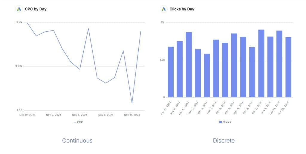
This guide covers what each type is, the marketing metrics that fall into each bucket, the charts that fit, the four levels of measurement that sit underneath both, and the mistakes that quietly wreck an analysis. There’s a quick test you can run on any metric, and an FAQ that answers the questions people actually type into a search bar.
| Discrete data | Continuous data |
|---|---|---|
In one word | Counted | Measured |
Answers | How many? | How much? How long? |
Values | Separate, with gaps between them (often whole numbers) | Any value in a range, including decimals |
Marketing examples | Clicks, sign-ups, purchases, downloads, form fills | Ad spend, time on page, conversion rate, CPC, session duration |
Fits these charts | Bar, column, pie, donut | Line, spline, area, bubble |
The test | Can you land on a value between two points? No. | Can you land on a value between two points? Yes. |
What Is Discrete Data?
Discrete data is made up of separate, countable values with gaps between them. You count it in whole steps, with nothing in between. Clicks, sales, sign-ups, and downloads are all discrete.
Each data point is a clean, whole event: someone clicked or they didn’t, they bought or they didn’t. There’s no such thing as 2.5 purchases or 3.7 email opens.
A common myth is that discrete data is always finite. It isn’t. Discrete values can be finite (the 12 ad variants in a test) or countably infinite (the number of times a page could be refreshed, which has no ceiling). What makes data discrete isn’t a hard limit. It’s the gap. Nothing exists between one click and two clicks.
Here’s a subtlety that trips people up: a discrete metric can still produce a fractional average. You can’t have 2.2 form fills from one visitor, but “2.2 form fills per visit” across a hundred visits is a perfectly normal continuous summary of discrete counts.
The raw events are discrete. The average is a measurement. Keep that straight and you’ll dodge a lot of bad chart choices.
Discrete metrics you’ll report on every week:
- Ad clicks and CTA clicks
- Conversions and purchases from a campaign
- Newsletter sign-ups and form submissions
- Downloads of a guide or gated asset
- Social interactions (likes, comments, shares)
- New customers acquired per campaign
These are the events that tell you what happened and how often. They’re the backbone of any marketing KPIs clients care about conversation, because a client understands “47 new leads” instantly.
How to Visualize Discrete Data
Discrete data belongs in charts that compare separate categories or counts side by side: bar charts, column charts, and pie or donut charts. The shape of the chart matches the shape of the data: distinct bars for distinct things.
Here’s which to reach for:
- Bar chart: compare a metric across channels at a glance. Click-through counts across Google, Meta, and LinkedIn, sorted highest to lowest.
- Column chart: track a count over time. Newsletter sign-ups month by month, where a spike in one column points straight to the promotion that caused it.
- Pie or donut chart: show the share of a whole. What percent of leads came from each referral source.
In Swydo, you pick the shape from the widget settings sidebar. Drop in a Column chart widget, point it at your sign-up metric, set the dimension to month, and the spikes show up without you touching a spreadsheet.

Sidenote. Pie charts get a bad reputation, and often deserve it. Past four or five slices, nobody can compare the wedges. If you’ve got more than five categories, a bar chart reads cleaner. For more on matching the chart to the job, see how to choose the right data visualization.
What Is Continuous Data?
Continuous data can take any value within a range, including fractions and decimals, and the precision is limited only by your measuring tool. Ad spend, time on page, session duration, and conversion rate are all continuous.
Between any two values there’s always another: $4.50 and $4.51 have $4.505 sitting between them, and so on, as far down as you want to go.
Continuous data captures gradual change. It’s how you see a trend build, a curve bend, or a rate drift over a quarter. Where discrete data gives you the count of events, continuous data gives you the texture: the slow climb in average order value, the creep in cost per click, the dip in time on page after a redesign.
One honest wrinkle worth knowing: some metrics marketers call “continuous” are really bounded proportions. Conversion rate, click-through rate, and bounce rate are ratios that can only live between 0% and 100%.
For day-to-day reporting, treating them as continuous is fine and standard. You’ll chart them on a line and nobody blinks. But they don’t behave like truly open-ended measurements such as revenue or time, and that matters the moment you start modeling them (more on that in the mistakes section below).
Continuous metrics you’ll see constantly:
- Ad spend over a campaign’s life
- Cost per click (CPC) and cost per acquisition
- Conversion rate and click-through rate
- Session duration and time on individual pages
- Revenue growth and average order value
- Customer lifetime value (CLV)
How to Visualize Continuous Data
Continuous data belongs in charts that connect values over a range: line charts, spline charts, and area charts for trends, and bubble charts for the relationship between two measures. The unbroken line is the point: it shows movement a row of separate bars can’t.
Here’s which to reach for:
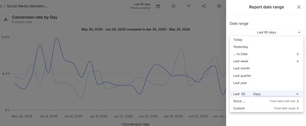
- Line or spline chart: the workhorse for anything over time. Revenue by week, conversion rate across 90 days, CPC month over month. Plot several lines together and correlations jump out, like a lift that lines up with the week you launched a new landing page.
- Bubble chart: for the relationship between two continuous variables. Put ad spend on one axis and conversion rate on the other, each bubble a campaign, and you can see at a glance whether spending more actually buys better results.
In Swydo, a Line chart widget handles the trends, and the Bubble Chart widget covers the spend-versus-performance view. Toggle the X-axis, Y-axis, grid lines, and legend right from the widget so the chart reads the way your client needs it to.
A quick note on histograms, since most statistics guides bring them up here. A histogram shows how often a continuous measure falls into ranges: how many sessions lasted 0–30 seconds, 30–60, and so on. It’s a useful way to spot whether most users bail fast or stick around.
Swydo focuses on the views agencies report on most: line, spline, area, and bubble charts. There’s no dedicated histogram widget, so if a distribution view is central to one client, that’s the place to pair a general BI tool with your reporting. For everything else, the trend charts do the work.
There are more marketing data visualizations out there than any single tool ships, and the right pick always comes back to the data type behind it.
A Quick Test for Any Metric
When you’re not sure which bucket a metric falls into, run one question: can it land on a value between two points? If no, it’s discrete. If yes, it’s continuous. The test below walks you through it.
Question 1 of 3
Can you count individual instances of it?
For example: clicks, purchases, sign-ups.
Question 2 of 3
Are those counts whole numbers, with nothing in between?
For example: 1, 2, 3, never 2.5.
Question 3 of 3
Can it take any value in a range, including decimals?
For example: time, revenue, conversion rate.
Discrete
Your metric is discrete.
It’s counted in separate, whole units. Reach for a bar, column, or pie chart, and summarize it with totals and counts.
Continuous
Your metric is continuous.
It’s measured on a scale and can take any value in a range. Reach for a line, spline, or area chart, and watch the trend over time.
The test works because it catches the gap. A metric that only lands on whole numbers has gaps, so it’s discrete. A metric that can sit anywhere on a scale has none, so it’s continuous.
The Four Levels of Measurement
Discrete and continuous describe how a value behaves, but there’s a second layer underneath every metric: its level of measurement. Statisticians sort data into four levels (nominal, ordinal, interval, and ratio), and knowing them tells you which summaries and math actually hold up.
First, the bigger split. You may already know it as qualitative vs quantitative data. All data is either qualitative (categories and labels) or quantitative (numbers you can do arithmetic on). Discrete and continuous both live under the quantitative branch. The four levels then add detail:
- Nominal: named categories with no order. Traffic source (organic, paid, email). You can count how many fall in each, but “average traffic source” is meaningless.
- Ordinal: categories with a rank, but uneven gaps. Customer satisfaction rated “poor, fair, good.” You know good beats fair, but not by how much.
- Interval: numbers with even gaps but no true zero. Temperature is the classic case; in marketing it’s rarer.
- Ratio: numbers with even gaps and a true zero, so ratios make sense. Revenue, clicks, time, and spend are all ratio data. Zero revenue means none, and $200 is exactly twice $100.
Most marketing metrics are ratio data. And here’s the tie-back: ratio data can be discrete (clicks and purchases, counted) or continuous (revenue and time, measured).
The level of measurement and the discrete/continuous split are two different lenses on the same number. Together, they tell you exactly how far you can push your analysis.
Why the Difference Matters for Your Reporting
The discrete-versus-continuous split decides which insights are valid, and getting it right is what separates a report that drives a decision from one that just fills a slide.
Discrete data shows you the events, the countable proof that something happened. Continuous data shows you the movement, the trend that tells you whether it’s working. You need both to act with any confidence.
Take a real pattern. You analyze website traffic and notice a steady climb in daily visitors over a month. That climb is continuous data, and on its own it only tells you something changed.
To learn why, you drop to discrete data (campaign click counts) and find the specific ad driving the lift. The continuous trend flagged the movement; the discrete count named the cause. Look at either alone and you’re guessing.
How Each Type Shapes Decisions
Discrete and continuous data answer different questions, so a strong decision usually leans on one of each. Here’s how that played out for a PR agency promoting a single blog article.
They tested two email styles (teasers that hinted at the article, and “spoilers” that gave away the punchline) and watched both data types.
The continuous data told the trend story. Spoiler emails drove a visible jump in website traffic and longer average session durations. Teaser emails did the opposite: less traffic, shorter visits.
The discrete data told the event story. Spoiler emails earned a higher click count, more arrivals on the site, and more newsletter sign-ups, each one a countable win.
Continuous data showed traffic surged. Discrete data showed why. The agency backed the spoiler strategy because both lenses pointed the same way, and that agreement is what made the call easy to defend to the client.
This is exactly where a monitoring layer earns its keep. In Swydo, you can set a Goal on a continuous pacing target (say, a monthly conversion-rate threshold) and watch it sit at On Track, Off Track, or Achieved as the month moves.
Pair it with an Alert on a discrete count, like conversions dropping below a set number over a 7-day window, and you find out the moment an event-level problem shows up instead of at the next reporting cycle.
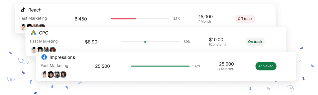
Targets and alerts like these are easiest to manage when you set up a marketing analytics dashboard once and reuse it across clients.
How to Combine Discrete and Continuous Data
The real payoff comes from pairing the two types in one view, and the cleanest way to think about it is the Count and Curve method. Every metric you report is either a Count (a discrete event total) or a Curve (a continuous trend).
On its own, each is half a story. Put a Count next to its Curve and the picture snaps into focus: the Count tells you what happened, the Curve tells you where it’s heading.
Run paid social for a coffee subscription brand and the method is obvious in practice. Conversions are your Count: 240 sign-ups this month, a clean discrete number. Cost per acquisition is your Curve, drifting from $18 to $24 over the same weeks.
Either number alone could mislead. The 240 looks like a win until the Curve shows you paid more for each one. Together, they tell you efficiency is slipping even as volume holds. That’s a decision you can act on today.
The catch is that blending marketing data by hand is slow and error-prone, especially across platforms that each label things their own way. This is where Combined Data Sources does the heavy lifting.
Blend up to five ad platforms (Google Ads, Meta, LinkedIn, TikTok, and more) into a single widget, and report Counts and Curves side by side. Clicks, Impressions, Conversions, and Purchases (your discrete totals) sit right next to Cost, CPC, CTR, and ROAS (your continuous measures).
It works across reports and your monitoring boards too, so the same blended view drives both the client deliverable and your internal checks.
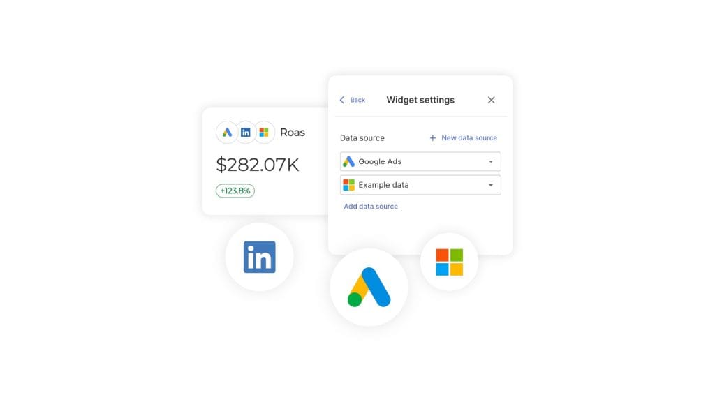
Want to build this on your own accounts? The flat rate includes 10 data sources, which covers most agencies’ first handful of clients, and unlimited seats mean your whole team can log in without per-user fees.
Sidenote. One thing to know up front: custom metrics don’t currently work inside combined widgets. If you need a custom blended metric (say, a margin-adjusted ROAS), build it as a Manual KPI sitting alongside the combined widget. It’s an extra step, not a wall, and it keeps the blended view honest.
The Count and Curve method shows up in three jobs agencies run constantly.
Refine the User Experience
Pair discrete traits with continuous behavior and you can personalize what a user sees. A travel booking platform might hold discrete data on each visitor, like age group, past destination types, and booking style (solo, family, couple), then read it against continuous signals like time on a destination page and scroll depth.
When users in their late 20s linger on adventure-travel pages far longer than any other category, that’s a discrete segment crossed with a continuous engagement measure. It’s a clear cue to surface more adventure trips to that group.
Sharpen Your Content Strategy
Discrete content attributes plus continuous engagement metrics tell you what’s actually landing. A beginner tutorial (discrete: format and topic) might pull a high click-through rate but a low time on page (continuous). That gap usually means a mismatch: people expected something the piece didn’t deliver. The fix is to adjust the depth or tone, and the same read applies across your content marketing KPIs and social posts.
Improve Conversion Paths
Pair discrete path attributes with your continuous conversion metrics and you can see where to put budget. If one ad format (discrete: the format) drives a higher conversion rate (continuous) than the rest, that’s your signal to shift spend toward it. A/B tests sharpen the same way. Compare which CTA leads to faster conversions, and you’re optimizing on proven movement instead of a hunch. When you’re weighing efficiency, it helps to be clear on ROAS vs ROI, since the two answer different questions.
Where Your Data Comes From Now
The discrete events and continuous measures in your reports increasingly come from first-party and platform-reported sources rather than cross-site tracking.
After years of back-and-forth, Google confirmed it will keep third-party cookies in Chrome rather than phasing them out. But the direction of travel hasn’t reversed. Safari and Firefox still block them by default, and most agencies now build reporting on first-party data, the platforms’ own APIs, and measurement that counts groups instead of individuals.
For your reports, the data types don’t change. A conversion is still a discrete count whether it comes from a cookie or a server-side event; spend is still a continuous measure.
What changes is the plumbing. When you pull Counts and Curves straight from each platform’s API (the way GA4 metrics and your ad accounts feed a reporting tool), you sidestep the tracking gaps that trip up older setups.
And as buyers start arriving from AI search, it’s worth learning to track AI traffic in GA4 so those discrete sessions show up in the right bucket.
Common Mistakes Marketers Make With Data Types
Most data-type errors come from treating a count like a measurement or the reverse, and they quietly bend an analysis until the conclusion is wrong. Four show up again and again.
Averaging discrete events into mush. Roll up event registrations across five different promotions into one average, and you’ve buried the one promotion that actually worked. The average looks tidy and tells you nothing about which campaign to repeat. Keep discrete counts broken out by source when the source is the thing you’re deciding on.
Rounding away real signal in continuous data. Continuous metrics carry precision for a reason. Round average time on page from 1:47 down to “about 2 minutes” and a content problem can vanish into the rounding. Small continuous shifts are often the early warning, so report them precisely.
Running the wrong model on a count. This one’s subtle and worth getting right. When you use regression to see how ad spend (continuous) affects conversions, the outcome type changes which model is valid.
If conversions are a count, ordinary linear regression can spit out nonsense like negative or fractional predictions. A Poisson or negative-binomial model fits counts properly. If the outcome is binary (converted or not), logistic regression is the tool.
Same idea for those bounded proportions from earlier. Conversion rate and CTR sit between 0 and 1, so they’re modeled with logistic or beta methods, not plain straight-line regression. You can leave this math to a stats tool. The thing to remember is that predicting conversions from spend isn’t always a simple straight line.
Bending the presentation. Selectively showing data or massaging a continuous metric to flatter a result misleads the client and eventually misleads you. A report that survives scrutiny is worth more than one that looks good for a week.
You avoid most of these traps just by knowing they exist. The rest comes down to a reporting setup that pulls clean numbers so you’re not hand-editing your way into errors. That’s the whole case for a data-driven marketing agency approach in the first place.
Discrete vs Continuous Data FAQ
Direct answers to the questions marketers actually ask about counts and curves
Discrete data is counted; continuous data is measured. Discrete data lands on separate, whole values with gaps between them (5 sign-ups, never 5.5). Continuous data can take any value in a range, decimals included (a 3.74% conversion rate, $812.40 in spend). The quick test: if you can find a valid value sitting between two points, it’s continuous. If you can’t, it’s discrete.
Think of a glass of ice water. The number of ice cubes is discrete (5 or 6, never 5.5); the amount of water is continuous (8oz, 8.1oz, 8.15oz). Same glass, two kinds of number.
Discrete data is data you count in whole, separate units with nothing in between. You can have 1, 2, or 3 sales, but never 2.5. It answers “how many?”—clicks, sign-ups, purchases, downloads, form fills. Each value is a clean event: it happened or it didn’t.
A common myth is that discrete data has to be finite. It doesn’t. The number of times a page could be refreshed has no ceiling, yet it’s still discrete, because there’s always a gap between one refresh and two. The gap is what makes data discrete, not the limit.
Continuous data is data you measure on a scale, and it can take any value in a range, decimals and all. Ad spend, time on page, session duration, and conversion rate are continuous. It answers “how much?” or “how long?”, and between any two values there’s always another one.
Continuous data is how you see change happen—the slow climb in average order value, the creep in cost per click, the dip in time on page after a redesign. Where a count tells you an event happened, a measurement tells you which direction it’s moving.
A discrete variable holds counted values with gaps between them (number of purchases); a continuous variable holds measured values on an unbroken scale (revenue, time). “Variable” and “data” point at the same split here—a variable is just the field you’re recording, and whether it’s discrete or continuous comes down to whether its values can sit between two points.
The same field can flip depending on how you record it. Log a visit as “3 minutes” and the variable is discrete. Log it as “3.45 minutes” and it’s continuous.
Ask one question: can the metric land on a value between two points? If no, it’s discrete. If yes, it’s continuous. Sign-ups come in whole numbers (4 or 5, never 4.5), so they’re discrete. Session duration can be anything, so it’s continuous.
A faster shortcut is to listen to the words. “How many” points to discrete; “how much” or “how long” points to continuous. That one question handles almost every metric you’ll meet in a report.
Conversion rate is continuous. It’s built from two counts (conversions divided by visitors), but the result is a rate that can be 3.75% or 3.76%, with values in between—so you chart it on a line like any other measured metric.
One nuance worth knowing: it’s a bounded proportion, capped at 0% and 100%, so it doesn’t behave like an open-ended measure such as revenue. That never matters for charting. It does matter if you start modeling it, where it calls for proportion-aware methods instead of plain linear regression.
Website visitors are discrete. You count whole people—10, 345, or 1,027—and there’s no such thing as 345.5 visitors. Visitor counts are a textbook “how many” metric.
Switch to visitors per hour or a growth rate, though, and that derived number becomes continuous, because a rate can take fractional values. Same underlying event, counted one way and measured another.
Revenue is continuous in every way that matters for reporting. It’s a measured amount you chart on a trend line, and it moves in fine gradations. Strictly, money has a smallest unit (one cent), which makes it technically discrete—but the steps are so small that everyone treats and charts it as continuous.
Revenue is also the cleanest example of ratio data: it has a true zero (zero revenue means none) and the ratios hold ($200 is exactly twice $100). That’s why averages, growth rates, and percentage comparisons all work on it.
Time is continuous. It can take any value on a scale—3 minutes, 3.45 minutes, 3.451 minutes—limited only by how precisely you measure it. Session duration, time on page, and load time are all continuous.
You can choose to record time as discrete, though, by rounding to whole minutes or counting “sessions over 5 minutes.” That’s a reporting decision, not a property of time itself, and it changes which charts and math apply.
Age is technically continuous—you have an exact age down to the second—but in marketing it’s almost always treated as discrete, because you record it in whole years. In practice, it behaves like a count in your reports.
Age groups (18–24, 25–34) are a different thing again. Those are ordinal categories—ranked buckets—not continuous data. So when a report shows “age demographics,” you’re usually looking at discrete or categorical data, not a measured scale.
Temperature is continuous. It can sit anywhere on a scale (20°, 20.5°, 20.53°), so it’s measured, not counted. It’s the classic example statisticians reach for, though it shows up in marketing far less often than spend or time.
Temperature is also the textbook case of interval data—even gaps between values, but no true zero (0° doesn’t mean “no temperature”). That’s why you can’t say 20° is “twice as warm” as 10°. Revenue and clicks, by contrast, do have a true zero, which is what lets you compare them as ratios.
Not at the same moment—a metric is being treated as one or the other in any given use. But the same underlying thing can be represented either way depending on how you measure it. Time can be continuous (3.45 minutes) or discrete (3 whole minutes). Purchases can be a discrete count (5 sales) or a continuous average (4.7 sales per day).
That’s where a discrete count can produce a fractional average and trip people up. You can’t have 2.2 form fills from one visitor, but “2.2 form fills per visit” across a hundred visits is a normal continuous summary of discrete events. The raw events are discrete; the average is a measurement.
Both are quantitative. Discrete and continuous are the two branches of quantitative data—numbers you can do arithmetic on. Qualitative data is the other side entirely: categories and labels, like traffic source or campaign name, that you sort rather than measure.
So the first fork is qualitative vs quantitative; the discrete vs continuous split only happens once you’re already on the quantitative side. A campaign name is qualitative. The clicks that campaign earned are discrete quantitative. Its conversion rate is continuous quantitative.
The four levels are nominal, ordinal, interval, and ratio, and they describe how much math a number can take. Nominal is named categories with no order (traffic source). Ordinal is ranked categories with uneven gaps (satisfaction rated poor, fair, good). Interval has even gaps but no true zero (temperature). Ratio has even gaps and a true zero, so ratios make sense (revenue, clicks, time, spend).
Levels of measurement and the discrete/continuous split are two lenses on the same number. Most marketing metrics are ratio data—and ratio data can be discrete (counted clicks) or continuous (measured revenue). Knowing both tells you how far you can push an analysis.
Ratio data is numerical data with even gaps and a true zero, which means ratios between values actually hold. Revenue, clicks, spend, and time are all ratio data: zero means none, and $200 is exactly twice $100. It’s the most flexible level—every summary and comparison is fair game.
Most marketing metrics live here, which is good news, because it’s why averages, growth rates, and percentage changes all behave. Ratio data still splits into discrete (counted) and continuous (measured), so “ratio” tells you the math is open while “discrete or continuous” tells you the chart.
Use charts that compare separate categories side by side: bar, column, and pie or donut. A bar chart compares a count across channels, a column chart tracks a count over time, and a pie or donut chart shows each part’s share of a whole. Distinct bars for distinct things.
One caution on pie charts. Past four or five slices, nobody can compare the wedges by eye. More than five categories, and a bar chart reads cleaner every time.
Use charts that connect values across a range: line, spline, and area charts for trends, plus bubble charts for the relationship between two measures. A line or spline chart is the workhorse for anything over time, like revenue by week or CPC month over month. The unbroken line shows movement a row of bars can’t.
When you want to see how two continuous metrics relate, a bubble chart does the job—ad spend on one axis, conversion rate on the other, each bubble a campaign. At a glance you can tell whether spending more actually buys better results.
Because the data type decides which chart tells the truth and which math is valid. Treat a count like a measurement and your “average” can bury the one campaign that worked. Treat a measurement like a count and your trend line turns into a staircase that flattens real movement. Get the type right and the rest of the report follows.
The two types also answer different questions, so strong decisions usually lean on one of each. Discrete counts name the event—the specific ad that drove a lift. Continuous trends show the movement—whether traffic is climbing. Look at either alone and you’re guessing.
The most common one is averaging discrete events into mush. Roll up registrations across five promotions into a single average and you’ve buried the promotion that actually worked. Keep discrete counts broken out by source when the source is what you’re deciding on. The reverse trap is rounding away real signal in continuous data, since small shifts are often the early warning.
A subtler one is running the wrong model on a count. Ordinary linear regression on a count can spit out nonsense like negative predictions; counts call for a Poisson or negative-binomial model, and bounded rates like conversion rate call for logistic or beta methods. You can leave that to a stats tool—just remember predicting conversions from spend isn’t always a straight line.
Next Steps
Sort your client’s metrics into Counts and Curves, and your reports get sharper almost immediately. You stop charting events as trends and start pairing them on purpose. The payoff is sharper data storytelling: a clearer story about what’s driving your clients’ results.
Pick one client and list their key metrics. Tag each as discrete or continuous, then build a single view that puts a Count next to its Curve.
If you want to try it on your own accounts, the Swydo 14-day trial doesn’t ask for a credit card, and you can connect one client and have a blended report live in an afternoon. And when you’re ready to compare platforms, our roundup of the best report automation tools lays them out side by side.
Agencies using Swydo report saving an average of 10 hours per week on reporting tasks
Get Started TODAY