
Most client reports don’t fail because the data is wrong. They fail as communication. They’re built for a meeting, but read alone by someone who wasn’t in it.
The metrics can be accurate. The charts can be clean. And the report still lands as a wall of numbers the client skims for ten seconds and forgets. The failure happened before anyone read a single figure, in the gap between how the report was built and how it’s actually consumed.
This piece walks the reporting workflow agencies actually use: connect the data, build from a template, add a summary if there’s time, schedule the send. Then it shows where the report quietly dies at each step. None of these are “you picked the wrong KPI.” They’re the failures that hide in plain sight.
The quick version:
- A report is built for the live walkthrough but consumed alone, async, often by a stakeholder who skipped the call.
- It usually fails at the communication layer, not the data layer.
- The test of a good report: does it still make sense when you’re not in the room to explain it?
- The common failure points are translation, context, hierarchy, interpretation, trust, and template rot.
- Each one traces back to a specific step in how the report gets made.
The Report You Send Isn’t the Report Your Client Reads
Here’s the gap at the center of all of this. You build the report for the moment you present it, when you can explain any number on the page. Your client experiences it in a completely different moment: alone, in their inbox, weeks later, with none of that explanation attached.
Walk the real workflow for a second. You pull the data, drop it into a template, maybe write a few lines of summary if the day allows, export a PDF or share a dashboard link, and send. In your head, the context is complete. You know why spend jumped in week three and what that dip in conversions was about.
None of that context travels with the file.
The handoff
What Survives After You Hit Send
Everything you explain out loud stops at stage one. Only what is written on the page travels any further.
Stage 01
In the room
You, presenting, able to explain any number on the page.
Why spend jumped in week three What the conversion dip was What each metric actually means What happens next monthStage 02
In the inbox
The client, alone, between two other meetings, weeks later.
Only what is written on the page What the conversion dip was What each metric actually means What happens next monthStage 03
In the forward
Their boss, who was never on a single call with you.
Only what is written on the page Any account history Who you are and what you were hired to do The reason this number mattersThe report has to carry what you used to say out loud.
The client opens it between two other meetings. Then they forward it to their boss, who was never on a single call with you. And research on how people actually read screens is unforgiving here: in eyetracking studies of 232 users, people didn’t read content word-by-word but scanned it in an F-shaped pattern, catching the top and the left edge and skipping most of the rest.
So the real standard for a report isn’t “is it accurate.” It’s “does it survive without me.” If the report only makes sense when you’re presenting it, it isn’t a report. It’s a script, and the client is reading it without the actor.
That standard matters because the stakes are quiet but real. A 2026 analysis of agency churn named communication breakdown a “silent killer” of retention: clients who feel uninformed about what their agency is doing go looking for alternatives. Not because results were bad. Because the work never landed.
Failure 1: It Speaks Platform, Not Business
The most common failure starts the moment you export. The report inherits the vocabulary of the tools it came from, and that vocabulary isn’t the language your client thinks in.
The report says sessions, impressions, CTR, ROAS. The client thinks in leads, customers, revenue, and “is this working.” Those are two different languages, and the report rarely translates between them.
It gets worse across tools. “Conversions” means one thing in Google Ads, another in GA4, and another in the client’s CRM. When the report shows all three without reconciling them, the client either double-counts or quietly stops trusting the numbers.
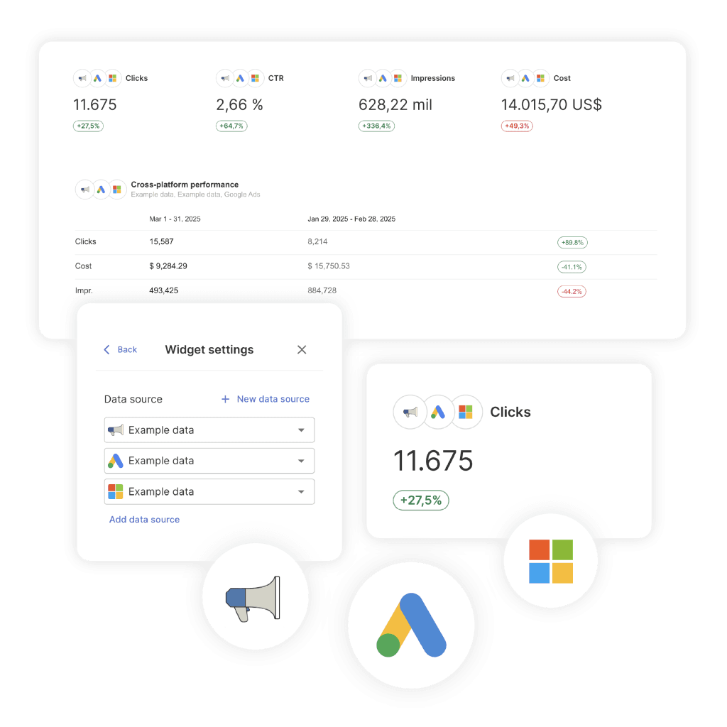
And the definitions never persist. You explain what a session is on the March call, and by April the client has forgotten, so you explain it again. The report carries no memory of its own terms.
The fix is translation baked into the report, not delivered live. Rename metrics to the words the client actually uses, and define them once, on the page, where the definition stays put. In Swydo, custom metric names let you relabel a field so “sessions” reads as “website visitors,” the client’s term, not the platform’s.
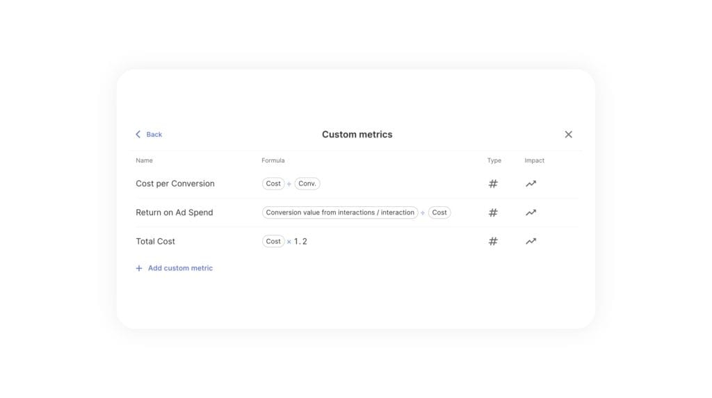
The goal is a report that teaches its own vocabulary, so nobody has to be in the room to decode it. This is the difference between a data dump and communicating results in a way clients actually understand.
Failure 2: The Numbers Have Nothing to Stand Next To
A number alone means nothing, and reports are full of numbers standing alone.
“142 leads.” Good or bad? Up or down? Ahead of the plan or behind it? The client can’t tell, because the report shows the current period and nothing to measure it against. The figure lands with no weight.
This traces straight back to the build step. Most templates display this month’s data by default. Adding a comparison (last period, last year, or a target) is an extra move, and under time pressure it’s the move that gets skipped.
So the client is left to judge a number in a vacuum, which they can’t do, so they don’t. They skim past it.
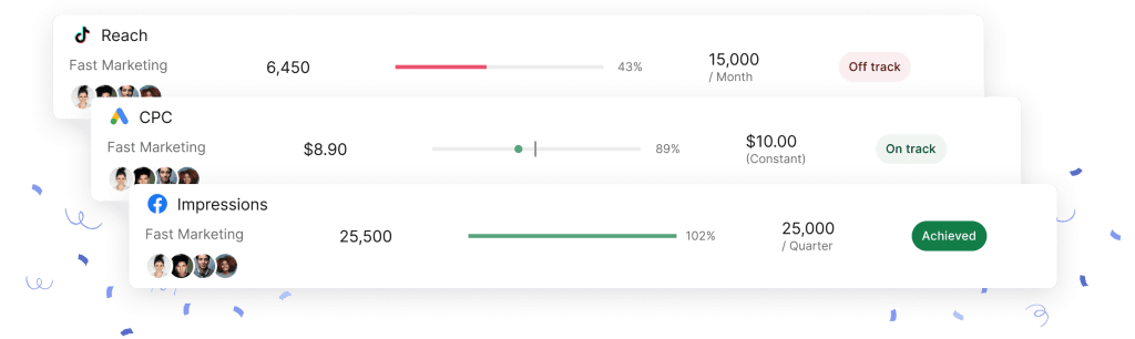
The fix is to never show a number without something beside it. A comparison to the previous period gives direction. A goal gives meaning. “142 leads, pacing toward a 200 target this quarter” tells a story that “142 leads” can’t. Swydo’s Goals attach a target and a timeframe to a metric, so progress shows as On Track, Off Track, or Achieved, and a soft month reads as a plan in motion instead of a bare, worrying number.
Failure 3: Nothing Tells the Client Where to Look
Because people scan instead of read, the report has a few seconds to point the eye at what matters. Most reports point it nowhere.
The single most important number sits on page six, weighted exactly the same as everything around it. Every widget gets equal visual space, so nothing stands out. And when nothing stands out, the F-pattern takes over and the client’s eye grabs whatever happens to be top-left, important or not.
This is a template problem. Drag-and-drop builders make it easy to drop twenty widgets into a neat grid, and a neat grid reads as “all of this is equally important,” which is never true.
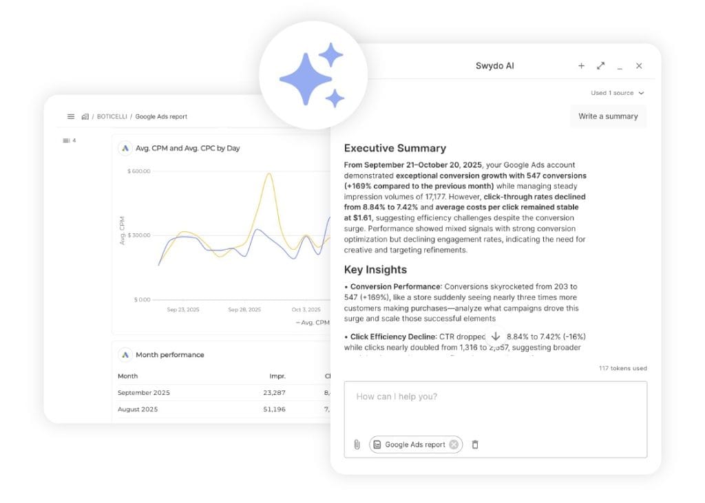
The fix is hierarchy. Lead with the one outcome that matters, big and at the top, where the scan starts. Put the supporting detail below for the people who want it. A tight executive summary at the very top does most of this work, because a client who reads only the first block should still walk away knowing whether the month was good and why. If you’re choosing how to display each metric, the right data visualization does the same job at the chart level, guiding the eye instead of overwhelming it.
Failure 4: It Shows What Happened, Not What It Means
A report can be complete and still say nothing, because it stops at the numbers and never reaches the “so what.”
The report shows traffic up 10%. It doesn’t say why, whether that’s good, what you did to cause it, or what happens next. It presents data and leaves the interpretation as homework, the kind the client isn’t equipped to do, which is why they hired you.
There’s a workflow reason this happens. The analysis step, the part where a human looks at the data and decides what it means, is the easiest to cut when you’re reporting for fifteen clients in a week. So the export becomes the report, and the thinking never makes it onto the page.
The deeper miss is the record of what you actually did. The client sees a spike but has no way to connect it to the campaign you launched, because the action was never noted next to the result. Cause and effect drift apart.
The fix is a narrative layer: a short summary of what happened, what it means, what you did, and what’s next. Swydo’s AI-generated email summaries draft that recap from the report’s own data, so the story rides along with every send instead of living only in your head.
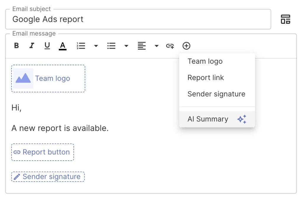
You still edit it, and that’s the honest limit: the tool can draft the recap, but it can’t supply your strategic judgment about what to do next. That part is yours.
The principles of turning the data into a story apply to every report regardless of how the first draft gets written.
Failure 5: One Wrong Number Sinks the Whole Thing
Trust in a report is all-or-nothing, and it breaks at the weakest number.
The report says 80 leads. The client’s own CRM says 50. You never explain the gap, maybe a tracking difference, maybe a double-count, and now the client doesn’t just doubt that one figure. They doubt the entire document, including the parts that were right.
This is a data-pipeline failure, and it’s usually invisible at send time. A connection silently breaks or re-authenticates, a metric pulls from the wrong view, and the report keeps generating on schedule with a number that’s quietly wrong. Nobody catches it, because nobody’s checking every figure before every send.
The fix is partly a system and partly a habit. Swydo’s Data Source Health checks flag broken or disconnected sources before a report goes out, so you’re not emailing a dashboard built on a dead connection.
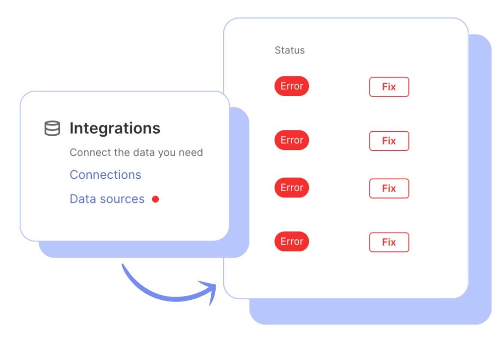
That safeguard becomes the whole game once you run more than a handful of clients, because checking every feed for every client by hand before every send is exactly the task that slips.
A single Metrics Overview across your whole roster, with Alerts that catch a broken or abnormal source overnight, turns that check from a manual sweep into something that surfaces on its own, whether you run five clients or fifty.
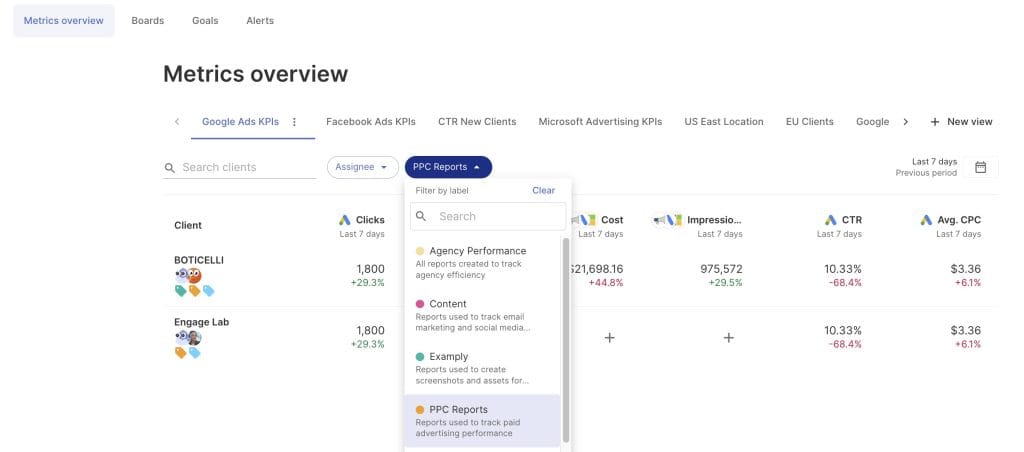
Worth being precise about what that does and doesn’t catch: health checks catch a connection that’s broken, not a number that’s loading fine but defined differently than the client’s CRM. That reconciliation, explaining why your 80 and their 50 aren’t a contradiction, is still a note you write yourself. One honest line in the report prevents a silent collapse of trust.
Failure 6: The Template Went on Autopilot
The last failure is the one nobody notices, because the report still sends itself every month.
You built the template eighteen months ago for a client whose goals were different then. The goals changed; the template didn’t. So the report still leads with the metrics that mattered at launch and buries the ones that matter now. It’s accurate and irrelevant at the same time.
The same rot shows up across stakeholders. The practitioner who wants channel-level detail and the CEO who wants one number get the identical report, because it’s easier to send one template to everyone than to tailor by audience. Neither reader is served well.
Automation is the cause here as much as the cure. Set-and-forget reporting saves enormous time, and that’s exactly why the report drifts out of sync with reality. Once it runs on its own, nobody revisits whether it’s still the right report.
The fix is a standing review. Every quarter, open the template and ask whether the metrics on it still match the goals the client has now, and whether the CEO and the practitioner need different views. Reusable templates make that easy to maintain, but they don’t audit themselves. That’s a calendar reminder, not a feature.
The failure map
Six Ways a Report Dies, and Where Each One Starts
None of these are the wrong KPI. Every one traces back to a specific step in how the report gets made.
| The failure | Where it starts | What the client experiences | The fix on the page |
|---|---|---|---|
| 01 Speaks platform, not business | The export. The report inherits the vocabulary of the tools. | Sessions, impressions, CTR, and no way to tell if that is a good month. | Rename metrics to the client’s words and define them once, on the page. |
| 02 Numbers with nothing beside them | The template default, which shows this month only. | “142 leads.” Up or down, ahead or behind, impossible to say. So they skim past it. | A comparison period or a goal next to every number that matters. |
| 03 Nothing says where to look | The drag-and-drop grid, where every widget gets equal space. | Twenty equal tiles. The eye grabs whatever sits top-left, important or not. | Lead with the one outcome that matters, big, at the top. Detail below. |
| 04 Shows what happened, not what it means | The analysis step, the first thing cut at fifteen clients a week. | Traffic up 10 percent, and interpretation left as homework they hired you to do. | What happened, what it means, what you did, what is next. |
| 05 One number contradicts their CRM | A pipeline break that is invisible at send time. | Your 80 against their 50, and now the whole document is suspect. | Catch broken sources before send, then one line reconciling the gap. |
| 06 The template went on autopilot | The schedule. Once it sends itself, nobody revisits it. | Last year’s priorities, on time, every month. Accurate and irrelevant. | A quarterly review against the goals the client has now. |
How to Build a Report That Works When You’re Not There
Every failure above is a version of the same thing: the report can’t stand on its own. So the standard to design against is simple. Imagine the report opened by a stakeholder who skipped every meeting, a month after you sent it. Does it still make sense?
The async test
Score the Last Report You Sent
Open it and read it the way the client did. Alone, fast, with nobody talking over it. Tick every statement that is true.
- The single most important number is at the top, and it is written in the client’s words.Failures 1 and 3
- Every key number has a comparison period or a goal sitting next to it.Failure 2
- Someone who has never met you could tell what each metric means without asking.Failure 1
- There are at least two sentences saying what it all means and what happens next.Failure 4
- Any figure that might contradict the client’s own data has a line explaining why.Failure 5
- The template has been checked against the client’s current goals this quarter.Failure 6
0 of 6
This is a script, not a report
It only makes sense while you are presenting it. The client is reading it without the actor.
That one test catches most of these. It forces translation, because jargon fails it. It forces context, because a bare number fails it. It forces hierarchy, a so-what, and a trust note, because each absence shows up the moment the presenter is gone.
This is a different discipline than client reporting best practices, which tell you what to put in. This is about whether what you put in survives contact with a real, distracted, solo reader. The best practices build the report. The async test stress-tests it.
And it ties directly to retention. Keeping a client is worth far more than the monthly invoice. The research most often cited here found that lifting retention by just 5% can raise profits by 25% to 95%. A report a client can read and understand alone is one of the cheapest retention tools you have, because it keeps the value visible between every meeting. The reports that fail this test feed the early signals that a client is starting to drift.
Next Steps
Open the last report you sent and read it as the client did: alone, fast, without you talking over it. Find the single most important number. If it isn't at the top and in the client's own words, that's failure one and three, and they're the cheapest to fix.
Then add the two things most reports are missing: a comparison next to every key number, and two sentences saying what it all means and what's next. Do that on one account before your next send, and watch whether the follow-up questions change.
Because a report that answers the question before it's asked is a report that's doing its actual job: communicating, while you're not in the room.
Diagnosing a Report That Fails
Symptom by symptom, where reports die and which step in your workflow caused it
Because you built it for a live walkthrough and they read it alone. Everything you would have explained out loud, why spend jumped in week three, what the dip in conversions was about, stays in your head. None of that context travels with the file.
Readers also scan instead of reading. Eyetracking research found people move through a page in an F shaped pattern, catching the top and the left edge and skipping most of the rest. If the takeaway is not at the top in plain language, it is not seen at all.
Because it is a script, not a report, and the client is reading it without the actor. On the call you supply the connective tissue between every number. On the page there is nothing between them.
It gets worse on the forward. The client passes it to a boss who was never on a single call with you, so even the account history is gone. If the document only works while someone narrates it, it will fail on every reading after the first.
Almost always the presentation. Metrics can be accurate and charts can be clean, and the report still lands as a wall of numbers the client skims for ten seconds and forgets. The failure happened before they read a single figure.
Test it before spending on better data. Picture the report opened by a stakeholder who skipped every meeting, a month after the send. If it stops making sense without you, the gap is communication, and that is far cheaper to close than the pipeline behind it.
Yes, though never in a way you can trace to one report. Communication breakdown is repeatedly named as a silent killer of agency retention, and clients who feel uninformed start looking around even when results are fine.
Nobody emails to say the report was confusing. They stop replying, stop asking questions, and eventually take a call from someone else. Retention research widely cited on this puts a five percent lift in retention at twenty five to ninety five percent more profit, which makes a readable report one of the cheapest retention tools you have.
Watch the questions, not the open rate. If a client asks something the report answered on page one, they stopped reading at the top. If they ask nothing at all for three cycles running, that is disengagement, not satisfaction.
Ask two things at the next review. Which part do you skip, and who else sees this. The answers tell you what to cut and who you are actually writing for, which is usually not the person on the call.
Match what the client does to the failure that causes it. Each symptom traces back to one specific step in how the report gets made, which is what makes it fixable rather than vague.
| What the client does | The failure | The step that caused it |
|---|---|---|
| Asks what a metric means, again | Translation | The export, which carries the tool's vocabulary |
| Asks whether a number is good | Context | The template default, showing this period only |
| Fixates on a minor metric | Hierarchy | The grid, where every widget gets equal space |
| Asks so what, or asks nothing | Interpretation | The analysis step, the first one cut under load |
| Questions a figure against their own system | Trust | The data pipeline, failing invisibly at send time |
| Goes quiet for months | Template rot | The schedule, running long after goals changed |
Translation and hierarchy, because they cost the least and block the most. Renaming metrics to the client's words and moving the one number that matters to the top can be done in an afternoon, and both change what a scanning reader sees in the first three seconds.
Interpretation is next and takes real time, because writing what the numbers mean is judgment nobody can hand off. Template rot is last, not because it matters least, but because it is a quarterly review rather than a fix.
Some of them, and it is worth being honest about which. A tool can rename metrics, attach goals to numbers, draft a recap, and flag a broken data source before you send. Those are mechanical problems with mechanical answers.
What no tool supplies is judgment. Deciding what the month actually means, what to do next, and whether this template still matches the client's goals is human work, and pretending otherwise is how reports end up automated and empty at the same time.
The report speaks the language of the tools it came from, not the language the client thinks in. It says sessions, impressions and CTR. They think in leads, customers and revenue.
Definitions also never persist. You explain what a session is in March, and by April it is gone, so you explain it again. Rename each metric to the client's own words and define it once on the page, where the definition stays put.
| What the report says | What the client hears | What to label it instead |
|---|---|---|
| Sessions | A tool word with no business meaning | Website visitors |
| Impressions | A big number that sounds inflated | Times your ad was seen |
| Conversions | Three different numbers across three tools | Form fills, calls and purchases, named separately |
| CTR | An acronym they will not ask about | Share of people who clicked |
| ROAS | Agency jargon for something financial | Revenue per dollar spent |
Because each platform defines it differently, and conversions is the worst offender. It means one thing in the ad platform, another in analytics, and another in the CRM, usually because of attribution windows and what each system counts as a completed action.
The damage is not the discrepancy, it is showing all three side by side without reconciling them. The client either double counts or quietly stops trusting the page. Name the source next to the number, or pick one system as the reference and say so.
At the very top, larger than everything around it, in the client's own words. Because readers scan, the report has a few seconds to point the eye at what matters.
Equal visual weight is a decision even when it is accidental. A tidy grid of twenty identical widgets tells the client that everything is equally important, which is never true, so their eye lands on whatever happens to sit top left.
Every widget you add makes the important one harder to find. Extra metrics feel generous and read as noise, which is why crowded reports and ignored reports tend to be the same reports.
There is also a signalling problem. A long report says everything here deserved your attention, and a client who cannot tell what to prioritise usually prioritises nothing. Detail is not the enemy, undifferentiated detail is.
State the finding, not the metric. Organic traffic up 23 percent after the content refresh tells the client what happened. Website sessions tells them nothing.
If the client has to study a legend or ask what they are looking at, the title failed and the chart has become decoration. A scanning reader takes the title and moves on, so the title has to carry the point on its own.
The report stops at the numbers and leaves interpretation as homework. It shows traffic up ten percent without saying why, whether that is good, what you did to cause it, or what happens next. That analysis is the work they hired you for.
The record of what you actually did is the deeper miss. The client sees a spike but cannot connect it to the campaign you launched, because the action was never noted beside the result, so cause and effect drift apart.
Four things, in this order. What happened, what it means, what you did, and what is next. Most summaries manage the first and skip the rest.
Put it above the data, not after it, and keep it short enough to finish in one glance. A client who reads only that block should still walk away knowing whether the month was good and why.
Trust in a report is all or nothing and it breaks at the weakest figure. Your report says eighty leads, their system says fifty, and now they doubt the entire document including every part that was right.
They have no way to audit which numbers are solid. One visible contradiction reclassifies the whole file as unreliable, and that judgment carries forward to everything you send afterward.
Explain the gap on the page before they find it. The cause is usually an attribution window, a tracking difference or a double count, and none of those are problems once they are named.
Be precise about what tooling catches. Source health checks find a connection that is broken. They do not find a number that loads fine but is defined differently than the client's system. That reconciliation is one sentence you write yourself, and it prevents a silent collapse of trust.
Lead with it. Open with the miss, what caused it, and what you are already doing about it, before any of the good news.
Clients usually know something is off because they see their own sales. Burying the drop on page six reads as spin and turns a bad month into a credibility problem. Opening with the miss and the response reads as control, which is what they are paying for.
A connection breaks quietly and the schedule keeps running. A source needs to re authenticate or a metric starts pulling from the wrong view, the report generates on time as always, and the wrong figure ships.
Nobody catches it because nobody checks every figure before every send. Past a handful of clients that manual sweep stops happening entirely, so the failures become invisible rather than rare. This is the one place automation genuinely beats discipline.
It can draft the recap, not the judgment. AI turns an export into readable prose in seconds, which rescues the step most likely to get skipped under load.
What it cannot supply is strategy. It does not know the campaign you launched last week, the budget conversation coming, or why this client panics about cost per lead. Treat the draft as a first pass you always edit, because an automated summary with no human read is a dashboard with a send button.
Review it every quarter against the goals the client has now. Two questions do the work. Do these metrics still match what they are trying to achieve, and do different readers need different views.
The failure is invisible because the report keeps sending itself. A template built eighteen months ago still leads with the metrics that mattered at launch and buries the ones that matter today, which makes it accurate and irrelevant at once.
It is both the cause and the cure, which is why it needs a guardrail. Automation saves enormous time and removes the manual errors, and that is exactly why the report drifts out of sync with reality.
Nothing prompts you to reopen a template that never breaks. The fix is not less automation, it is a calendar reminder that forces a human to look at the thing running unattended.
No. The practitioner who wants channel detail and the executive who wants one number are both badly served by the same file, and sending one template to the whole list is the most common version of this.
You do not need a separate report per person. You need one document with two reading depths, an executive block at the top and the detail underneath, with a clear signal about where each reader can stop.
Yes, but the report cannot depend on it. The call is where nuance lives and where you hear what the client actually cares about, and no document replaces that.
The mistake is building something that only works while you talk over it. Write it to stand alone first, then use the call for the conversation it starts. When a call is not possible, a short recorded walkthrough carries most of the context and travels with the file.
Send client reports that make sense when you are not in the room to explain them.
Start Your Free Trial Today