
You sent the report. It looks great. The dashboards are clean, every metric reconciles, the colors match the client’s brand.
Then your client opens it, scrolls for about eleven seconds, and writes back: “Looks good. So what should we do?”
That one question is the whole difference between data visualization and data storytelling. And honestly? It’s also the difference between a renewed retainer and a churned account — and a good chunk of the client reporting best practices we hear come up over and over again.
So let’s talk about it. What each one actually is, where they overlap, which framework to reach for in a monthly report, and how to handle the bad months — the ones nobody else writes about.
Data Visualization vs Data Storytelling, in Plain English
Here’s the simplest way to think about it.
Data visualization is the visual representation of data. Charts, graphs, dashboards, maps. Anything that takes numbers and turns them into something your eyes can read quickly.
Data storytelling is what you build on top of that. It’s the visual plus a narrative plus the context that explains why any of it matters and what to do next.
One shows the what. The other explains the so what.
Want an analogy that sticks? A visualization is a photograph of a crime scene. A data story is the detective walking you through what happened, who did it, and what comes next. Both use the same evidence. Only one helps you make a decision.
The core difference
Showing the what vs. explaining the so what
📊 Data Visualization
Shows the what
📖 Data Storytelling
Explains the so what
This isn’t a new idea. Cole Nussbaumer Knaflic, who wrote Storytelling with Data back in 2015, draws a hard line between exploratory analysis (what you do when you’re getting familiar with the data) and explanatory analysis (what you do when you’ve found something specific and need someone specific to act on it). Storytelling lives entirely in the explanatory side.
Brent Dykes, in Effective Data Storytelling, simplifies it even further: data + visuals + narrative = change. Take any one of those three away and the whole thing falls apart.
Here’s how it shakes out side by side.
| Dimension | Data Visualization | Data Storytelling |
|---|---|---|
| Primary goal | Show data clearly | Drive a decision or action |
| Mode | Exploratory or explanatory | Always explanatory |
| Output | Chart, dashboard, map | Narrative supported by visuals |
| Required components | Data + visual encoding | Data + visuals + narrative |
| Audience effort | The audience interprets | You pre-digest and recommend |
| Common failure | Spaghetti dashboards, chartjunk | The “so what?” still unanswered |
| Use it for | Daily monitoring, ad-hoc digging | Client reviews, QBRs, strategy calls |
Look at that last row. That’s where most agencies trip up.
You’re probably treating your monthly client report — which is an explanatory, decision-driving moment — like a self-service dashboard. The client opens the deck, sees twenty charts, and is left to do the analytical work themselves. That’s not reporting. That’s outsourced thinking. And your client knows it.
If you’ve ever wondered whether you should be sending a dashboard or a report in the first place, that gut feeling is the right instinct. They’re not the same tool, and they’re not the same moment.
The Three Elements Every Data Story Needs (And the One You’re Probably Skipping)
Take any client report you’ve sent in the last six months. Pull it up. You can trace its strength back to which of these three elements were present and which were missing.
1. Data is your foundation. Trustworthy, relevant to the client’s actual business goal, reconciled across sources. Most agencies do this part well. The rare exceptions usually involve quietly switching attribution models between months — and we’ll come back to that one.
2. Visuals are your bridge. The chart you choose either lights up the insight or buries it. Stephen Few’s research on pre-attentive processing shows the brain decides what’s important in under 250 milliseconds, before your conscious mind even engages. A bar chart with one orange bar against six gray ones tells the eye exactly where to look. A rainbow-colored stacked bar with twelve segments tells the eye to give up. (If you’ve ever stared at a chart and known something was off but couldn’t say why, that’s usually a sign you chose the wrong data visualization for the question you were trying to answer.)
3. Narrative is the part you’re skipping. It’s where you, the expert, tell your client what the numbers mean and what to do next.
It’s the difference between “CTR was 2.3%” and “CTR climbed to 2.3% — your highest in nine months — because the new vertical-video creative we shipped on the 14th outperformed static by 4×. We’re shifting 30% of next month’s static budget into video.”
Same data. Same chart. Wildly different report.
Dykes mapped out what happens when you mix and match these three elements. It’s worth memorizing:
- Data + visuals, no narrative → you enlighten the audience. They see the pattern but don’t know what to do with it.
- Data + narrative, no visuals → you inform them. They trust the claim but can’t verify it at a glance.
- Visuals + narrative, no data → you engage them. They’re interested but you have no proof.
- All three together → you drive change.
Brent Dykes’ formula
The three elements every data story needs
Take any one away and the whole thing falls apart
Here’s the uncomfortable question. If your monthly report is mostly screenshots from Looker Studio with a one-line summary at the top, which one are you delivering?
You’re delivering enlighten. Your client sees the data. They just can’t act on it without doing your job for them.
Why This Matters Way More for You Than for In-House Analysts
In-house analysts have a captive audience. They sit twenty feet from the marketing director. If a chart isn’t clear, the director walks over and asks. Worst case? A longer meeting.
You don’t have that luxury. The cost of a poor report for you is a churned account.
And the math gets ugly fast. Your industry runs on roughly 15–25% annual client churn, and the average mid-tier digital retainer sits somewhere between $2,500 and $5,000 a month. Lose two clients and you’ve burned $60K to $120K in annualized revenue. Replacing them? That costs five to seven times more than retaining them, according to Invesp’s customer acquisition research. Which is why client retention is usually a bigger lever than new business.
Now here’s the part that should genuinely make you rethink things. Swydo’s client retention KPI analysis found that poor communication and transparency (57%) and inability to demonstrate value (53%) are top reasons clients leave marketing agencies — putting it on par with the work itself
Read that again.
Your clients are churning less because of bad results than because of bad reporting about the results.
The 12-month arc
How clients quietly disengage from your reports
They churn less because of bad results than because of bad reporting about the results
Honeymoon
Excitement, full attention, every report opened
Questions
They start asking what your report doesn’t answer
Erosion
They stop opening it; meetings feel transactional
End
“Just looking” at competitors, then gone
There’s a predictable arc to it. We calls it the Honeymoon → Questions → Erosion → End cycle. Month one is exciting. By month three, your client starts asking questions your report doesn’t answer. By month six, they’ve stopped opening it. By month nine, they’re “just looking” at competing agencies. By month twelve, they’re gone.
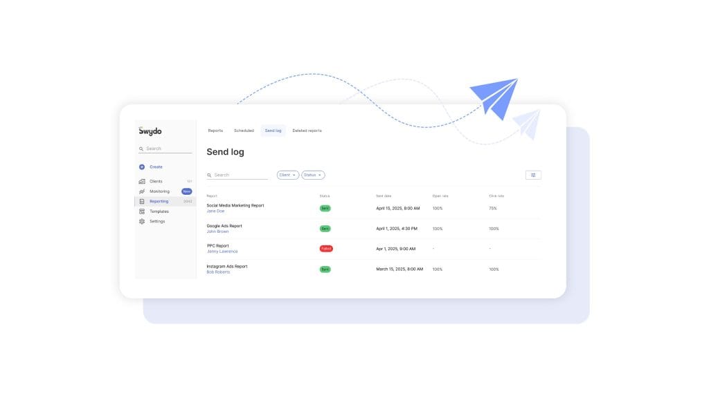
If you’ve never actually checked whether your clients are opening the reports you send, that’s the first uncomfortable thing worth doing this week. (Inside Swydo, the Send Log shows you the open and click rate on every scheduled send — useful for confirming whether the silence you’re hearing is “they read it and have no questions” or “they stopped reading three months ago.”)
And the cycle isn’t really about performance. Performance fluctuates. Your clients understand that. The cycle is about the moment your client realizes you’re sending data instead of insight. That’s where improving client communication through reporting stops being a nice-to-have and starts being the actual job.
In an agency, data storytelling isn’t a soft skill. It’s a retention strategy.
Six Frameworks for Client Reporting (And Which One To Reach for When)
There’s no single “right” way to structure a data story. There are several proven ones, and each one fits a different reporting moment. Knowing which to grab is half the craft.
Six proven frameworks
Match the framework to the moment
A monthly report doesn’t need a six-element story arc. A QBR doesn’t deserve a flat bullet list.
Setup → Conflict → Resolution
Aristotle / Knaflic
SCQA / Pyramid Principle
Barbara Minto
Six-element story arc
Brent Dykes
What Is / What Could Be
Nancy Duarte
IABI
Avinash Kaushik
PICA
Lea Pica
For most of your monthly reports, the workhorse is Setup → Conflict → Resolution. It mirrors how your client already thinks. What was supposed to happen? What actually happened? What do we do about it?
Setup establishes the goal. Conflict introduces the surprise — good or bad. Resolution is your recommendation.
Talking to a CFO or a CMO? Switch to SCQA. They don’t want a chronological narrative. They want the answer first and the supporting logic second. Lead with “We recommend reallocating $40K from display to paid social next quarter.” Then back into the data. (This is the same logic behind how to write an executive summary — answer up top, evidence below.)
Heading into a QBR or a renewal? Duarte’s What Is / What Could Be is unmatched. You alternate between the current reality (with all its constraints) and a vivid future state (made possible by the next phase of work). Duarte famously diagrammed Steve Jobs’ iPhone keynote and Martin Luther King Jr.’s “I Have a Dream” speech as the same shape — a rhythmic oscillation between reality and possibility.
The mistake to avoid? Using one framework for everything.
A monthly performance report doesn’t need a six-element story arc. That’s overkill, and it’ll feel like a TED talk when your client wanted a status update. A QBR doesn’t deserve a flat IABI bullet list either. That’s underkill, and it’ll feel like a help-desk ticket when your client wanted vision.
Match the framework to the moment.
Turning Your Monthly Dashboard Into a Story Your Client Actually Reads
Here’s the workflow we’d suggest making your default. It works for paid, SEO, social, email, integrated retainers — pretty much anything.
1. Anchor to one business goal, not a channel KPI. Before you open any tool, write down the one outcome your client cares about this month. Pipeline. Revenue. Qualified leads. CAC. Not impressions, not CTR, not engagement rate. Those are diagnostic metrics. They’re how you explain the goal. They aren’t the goal. (If you’re not sure which numbers belong on the cover slide vs. in the appendix, this list of must-have metrics for a digital marketing report is a useful sanity check.)
2. Find the one or two things that actually moved that goal. This is the part that takes the longest and gets skipped the most. Open your data and ask the hard question. Of everything that happened this month, what one or two things actually changed the outcome? Most months, it’s a creative refresh, an algorithm change, a seasonality moment, or a budget shift. If you can’t name the cause, you don’t have an insight yet. You have an observation.
3. Storyboard before you open any tool. Sketch the deck on paper or in a Google Doc before you build a single chart. What’s slide one? What’s the headline? What chart goes where? This single habit is what separates senior strategists from junior ones.
Knaflic frames it like this: “the responsibility for clarity lies 100% with the communicator, never with the audience.” Storyboarding is how you take that responsibility seriously.
4. Apply your framework to the deck arc. Slide 1 is where you were and what you set out to do. Slides 2–4 are what happened, including the surprise. Slides 5–6 are what you did and what you recommend next. Three acts, six slides. Anything more is a dashboard pretending to be a story.
5. Write action titles for every chart. This is the highest-leverage edit you can make to any deck. Replace category titles like “Mobile Performance” with insight titles like “Mobile checkout is leaking 18% of revenue.” Replace “Social Engagement Trend” with “Reels engagement is 4× higher than static — we’re shifting budget.”
Highest-leverage edit
Category titles vs. action titles
If your reader only reads titles, they should still get the story
✗ Category title
Mobile Performance
✓ Action title
Mobile checkout is leaking 18% of revenue
✗ Category title
Social Engagement Trend
✓ Action title
Reels engagement is 4× higher than static — we’re shifting budget
✗ Category title
CTR was 2.3%
✓ Action title
CTR climbed to 2.3% — the new vertical-video creative outperformed static by 4×
Action titles are the chart’s thesis statement. If your reader only reads titles, they should still get the story.
6. Annotate the why, not the what. Don’t write “Conversions dropped 22% from June to July.” The chart already shows that. Write “Conversions dropped 22% in July because Apple’s MAID changes reduced Meta’s optimization signal during a creative refresh — modeled conversions held steady, suggesting attribution loss, not performance loss.”
The why is what you’re being paid for.
7. End with three prioritized recommendations. Not five. Not ten. Three. Ranked by expected business impact. Each one with an owner and a date.
If you don’t end with explicit “we recommend” language, you’ve ended with implied homework. And your client will resent you for it.
The 5-3-1 Rule, the Bar Test, and the Executive Hook
Three small habits that make every report you send shorter, sharper, and more likely to get read.
The 5-3-1 rule. Per channel, surface no more than five metrics, three insights, and one prioritized action. The discipline forces you to choose. If everything is highlighted, nothing is.
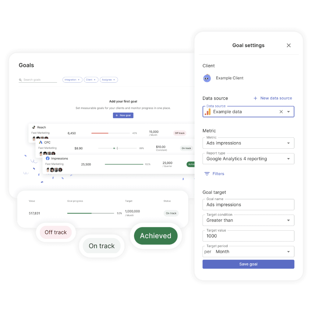
It also helps to attach an explicit pacing target to that one prioritized action. Swydo’s Goals feature is built around exactly this — every goal lives in one of three states (On Track, Off Track, Achieved) so your client doesn’t have to do the math on whether you’re actually going to hit the number. They open the report and see the answer.
The Bar Test. Could you explain this slide to a friend at a bar without the chart in front of you? If the answer is no, the slide is too complex or the takeaway is buried. The test reliably exposes charts that look impressive but communicate nothing.
The executive hook. One sentence at the very top of your report — before any chart — that summarizes the whole period. Something like “July was a controlled correction. We paused two underperforming campaigns, reduced spend 18%, and held pipeline flat — setting up August for a 2× efficiency lift.”
If your client reads only that sentence and nothing else, they should still walk away with the right picture. And honestly? Many will. Make it count.
How To Lead the Story for Each Channel
Every channel has its own narrative pitfalls. Here’s how to lead the story for the five most common.
Paid media. Lead with blended ROAS and incremental contribution. Not platform-reported ROAS. Meta and Google both inflate returns because they each take credit for the same conversion. Meta’s iOS-modeled conversions in particular routinely overstate performance after Apple’s tracking changes. (If you’ve never sat down and explained the different marketing attribution models to your client, that’s a conversation worth having before the next bad month, not during it.)
The weak version: “Meta ROAS was 4.2.”
The strong version: “Blended ROAS held at 2.8 despite Meta-reported 4.2, suggesting modeled-conversion inflation. We’re investing in incrementality testing next month to calibrate.”
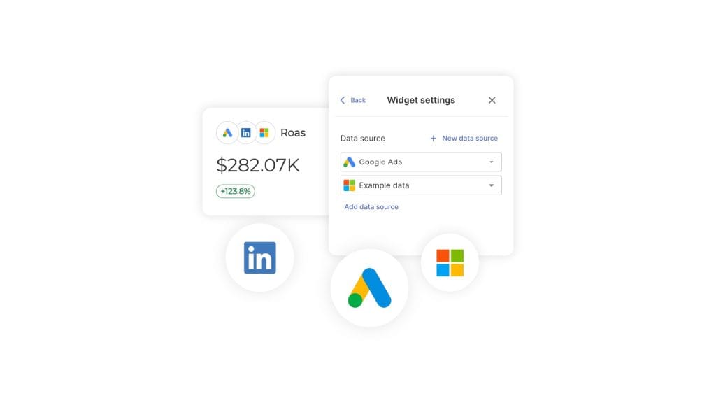
The trick is being able to put a real blended view in front of the client without rebuilding it in a spreadsheet every month. Combined Data Sources in Swydo lets you pull spend, clicks, conversions, revenue, and ROAS from up to five ad platforms into a single widget — so your blended ROAS chart actually reflects reality, not whichever platform reported last.
SEO. Lead with organic-driven revenue and qualified traffic. Not keyword rankings. Not domain authority. Rankings are a leading indicator, not an outcome. The bigger question is which SEO metrics actually map to revenue for this specific client — and that varies more than most agencies admit.
Tie non-brand organic sessions to assisted conversions and pipeline. And be honest about the fact that AI Overviews are reshaping click patterns. If your client’s brand is being cited inside AI answers, that’s a measurable win even when sessions are flat.
Social. Treat organic engagement as creative R&D for paid amplification.
The weak version: “Reels got 1.2M views.”
The strong version: “This week’s three top organic Reels share a hook structure we’re now testing in paid. Initial paid CTR is 2.4× the static baseline.”
You’re connecting an organic learning to a paid action. Which is what your client is actually paying for.
Email. Apple’s Mail Privacy Protection has made open rates effectively unreliable as a primary KPI. Lead with click-through rate, click-to-conversion, and revenue per send. Ignore opens except as a sanity check.
B2B funnel. Lead with SQLs, pipeline, and CAC payback. Not MQL volume. MQLs are the most gameable metric in B2B — any motivated team can manufacture more of them by loosening the scoring criteria. Align your reported leads with the client’s actual closed-won data, even when it’s painful. Especially when it’s painful.
The Bad-Month Playbook
Here’s a question worth sitting with for a second. When was the last time you presented a flat or declining month to a client and they came out of the meeting more confident in you, not less?
If you can’t think of one, this section is for you.
The bad-month playbook is the single most under-addressed topic in agency reporting. Which is wild, because it’s the topic that decides whether your clients renew.
The instinct when a month goes badly is to bury the lede. Lead with what worked. Hide the bad chart on slide nine. Add caveats. Hope nobody notices.
That’s the playbook of an agency about to lose an account.
The clients who renew during bad months are the ones whose agencies told them about the bad month first. With context. With a diagnosis. With a plan.
Here’s the structure that actually works.
Pre-empt with a change log. Before the performance section, drop in a one-slide log of everything that changed during the period. Algorithm updates, tracking changes, creative refreshes, seasonality, budget shifts, your own optimization decisions. When you frame the period this way, performance changes start to look like the predictable result of identifiable causes — not random failures.
The bad-month playbook
How agencies turn flat months into renewed contracts
Clients who renew during bad months are the ones whose agencies told them about the bad month first — with context, diagnosis, and a plan
Pre-empt with a change log
Before the performance section, drop in a one-slide log of everything that changed during the period. Performance changes start to look like predictable results, not random failures.
Frame attribution honestly
If modeled conversions diverge from observed conversions, say so. If iOS-modeled Meta conversions are inflating reported ROAS, say so. Clients given the unvarnished truth in a bad month become loyal forever.
Use STAR for failed tests
Situation, Task, Action, Result, Learning. The result is where the bad news lives. The learning is where the renewal lives. Every failed test should produce a learning that informs next month’s plan.
Take ownership, project forward, ask for a decision
A strong recovery narrative does six things at once: takes ownership, explains causation, recalibrates how to interpret past data, projects forward, makes a concrete ask, and sets a deadline.
Skip this playbook
Lose the account
Run this playbook
Get a budget increase out of a bad month
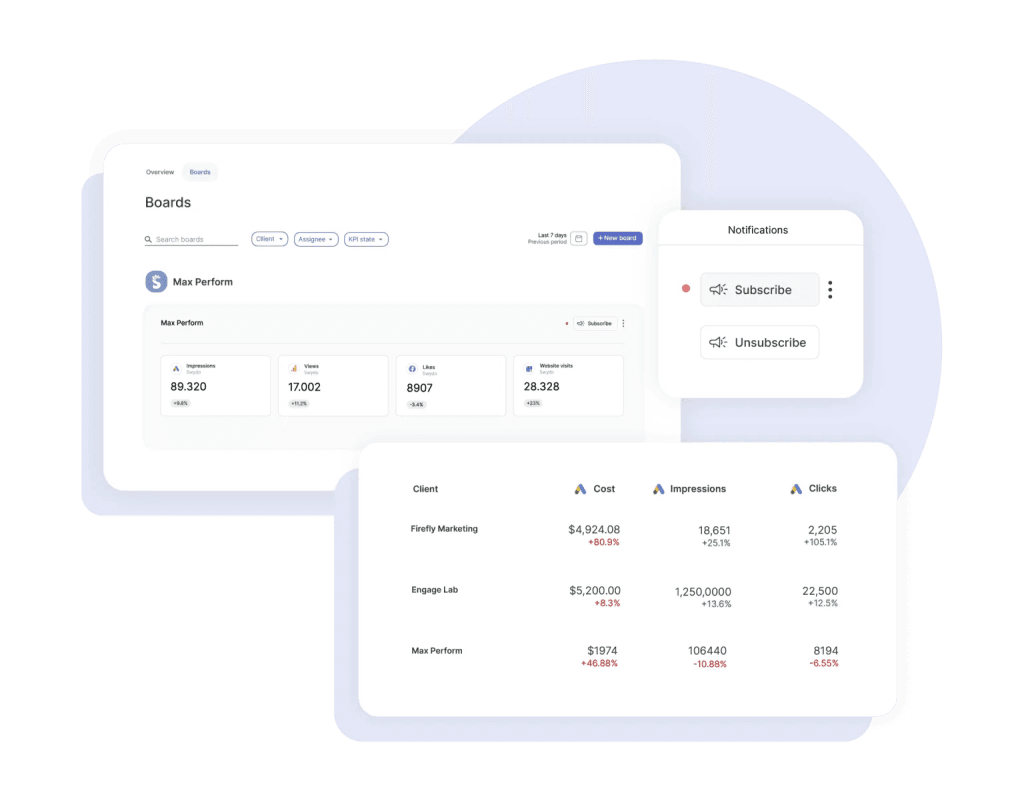
The other half of pre-empting is catching the bad signals before your client does. Monitoring Boards in Swydo run alerts on a per-board basis — when a KPI flips from green to red, you find out before the monthly review meeting, not during it. That extra week of lead time is usually the difference between presenting a problem and presenting a problem with a fix.
Frame attribution honestly. If modeled conversions diverge from observed conversions, say so. If iOS-modeled Meta conversions are inflating reported ROAS, say so. If GA4’s data-driven attribution shifted credit between channels, say so.
Clients who feel they’re being given the unvarnished truth in a bad month become loyal forever. Clients who feel they’re being managed start taking pitches.
Use STAR for failed tests. Situation, Task, Action, Result, Learning. The result is where the bad news lives. The learning is where the renewal lives. Every failed test should produce a learning that informs next month’s plan.
A sample 200-word narrative for a 30% conversion drop:
“July conversions dropped 30% versus June. Three factors drove the decline. First, we deliberately paused our top two creative concepts to refresh fatigued audiences after a six-week run — this was planned and accounted for an estimated 15-point drag. Second, Meta’s modeled-conversion accuracy degraded mid-month following an iOS update, which our incrementality test suggests overstated June’s true ROAS by ~12%. Third, seasonality drove a category-wide softness — competitor ad recall dropped in tandem per our brand-tracking panel. Net of these factors, your underlying CAC actually improved 8%. We’re shipping the new creative cohort August 4th, holding budget flat, and we project August conversions to recover within 5% of June’s reported number — but with a more reliable measurement baseline. Our recommendation: approve the August creative concepts by EOD Friday, and pre-approve a 10% budget flex for the second half of the month if early signals are strong.”
That paragraph does six things at once. It takes ownership. It explains causation. It calibrates how the client should interpret past data. It projects forward. It makes a concrete ask. It sets a deadline.
That’s the difference between losing the account and getting a budget increase out of a bad month.
Your clients don’t churn because performance dropped. They churn because nobody told them why.
Mistakes That Quietly Cost You Retainers
Ten things we see in agency reports all the time, ranked roughly by how often they cost you accounts.
- Spray-and-pray data dumps. Twenty-eight charts, no hierarchy, no point of view. Your client has to figure out what’s important. They won’t.
- Dual-axis charts and 3D pies. Dual axes invite spurious correlation interpretations. Pie charts beyond three slices are unreadable. Both quietly signal “I made this in 2008.”
- No clear “so what.” Every chart should answer a real question. If you can’t articulate the question, cut the chart.
- Burying losses. Hiding a bad result on slide nine. Your client always finds it. The damage is doubled because you didn’t lead with it.
- Inconsistent metrics across months. Last month it was MQLs. This month it’s SQLs. Next month it’s pipeline. Your client can’t track progress because the goalposts keep moving.
- Channel silos vs. an integrated story. Reporting paid, SEO, social, and email as four disconnected sections. Your client runs one business with one funnel. Report it that way.
- Default platform reports. Sending a Meta Ads Manager screenshot. Your client could have gotten that from their nephew. They’re paying you for synthesis.
- Vanity metrics. Impressions, raw email opens, reach, follower count, page views without conversion context.
- Automated reports without commentary. Whatever tool generated it, a human should add a paragraph before it goes out. The automation is the floor, not the ceiling.
- Switching attribution silently. Quietly toggling from last-click to data-driven attribution between months — and the numbers improve. Your client may not notice for two months. When they do, the trust is gone.
Tools Worth Knowing Right Now
The landscape splits into four buckets. Most agencies end up combining two or three of them rather than going all in on one.
Enterprise BI platforms. Tableau, Power BI, Looker, ThoughtSpot, Qlik, Domo, Sisense. Best for clients with their own BI teams. All of them have shipped native AI narrative features now — Tableau Pulse, Power BI Copilot, Looker’s Conversational Analytics, ThoughtSpot Spotter, Qlik Answers. Use Tableau if visual storytelling is the priority and your client tolerates the learning curve. Use Power BI if your client lives in Microsoft. Use Looker Studio (the free tier) for SMB clients who need shareable dashboards without licensing cost.
Agency-purpose-built reporting. AgencyAnalytics, Whatagraph, Databox, DashThis, NinjaCat, Improvado, TapClicks, Swydo, Klipfolio, Funnel, Supermetrics. These are designed around your workflow specifically — client portals, white-label branding, multi-account aggregation, automated scheduling. AgencyAnalytics has Ask AI. Whatagraph has IQ and IQ+. Databox has Performance Indicator AI. NinjaCat has an AI Insights Generator. For most agencies under 50 people, one of these is your foundation — and if you’re still shopping around, this breakdown of the best client reporting software is a faster way to compare than going site by site.
Storytelling-first and design-led. Datawrapper, Flourish (now part of Canva), Infogram, Observable, Highcharts. These produce publication-quality visuals with editorial polish. Datawrapper deserves a special callout — they’ve explicitly resisted adding generative AI to their core workflow, arguing that chart choice is a craft that benefits from friction. A useful counterpoint to the rest of the industry.
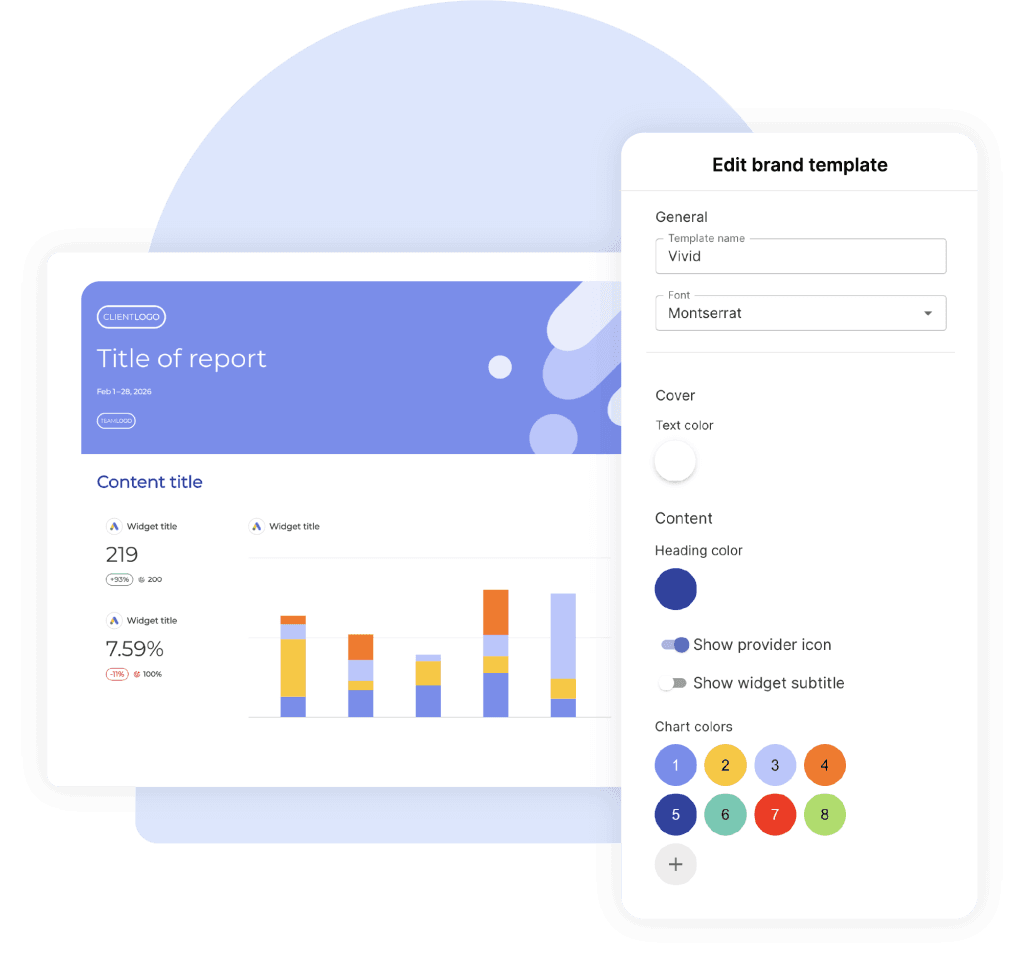
Most agency platforms now handle the design layer through reusable styling — Swydo’s Brand templates let you set fonts, colors, cover images, and footer layouts once and apply them across every client report, so you’re not re-skinning a deck every time you onboard a new account.
AI-native analysis. Julius AI, Hex Notebook agents, ChatGPT Advanced Data Analysis, Claude artifacts, Akkio. Great for ad-hoc analysis and one-off custom visualizations. Best when used by analysts who can verify the output. Don’t use them as autopilot.
For presentation delivery, Gamma has emerged as the dominant AI presentation tool with over 70 million users, having absorbed much of the market after Tome’s shutdown. Beautiful.ai owns the brand-governance and template-control use case for larger agencies that need consistency across account teams.
A Practical AI Workflow for Drafting Client Narratives
Generative AI has changed what’s possible in client reporting more than any tool shift in the last decade. But it hasn’t changed the fundamentals.
AI is a draft engine. It is not a thinking engine.
Used well, it cuts your narrative-writing time by 60–80% and frees you up to do more analysis. Used badly, it puts hallucinated metrics into client-facing decks. There’s a clear right way to do this — and it overlaps with how to use automated reporting for actionable insights more than people realize.
Here’s the five-step workflow.
Step 1. Provide the client’s business goal. Something like “This client is a DTC supplement brand. Their primary goal this quarter is reducing CAC below $42 while maintaining new-customer revenue above $180K/month.”
Step 2. Paste this period’s KPI table. Actual numbers. CSV format works fine.
Step 3. Paste last period’s KPI table. AI can’t generate insight without comparison.
Step 4. Use this prompt:
“You’re a senior performance marketing strategist writing for a sophisticated client. Using the data above, write a 200-word client-facing narrative for the monthly report. Use Setup → Conflict → Resolution structure. Lead with one executive-summary sentence. Identify the one or two factors that most likely drove the change. End with three prioritized recommendations, ranked by expected business impact. Do not invent any numbers not present in the data. Flag any metrics that look anomalous or worth investigating further.”
Step 5. Review every single number for hallucination. Read every figure in the AI draft and verify it appears in your source data. AI tools will confidently invent percentages, ratios, and benchmark comparisons that don’t exist. This is non-negotiable.
A single fabricated stat in a client deck costs you more than every minute of writing time you saved.
A few more guardrails worth building into your habit. Never let AI invent benchmark figures — “industry average is 2.5%” is the most common fabrication. Always verify quoted percentages against the source. Disclose AI assistance internally so account leads know what was machine-drafted. Treat AI narratives as first drafts that a strategist edits, never as finished output.
The agencies using AI well right now treat it as a junior analyst that drafts fast but needs supervision. The agencies struggling with it treat it as a senior strategist who doesn’t need editing.
Pick the first model.
If you’re using Swydo, this is what Swydo AI is built for. It sits inside the report itself with four default prompts — Summary, Wins, Issues, Recommendations — and you can paste any output straight into a text widget so the narrative and the data live on the same page. It still needs your edit, same as any AI draft. But the round-trip from “data is in” to “narrative is written” goes from an hour to about ten minutes.
Dashboard or Deck? It Depends on the Moment
Different reporting moments call for different formats. Knaflic’s exploratory-vs-explanatory split is the cleanest decision rule.
| Touchpoint | Format | Why |
|---|---|---|
| Daily/weekly pulse | Slack or email digest with 3–5 bullets | Your client wants the headline, not the deck |
| Monthly performance review | Annotated deck + linked dashboard | Deck for the story, dashboard for proof |
| Quarterly business review | Narrative deck (10–15 slides max) | Strategic, future-facing — tell a story |
| Ad-hoc question | Live dashboard with annotation | Exploratory by definition |
| Renewal conversation | Short narrative deck (5–7 slides) | Make the case for the next phase |
The pattern is straightforward. The more strategic the conversation, the more narrative the format. The more operational, the more dashboard-like.
Sending a 40-page deck for a weekly check-in is overkill. Sending a Looker Studio link for a QBR is malpractice.
Building This Into How Your Agency Actually Operates
Tools and frameworks are necessary, but they’re not enough. The agencies that consistently produce strong client reports build the practice into the culture, not just the workflow.
Train every account manager in storytelling, not just the analysts. The analyst builds the chart, but your AM is the one presenting it. The presenter is the storyteller. If you only train analysts, you’ve trained the wrong people.
Standardize on one default framework across the agency. Pick Setup → Conflict → Resolution, or pick IABI, or pick something else — but pick. Inconsistent framework choice across teams produces inconsistent client experiences.
Build internal swipe files. The fastest way to elevate junior storytelling is to give people examples. Maintain a shared library of strong action titles, strong narrative paragraphs, strong recommendation phrasings — organized by channel and by situation. Junior AMs improve faster by remixing proven copy than by inventing from scratch.
Audit reports every quarter for “so what” presence. Pull a random sample from across the agency and grade them on one criterion. Does every chart have a clear “so what” answer? The agencies that institutionalize this audit see report quality drift upward over time. The ones that don’t see it drift down — usually toward whichever junior AM is busiest at the moment.
Now look at your own agency for a second. How many of these are already in place? And if a new AM joined tomorrow, how would they learn your standard?
Those are the questions worth answering this week, not next quarter.
One Last Thing
The agencies that win the next decade of client work won’t be the ones with the most dashboards. They’ll be the ones whose clients open the report, read the first sentence, and immediately know what to do.
That’s data storytelling. That’s the practice. That’s the retainer.
Pick a framework. Storyboard before you build. Write action titles. Annotate the why. End with three recommendations.
Do that for ninety days, on every account you have. Then look at your renewal rate.
So — which of the ten mistakes is the one you’re going to fix this week?
Data Visualization vs Data Storytelling FAQ
Direct answers on the difference, and how agencies use both to drive client decisions
Data storytelling is the practice of combining data, visuals, and narrative to drive a decision or action. It builds on top of data visualization by adding the context that explains why the numbers matter and what to do next.
A chart shows the “what.” A data story explains the “so what.” That extra layer — the diagnosis, the recommendation, the call to action — is what turns a dashboard into a decision.
Data, visuals, and narrative. Data is the evidence. Visuals are the bridge. Narrative is the explanation of why it matters and what to do.
Brent Dykes formalized this as: data + visuals + narrative = change. Remove any one element and the story collapses. Data plus visuals without narrative only enlightens. Data plus narrative without visuals informs but can’t be verified at a glance. Visuals plus narrative without data engages but lacks proof.
Data visualization shows the data. Data storytelling explains what the data means and what to do about it.
A visualization is a photograph of a crime scene. A data story is the detective walking you through what happened, who did it, and what comes next. Both use the same evidence — only one helps you make a decision. Visualization works for daily monitoring and exploration. Storytelling is required for client reviews, QBRs, and any moment that demands a decision.
Exploratory analysis is what you do when getting familiar with the data — looking for patterns, anomalies, and questions worth answering. Explanatory analysis is what you do once you’ve found something specific and need someone specific to act on it.
This distinction comes from Cole Nussbaumer Knaflic’s Storytelling with Data. Storytelling lives entirely on the explanatory side. Most agency reports fail because they treat a monthly review (an explanatory moment) like a self-service dashboard (exploratory) — leaving the client to do the analytical work themselves.
Because clients churn from bad reporting more than from bad results. Research from Swydo found that poor communication and transparency (57%) and inability to demonstrate value (53%) are top reasons clients leave marketing agencies — putting reporting on par with the actual work.
The financial math makes it urgent. Annual agency churn runs 15–25%, and replacing a client costs 5–7× more than retaining one. For an agency with $3,500 average retainers, losing two clients to bad reporting can mean $80K+ in lost annual revenue. Storytelling isn’t a soft skill for agencies — it’s a retention strategy.
“CTR climbed to 2.3% — your highest in nine months — because the new vertical-video creative we shipped on the 14th outperformed static by 4×. We’re shifting 30% of next month’s static budget into video.”
That’s data storytelling. The same chart with just “CTR was 2.3%” underneath it is data visualization. Same numbers, same chart, wildly different report. The storytelling version diagnoses the cause, quantifies the impact, and recommends a specific action — which is the work clients actually pay agencies for.
Both. The hard skill is data analysis and chart construction. The soft skill is reading the audience, structuring narrative, and framing recommendations.
Treat it as purely soft and your reports sound confident but lack evidence. Treat it as purely hard and your reports are technically correct but unread. The discipline lives at the intersection — which is why training only analysts in storytelling is a mistake. The account manager presenting the work is the storyteller, so they need the skills too.
A good data story does five things: anchors to one business goal, identifies the one or two factors that actually moved that goal, uses charts that make the insight pre-attentively obvious, includes a clear narrative explaining the why, and ends with prioritized recommendations that specify owners and dates.
The fastest test: if your client read only the executive hook (one sentence at the top) and the chart titles, would they still walk away with the right picture and the right next step? If yes, you have a story. If no, you have a dashboard.
Six to ten slides for the deck, plus a linked dashboard for proof.
Longer than ten slides and you’re sending a dashboard. Shorter than six and you’re sending a status update. The structure that fits the middle: slide 1 sets up where you were and what you set out to do, slides 2–4 show what happened including the surprise, slides 5–6 cover what you did and what you recommend next.
It depends on the touchpoint. The more strategic the moment, the more narrative the format.
| Touchpoint | Format |
|---|---|
| Daily/weekly pulse | Slack or email digest with 3–5 bullets |
| Monthly performance review | Annotated deck + linked dashboard |
| Quarterly business review | Narrative deck (10–15 slides max) |
| Ad-hoc question | Live dashboard with annotation |
| Renewal conversation | Short narrative deck (5–7 slides) |
Sending a 40-page deck for a weekly check-in is overkill. Sending a Looker Studio link for a QBR is malpractice.
Per channel, surface no more than 5 metrics, 3 insights, and 1 prioritized action.
The discipline forces you to choose. If everything is highlighted, nothing is. The single prioritized action should also have an explicit pacing target — On Track, Off Track, or Achieved — so the client doesn’t have to do math to know whether you’re going to hit the number.
Action titles are the chart’s thesis statement. They tell the reader what the data means, not what they’re looking at.
Replace “Mobile Performance” with “Mobile checkout is leaking 18% of revenue.” Replace “Social Engagement Trend” with “Reels engagement is 4× higher than static — we’re shifting budget.” If your reader scrolls through the deck and only reads the slide titles, they should still get the complete story. This is the highest-leverage edit you can make to any client report.
Could you explain this slide to a friend at a bar without the chart in front of you? If no, the slide is too complex or the takeaway is buried.
The Bar Test reliably exposes charts that look impressive but communicate nothing. If the takeaway can’t survive a verbal retelling without visual support, it doesn’t belong in a client deck.
A single sentence at the very top of a report — before any chart — that summarizes the entire period.
Example: “July was a controlled correction. We paused two underperforming campaigns, reduced spend 18%, and held pipeline flat — setting up August for a 2× efficiency lift.” If your client reads only that sentence and nothing else, they still walk away with the right picture. Many will. Make it count.
Use SCQA: Situation, Complication, Question, Answer. Lead with the recommendation, then back into the data.
Example: “We recommend reallocating $40K from display to paid social next quarter. Display CPA has risen 34% over three months while social has held flat. The window to act is closing — competitive bidding pressure on social typically peaks in Q4.” Executives don’t want a chronological story. They want the answer first and the supporting logic second.
One business goal, two or three diagnostic metrics that explain it, and channel-specific outcome metrics — not vanity metrics.
For paid media: blended ROAS and incremental contribution, not platform-reported ROAS. For SEO: organic-driven revenue and qualified traffic, not keyword rankings. For social: paid amplification of organic learnings, not raw view counts. For email: click-through and revenue per send, not opens (Apple Mail Privacy Protection broke open rates). For B2B: SQLs and pipeline, not MQL volume — MQLs are the most gameable metric in B2B.
The ten that quietly cost agencies retainers: spray-and-pray data dumps with no hierarchy, dual-axis charts and 3D pies, missing “so what” answers, burying losses on later slides, inconsistent metrics across months, channel silos instead of an integrated story, default platform screenshots, vanity metrics, automated reports without commentary, and silently switching attribution models between months.
The last one is the most damaging. Quietly toggling from last-click to data-driven attribution and watching the numbers improve seems harmless. Your client may not notice for two months. When they do, the trust is gone for good.
Because the report sends data instead of insight, leaving the client to do the analytical work themselves.
The pattern follows a predictable arc: Honeymoon → Questions → Erosion → End. Month one, every report gets opened. By month three, the client starts asking questions the report doesn’t answer. By month six, they’ve stopped opening it. By month nine, they’re “just looking” at competitors. By month twelve, they’re gone. The cycle isn’t really about performance — it’s about the moment the client realizes they’re getting outsourced thinking instead of expert analysis.
Trend over time: line chart. Comparison across categories: bar chart (horizontal if labels are long). Distribution: histogram or box plot. Part-to-whole: stacked bar, not pie.
The Financial Times’ Visual Vocabulary is the most respected open reference for matching chart type to question. The principle behind it: Stephen Few’s research shows the brain decides what’s important in under 250 milliseconds — pre-attentively, before conscious thought engages. The right chart lights up the insight in that window. The wrong chart buries it.
Pie charts beyond three slices become unreadable because the human eye can’t accurately compare angular areas. Dual-axis charts invite spurious correlation interpretations — viewers see two lines moving together and assume causation that doesn’t exist.
Both also signal a lack of design literacy. They’re the visual equivalent of a typo on a homepage: a small thing that quietly erodes trust in the rest of the work. Use stacked bars instead of pies. Use small multiples or a secondary chart instead of dual axes.
Setup → Conflict → Resolution. It mirrors how clients already think: what was supposed to happen, what actually happened, what do we do about it.
Setup establishes the goal. Conflict introduces the surprise (good or bad). Resolution is your recommendation. This three-act structure works for paid, SEO, social, email, and integrated retainers. It’s the workhorse framework — reach for it as the default unless the moment specifically demands something else.
Six frameworks cover almost every reporting moment:
| Framework | Best for |
|---|---|
| Setup → Conflict → Resolution | Monthly performance reports |
| SCQA / Pyramid Principle | Executive summaries, CFO/CMO audiences |
| Six-element story arc (Dykes) | Strategic shifts, narrative-led decks |
| What Is / What Could Be (Duarte) | QBRs, scope expansions, renewals |
| IABI (Kaushik) | Channel-by-channel reporting |
| PICA (Pica) | Single-chart commentary |
The mistake is using one framework for everything. A monthly report doesn’t need a six-element story arc. A QBR doesn’t deserve a flat IABI bullet list. Match the framework to the moment.
SCQA stands for Situation, Complication, Question, Answer. It’s a structure from Barbara Minto’s Pyramid Principle designed for executive audiences who want the answer first and the supporting logic second.
Situation: the stable starting point everyone agrees on. Complication: what changed or went wrong. Question: the implicit decision the client needs to make. Answer: your recommendation, then the evidence. Use SCQA for CFO and CMO audiences, executive summaries, and any moment where the reader has 30 seconds before they need the headline.
A presentation structure that alternates between current reality (What Is) and a vivid future state (What Could Be) to build momentum toward a decision.
Duarte famously diagrammed Steve Jobs’ iPhone keynote and Martin Luther King Jr.’s “I Have a Dream” speech as the same shape — a rhythmic oscillation between reality and possibility. Use it for QBRs, scope expansion conversations, and renewals where you need the client to feel the gap between where they are and where they could be.
Seven steps in this order: anchor to one business goal, find the one or two things that actually moved that goal, storyboard before opening any tool, apply your framework to the deck arc, write action titles for every chart, annotate the why (not the what), and end with three prioritized recommendations.
The single highest-leverage habit is storyboarding on paper or in a Google Doc before building any chart. Knaflic frames it this way: “the responsibility for clarity lies 100% with the communicator, never with the audience.” Storyboarding is how you take that responsibility seriously.
Use color to direct attention to one thing. Strip everything else to gray. Add an action title that states the takeaway. Annotate the why, not the what.
A bar chart with one orange bar against six gray ones tells the eye exactly where to look in milliseconds. A rainbow-colored stacked bar with twelve segments tells the eye to give up. Don’t write “Conversions dropped 22% from June to July” — the chart already shows that. Write why it dropped, what you’re doing about it, and what to expect next.
Tell them about it first, with context, diagnosis, and a plan. Don’t bury the lede.
The instinct to lead with what worked, hide the bad chart on slide nine, and add caveats is the playbook of an agency about to lose an account. Clients who renew during bad months are the ones whose agencies pre-empted the conversation honestly. The structure that works: pre-empt with a change log, frame attribution honestly, use STAR for failed tests, take ownership, project forward, and end with a concrete ask and deadline.
Situation, Task, Action, Result, Learning. The result is where the bad news lives. The learning is where the renewal lives.
Every failed test should produce a learning that informs next month’s plan. Without the learning, a failed test is just bad news. With the learning, it’s invested capital — proof that the engagement is generating compounding intelligence about the client’s business. That reframing is what turns “we lost money” into “we now know something competitors don’t.”
A one-slide log of everything that changed during the reporting period: algorithm updates, tracking changes, creative refreshes, seasonality, budget shifts, and your own optimization decisions.
It belongs at the top of the performance section, before the numbers. When you frame the period this way, performance changes start to look like the predictable result of identifiable causes — not random failures. A change log is the single most underused tool in agency reporting and the most effective at preserving trust during volatile months.
Identify the specific causes, separate planned drops from unplanned ones, calibrate how the client should interpret prior data, project forward, and end with a concrete ask.
A working template: “[X]% drop driven by three factors. First, we planned [Y] — accounts for ~[N] points. Second, [external change like an iOS update] degraded measurement — incrementality testing suggests prior months overstated true performance by ~[M]%. Third, [seasonality or category effect]. Net of these factors, underlying CAC actually improved [Z]%. We’re shipping [specific action] on [date], holding budget flat, and project recovery within [timeline] — but with a more reliable measurement baseline. Recommendation: approve [decision] by [deadline].”
Because Meta and Google both take credit for the same conversions, inflating each platform’s reported returns. Meta’s iOS-modeled conversions in particular routinely overstate performance after Apple’s tracking changes.
The fix is to lead with blended ROAS — total revenue divided by total spend across all paid channels — and back it up with incrementality testing where possible. Reporting platform-claimed returns without this calibration eventually creates a credibility gap when your client compares your numbers to their actual revenue line.
Not silently. Consistency in measurement matters more than picking the “right” model.
Quietly toggling from last-click to data-driven attribution because the numbers improve is one of the most damaging mistakes in agency reporting. Your client may not notice for two months. When they do, the trust is gone for good. If a model change is genuinely warranted, flag it explicitly, restate prior periods on the new basis, and explain the reasoning before showing the new numbers.
Vanity metrics are numbers that look impressive but don’t connect to business outcomes: impressions, raw email opens, reach, follower count, and page views without conversion context.
They’re easy to grow, hard to argue with, and almost meaningless. A 2M-impression campaign that drove zero pipeline is a worse outcome than a 200K-impression campaign that drove $80K in qualified opportunities. Reporting vanity metrics trains clients to ignore the numbers — exactly the opposite of what good storytelling should do.
Not for the synthesis layer. AI is excellent at drafting copy, summarizing data, and producing first-pass recommendations. It’s unreliable at understanding what your specific client cares about, calibrating tone for a specific relationship, and resisting the urge to invent benchmarks.
Use AI as a draft engine, not a thinking engine. The agencies winning with AI treat it as a junior analyst that drafts fast but needs supervision. The agencies struggling with it treat it as a senior strategist who doesn’t need editing. Pick the first model.
Five steps. First, give the AI the client’s business goal and context. Second, paste this period’s KPI table. Third, paste last period’s KPI table for comparison. Fourth, prompt with a specific role, structure, and constraints. Fifth — non-negotiable — verify every single number against your source data before sending.
A working prompt: “You’re a senior performance marketing strategist. Using the data above, write a 200-word client narrative using Setup → Conflict → Resolution structure. Lead with one executive-summary sentence. Identify the one or two factors that most likely drove the change. End with three prioritized recommendations ranked by expected business impact. Do not invent any numbers not present in the data. Flag any metrics that look anomalous.”
Hallucination. AI tools confidently invent percentages, ratios, and benchmark comparisons that don’t exist. The most common fabrication is industry benchmarks — “industry average is 2.5%” — which sound authoritative but are often invented from training data patterns.
A single fabricated stat in a client deck costs more than every minute of writing time saved. The guardrails that matter: never let AI invent benchmarks, always verify quoted percentages against source, disclose AI assistance internally so account leads know what was machine-drafted, and treat AI narratives as first drafts that a strategist edits — never as finished output.
Four categories. Most agencies combine two or three rather than going all-in on one.
| Category | Best for |
|---|---|
| Enterprise BI (Tableau, Power BI, Looker) | Clients with their own BI teams |
| Agency reporting (Swydo, AgencyAnalytics, Whatagraph, Databox) | Multi-account aggregation, white-label, scheduling |
| Storytelling-first (Datawrapper, Flourish, Infogram) | Publication-quality custom visuals |
| AI-native (Julius, Hex, ChatGPT Advanced Data Analysis) | Ad-hoc analysis and one-off custom work |
For most agencies under 50 people, an agency-purpose-built platform is the foundation, with a design tool or AI tool layered on for custom moments.
Looker Studio (formerly Google Data Studio) is the most capable free option for agencies serving SMB clients. It connects to most ad platforms natively, supports shareable dashboards, and has no licensing cost.
Datawrapper has a generous free tier for publication-quality static charts and is the preferred tool of newsrooms like the New York Times for editorial visuals. Flourish (now part of Canva) offers a free tier for animated and interactive charts. None of these replace a paid agency reporting platform for multi-client workflow — but they’re solid for individual visuals or single-client setups.
Four practices. Train every account manager in storytelling, not just analysts. Standardize on one default framework agency-wide. Build internal swipe files of strong action titles and narrative paragraphs. Audit reports every quarter for “so what” presence.
The audit is the most important. Pull a random sample from across the agency and grade them on one criterion: does every chart have a clear “so what” answer? Agencies that institutionalize this audit see report quality drift upward over time. Those that don’t see it drift down — usually toward whichever junior AM is busiest at the moment.
Cole Nussbaumer Knaflic (Storytelling with Data) for the exploratory-vs-explanatory distinction and the principle that clarity is the communicator’s responsibility. Brent Dykes (Effective Data Storytelling) for the data + visuals + narrative formula. Stephen Few (Show Me the Numbers) for the cognitive science of pre-attentive processing. Nancy Duarte (Resonate) for the What Is / What Could Be presentation structure.
For practitioner-focused frameworks: Avinash Kaushik on web analytics and IABI, Barbara Minto on the Pyramid Principle for executive communication, and Lea Pica on single-chart commentary. Reading two of these authors covers most of what an agency needs to elevate reports from data dumps to decisions.
Turn every client report into a renewal conversation with Swydo.
Start Your Free Trial Today